Map Tutorial 3
The North and Baltic Sea
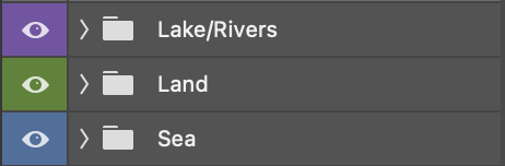
I started by creating a new folder named Sea and nested the new layer named Sea_color within it. I then placed the Sea folder under Land folder:
I went on to Edit -> Fill -> Color and chose a blue color from the color palette reference layer I had previously created. I then set Sea_color to Multiply to see through the water in future layers.
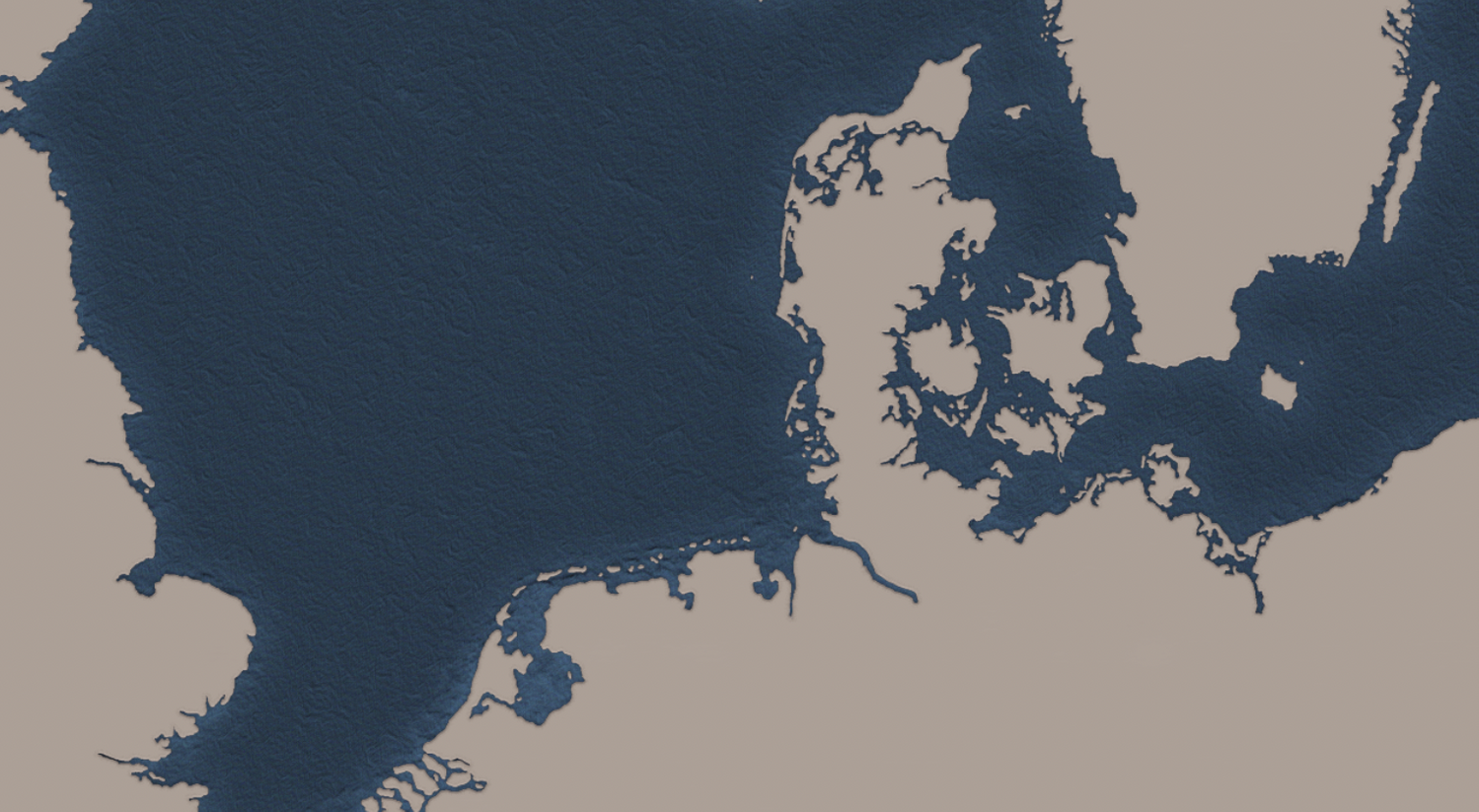
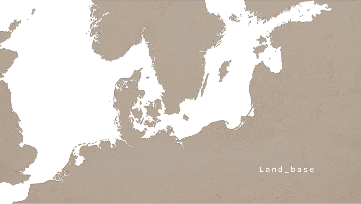
At this point I only had Land_base and Sea_color visibility on to see where I was. Looking like this:
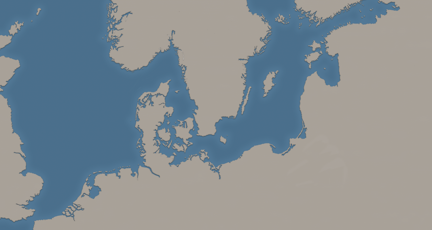
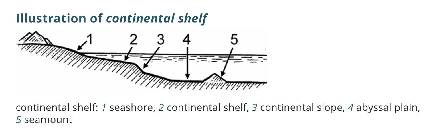
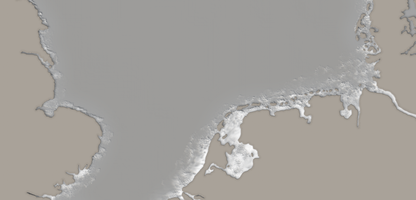
The outer glow you see around the land's margin comes from the effect applied to Land_base layer early on. Its purpose is to create a Continental shelf effect:
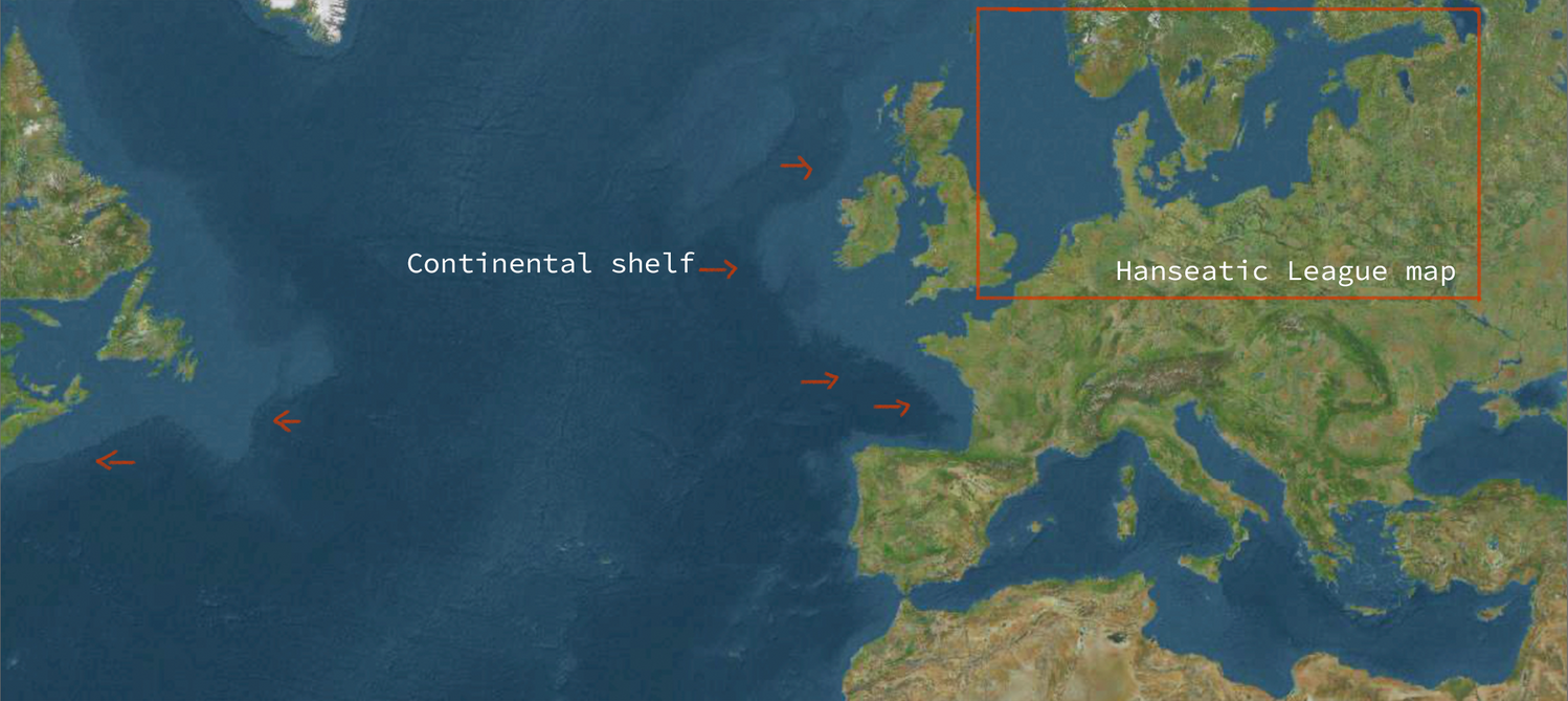
Cross-section view:
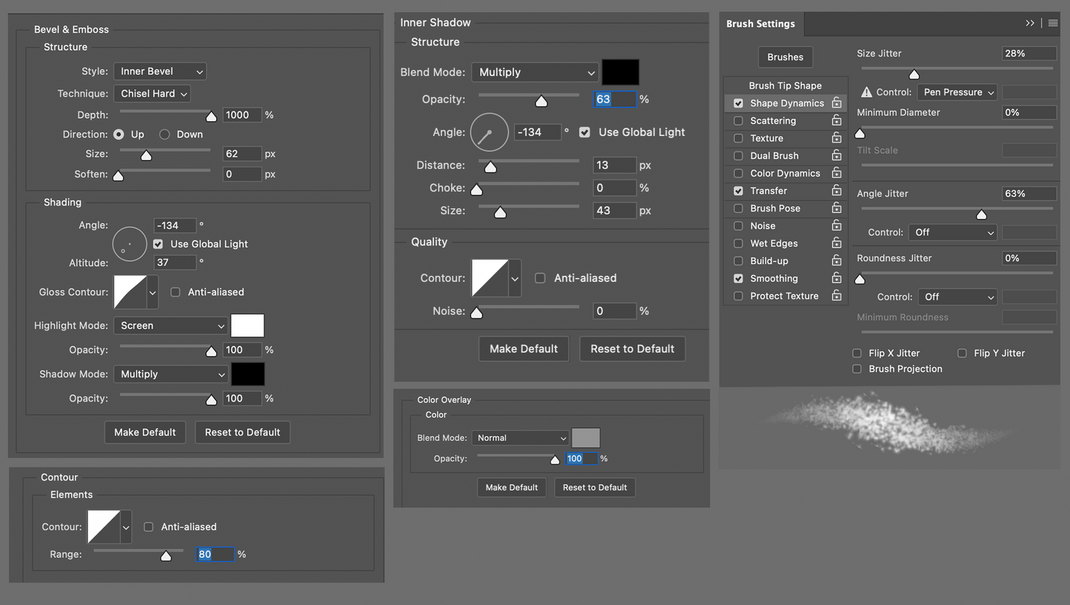
So working in this order:
01- New layer Continental_background
02- Edit -> Fill.. -> Grey background
03- A new layer named Continental_shelf above Continental_background
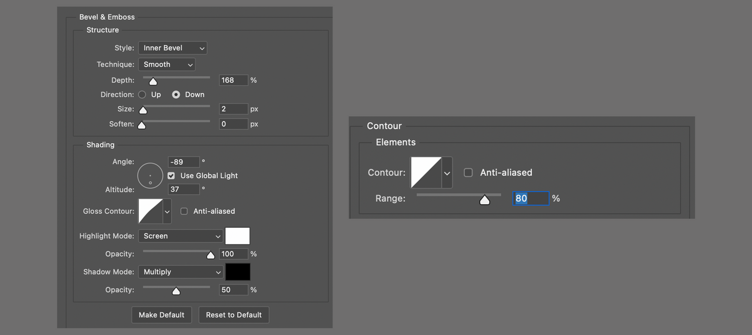
04- Specs:
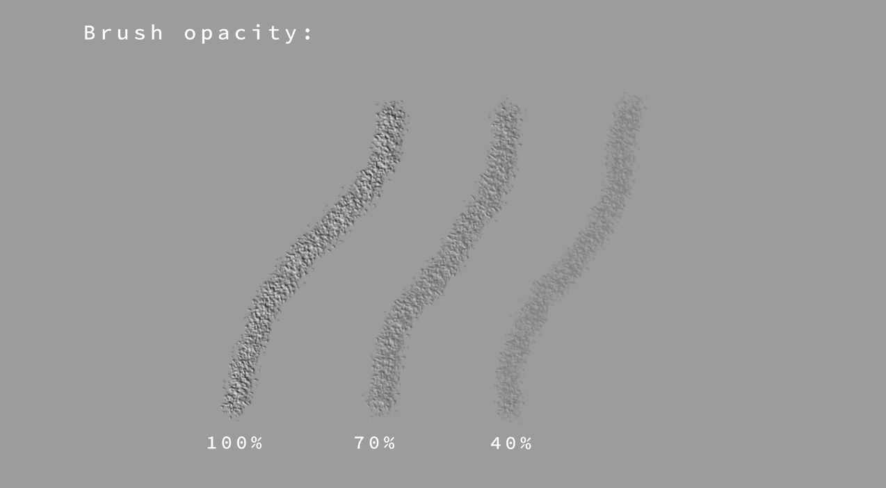
The brush settings are the same as the ones used for the Terrain layer in Part I:
01- Splatter brush
02- Brush tip shape -> Spacing: 30%
03- Brush color to white or same color as background.
I played around with the brush opacity until satisfied:
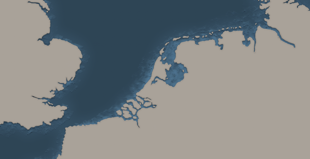
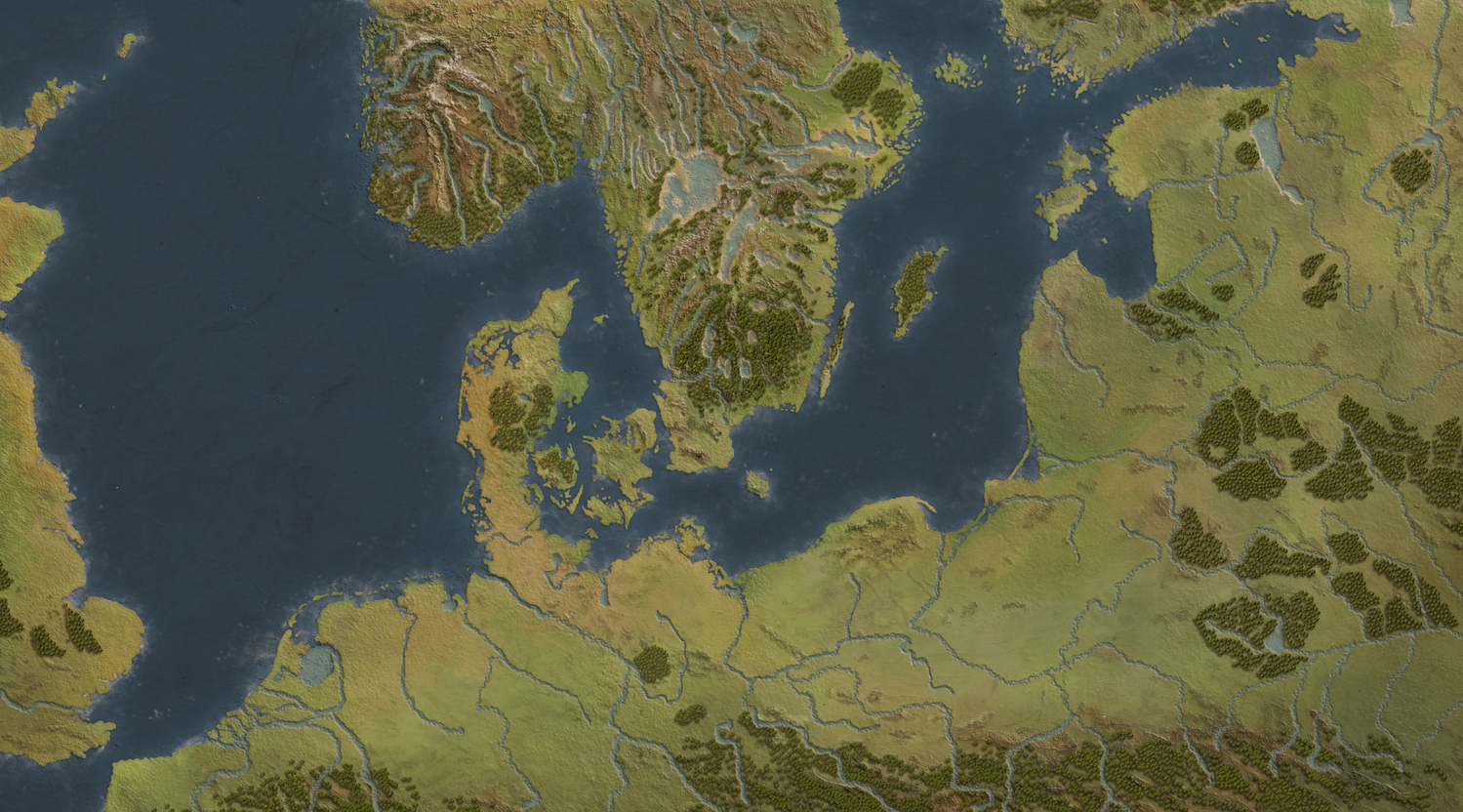
Results:
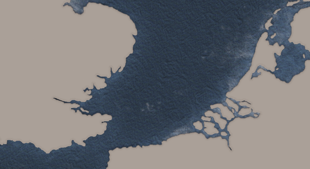
I then turned visibility on for sea_color and lowered sea_color opacity to 90% to see through the water, with these results:
Next, I added some wave texture by following these steps:
01- New layer Sea_texture
02- Filter -> Render -> Clouds
03- Filter -> Render -> Different clouds
04- Filter -> Noise -> Add Noise
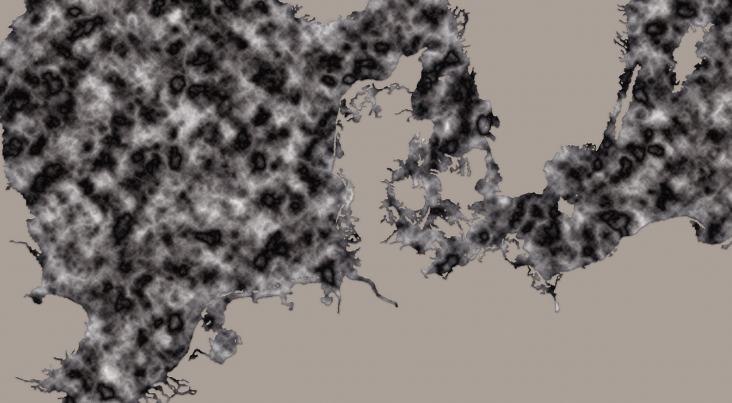
05- Filter -> Filter Gallery -> Glowing Edges
06- Lowering the layer’s opacity to 70%
07- Placing Sea_texture layer under Sea_color
Then getting a texture similar to this:
And for final touches I added a foam effect to the sea to achieve a more realistic look.
So in this order:
01- New layer named Sea_foam above Sea_color
02- Specs:
03- And with Splatter Brush to 80% Opacity -> Color: White painting the coastal areas:
04- I then used an Eraser brush to sharpen the splatter strokes, to eventually make it 'pop' around the edges:
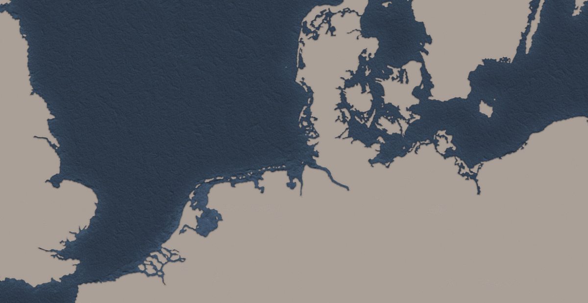
And when turning visibility on in all layers I got the final result:
And that was it! After tweaking here and there, and applying different filters to it I ended up with something looking like this:
Am I content with the final result?
As a non-experienced cartographer, yes. As a perfectionist, no.
Things I would change today?
More forests! Happier shapes, happier trees.
Are there more practical ways of applying effects and using tools?
Definitely, I just don't know about them. Most of the results here are just a combination of mistakes, and making Photoshop crash. But as the great late Bob Ross used to say:
I wish you many happy accidents!
- Tawatha
No spam, no sharing to third party. Only you and me.

Member discussion