Marea Oslo
16 May, 2026 · Marine restoration


16 May, 2026 · Marine restoration
Marea Oslo, is a non-profit working to restore the marine ecosystem in the Oslofjord.
The fjord has been widely documented as polluted and under pressure:
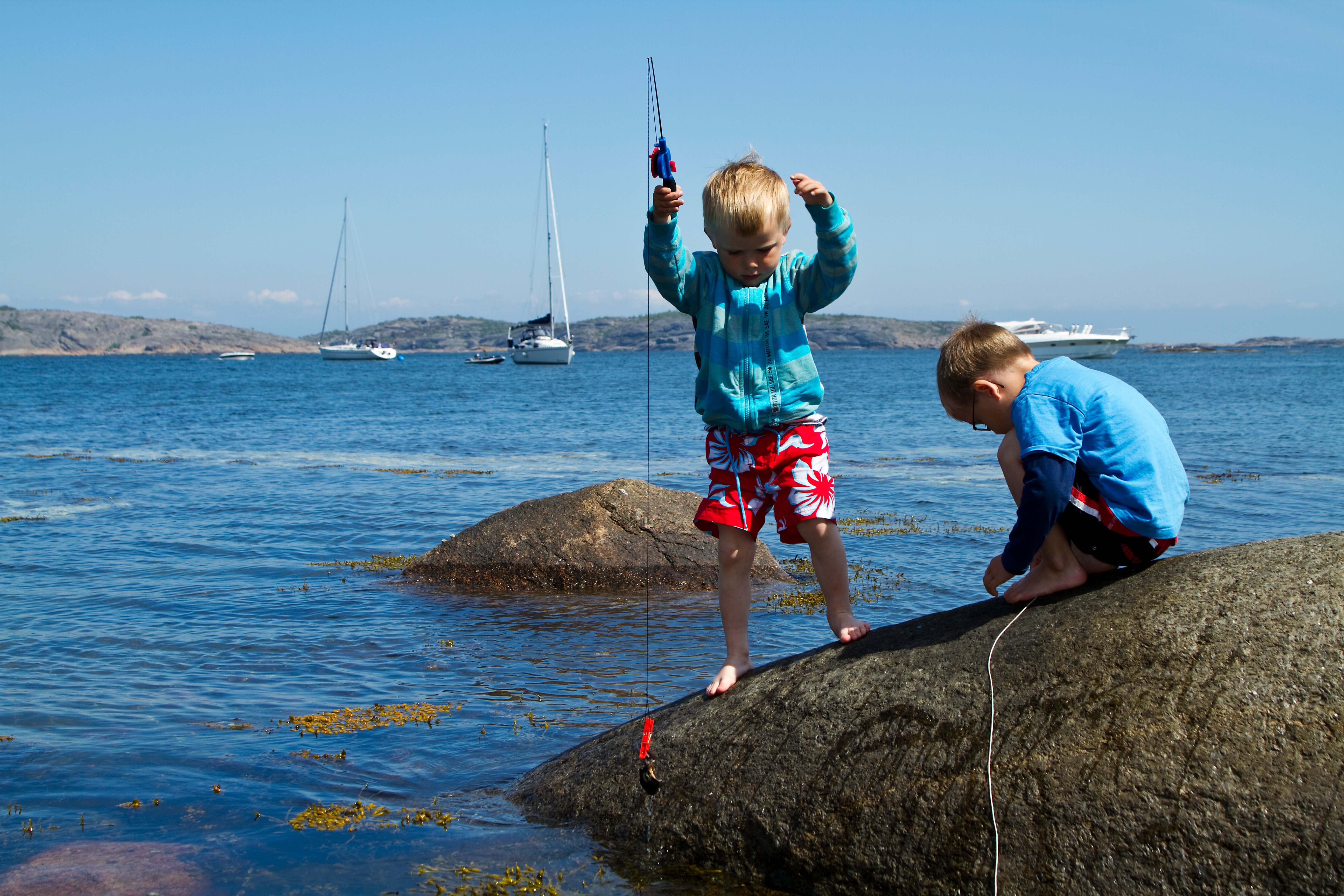
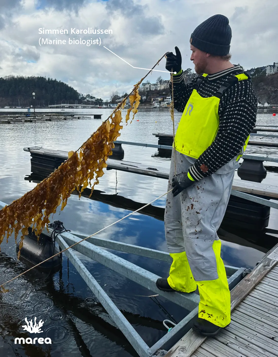
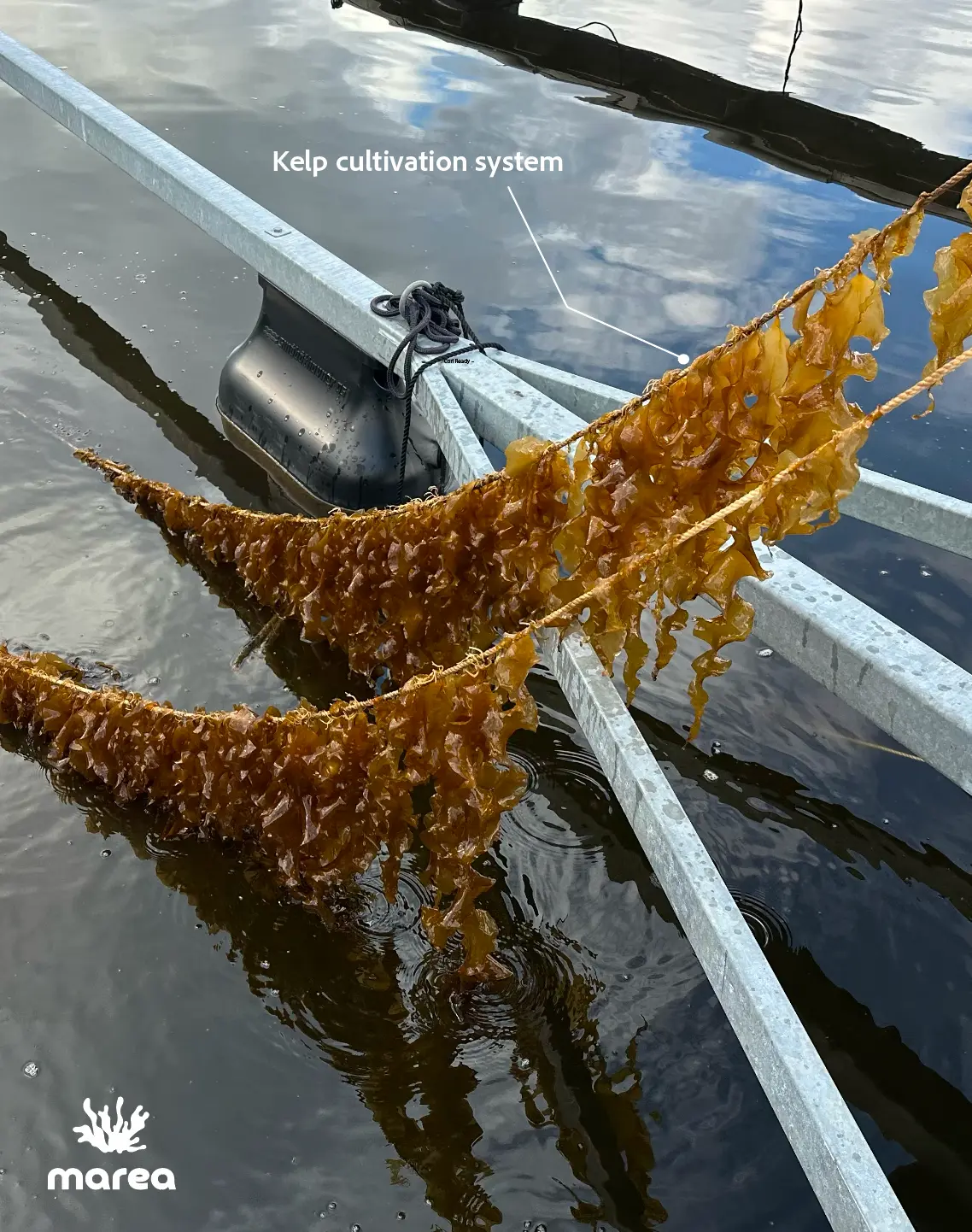
One of the ways they are responding to this is through kelp cultivation, which can help bring life back by creating habitat and supporting marine ecosystems over time. As it grows, kelp also absorbs CO₂ from the water. Ref.
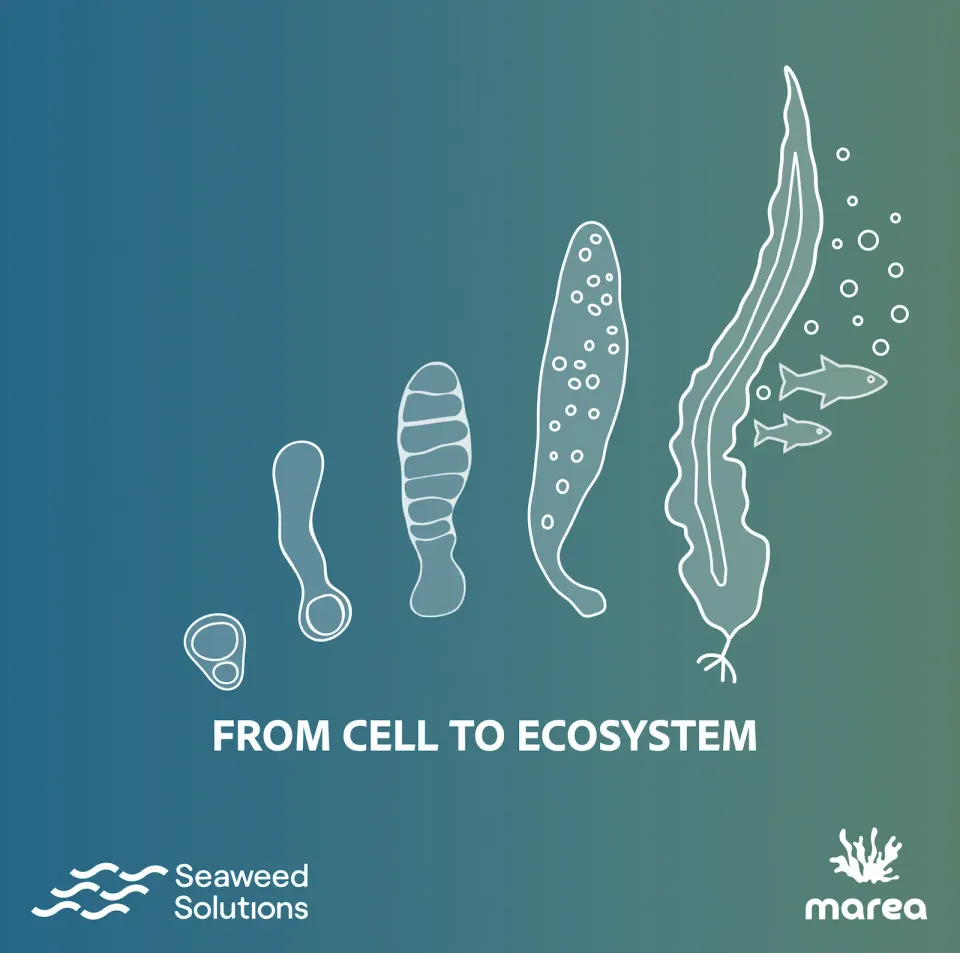
Diagrammatic scientific illustrations [ 5th April, '26]
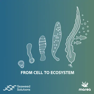
This is a diagrammatic sequence showing how Seaweed Solutions and Marea Oslo work together through kelp cultivation to support the development of marine ecosystems. It is presented in a carousel format for social media publication.
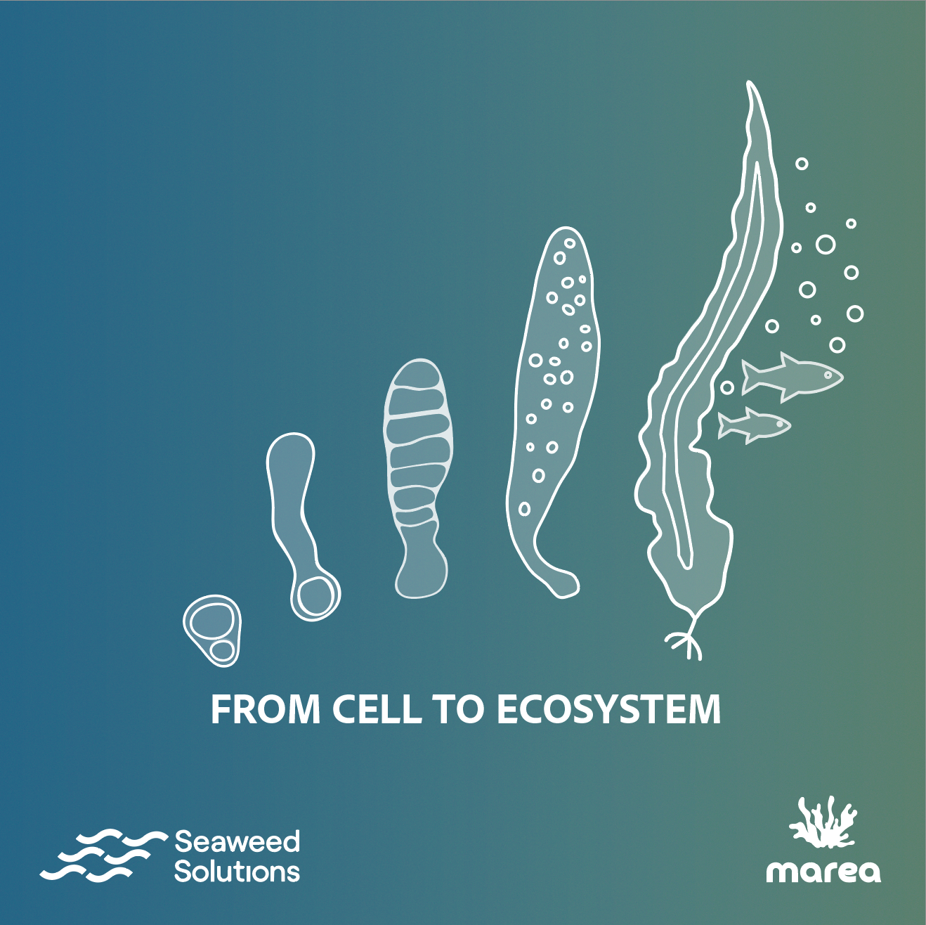
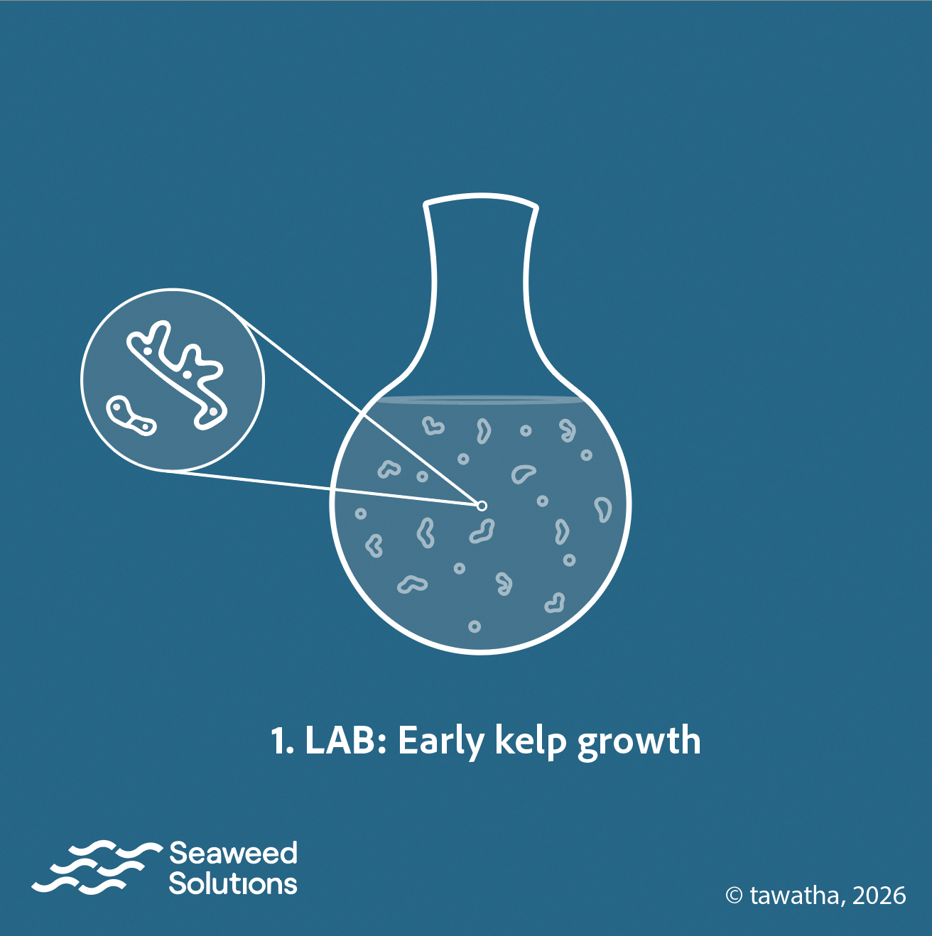
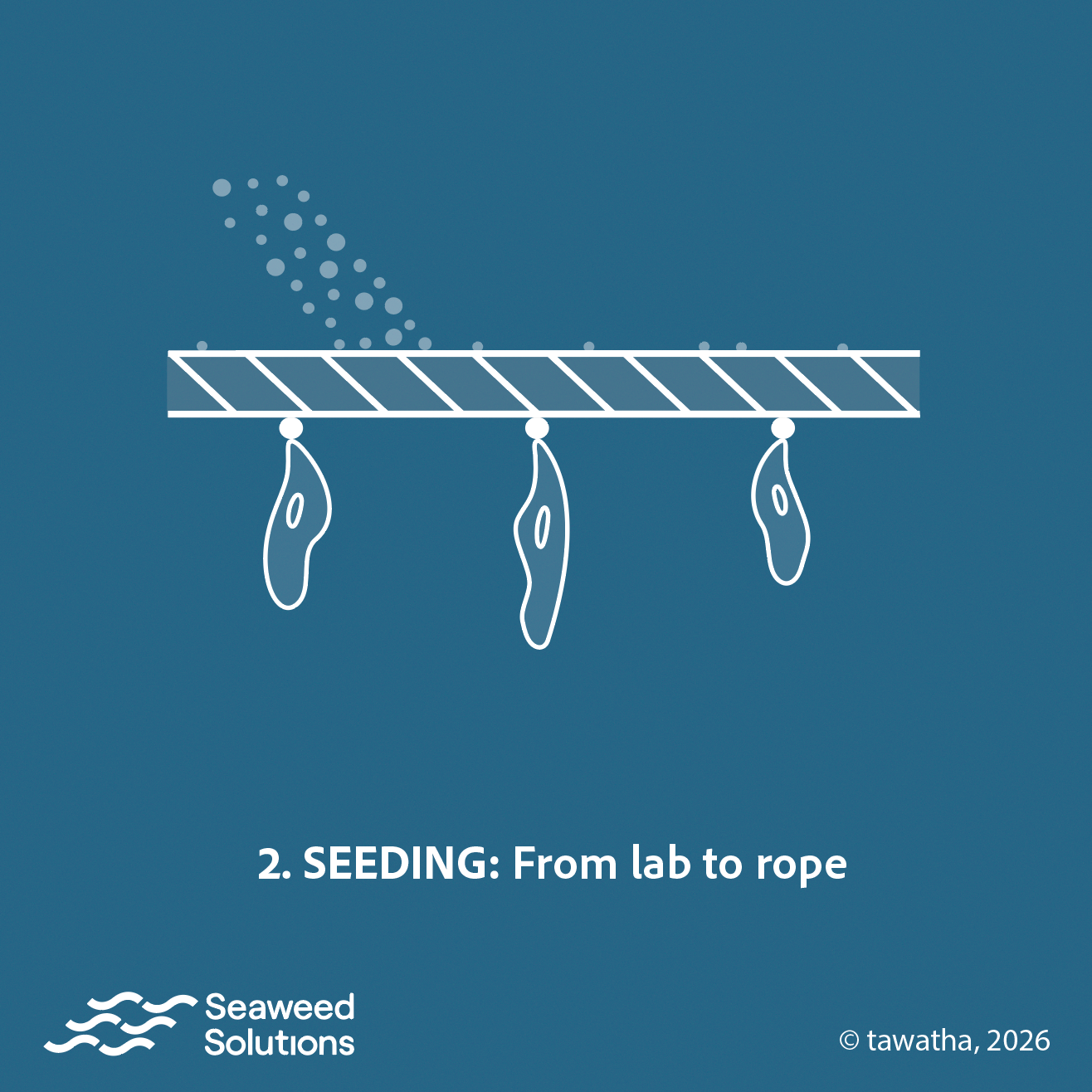
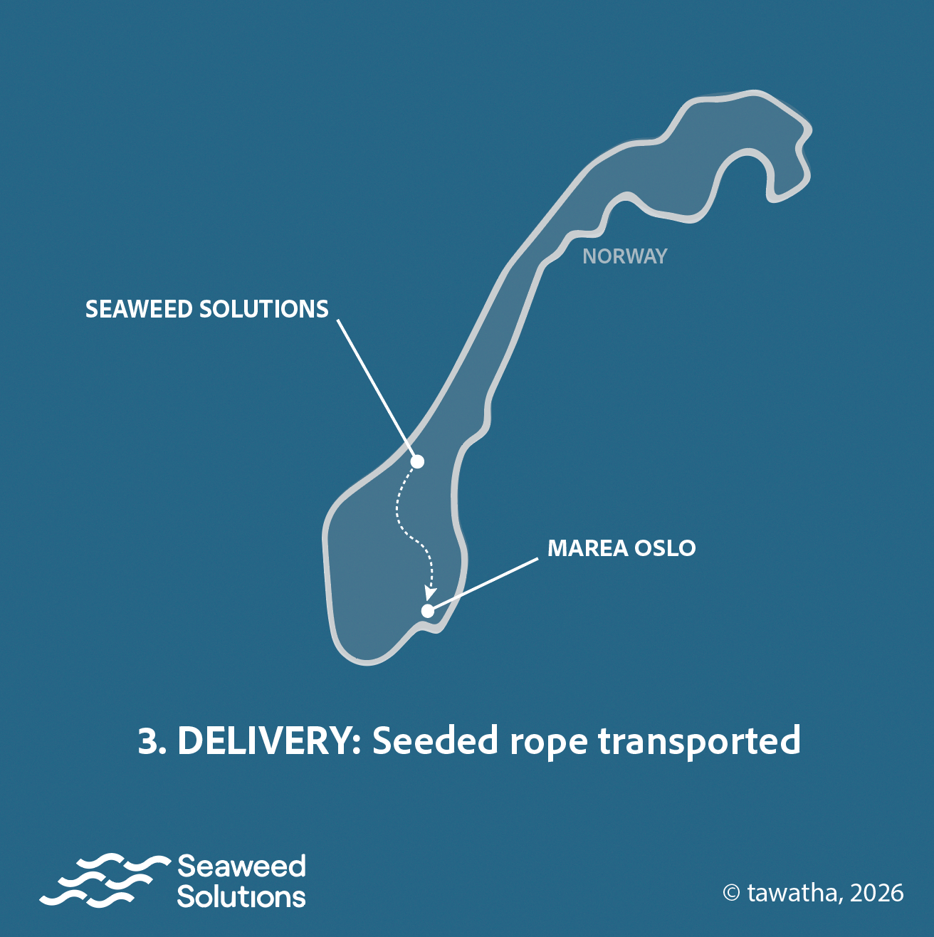
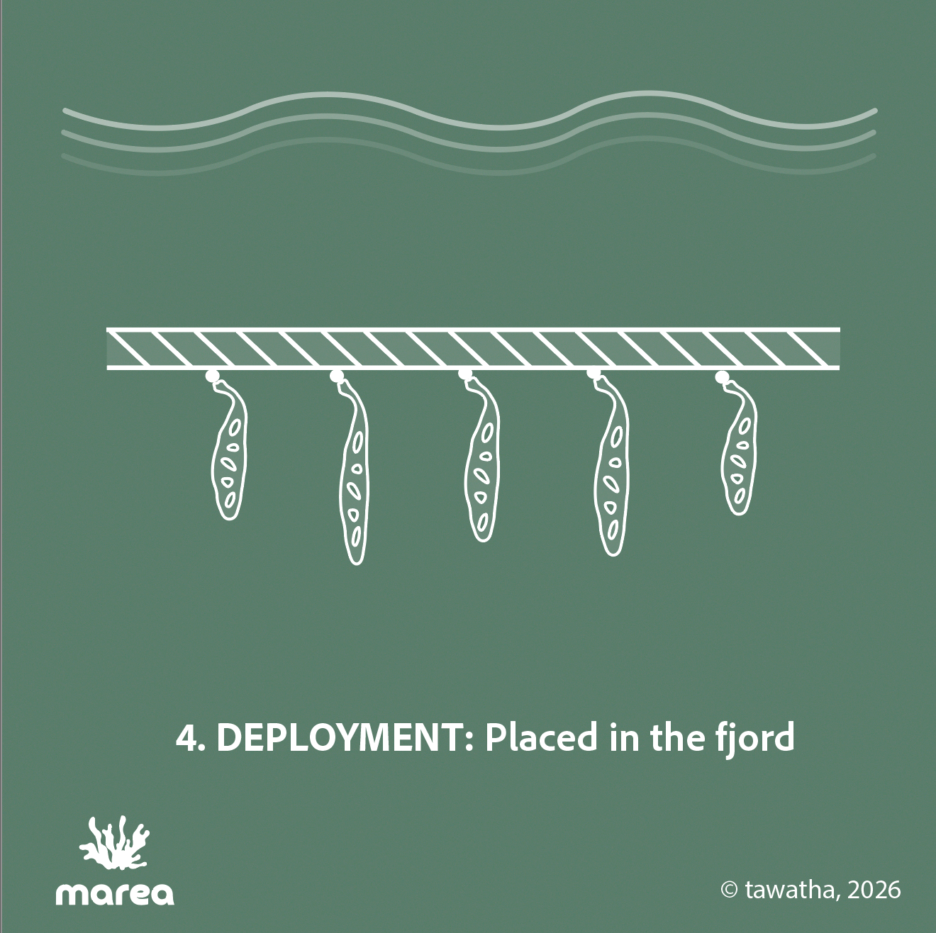
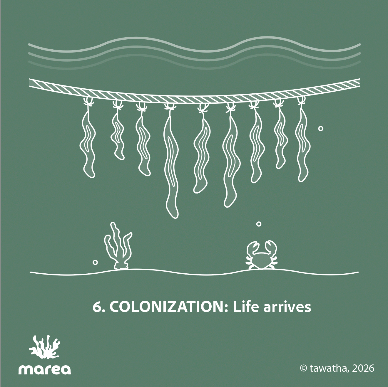
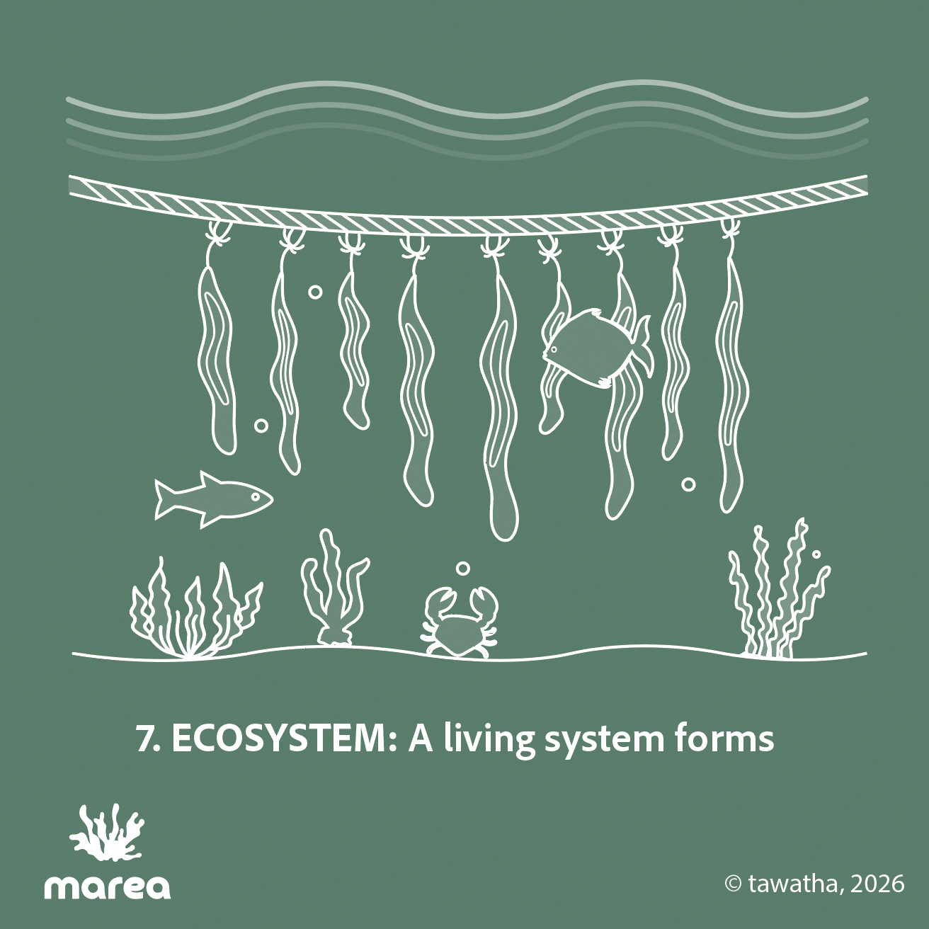
The visual language is intentionally minimal, using fine white line-work, simplified forms, and a dual palette to keep the focus on process and progression. The sequence moves from early cellular stages in the lab to rope seeding, transport, deployment in the fjord, kelp growth, colonization, and finally ecosystem formation.
The cover uses a blue-to-green gradient to bring both collaborators together and make the transition from controlled cultivation to ecological development visible.
I kept the typography consistent throughout using Adobe Clean, switching between regular and bold to create hierarchy without overcomplicating things. The text was sized at 47 pt for small-screen readability, with the goal of keeping the information concise, so the visuals could do most of the storytelling.
For the cellular stages on the cover, I used this scientific paper as reference.
[More to come]
15 Aug, 2023 · Landscape architecture

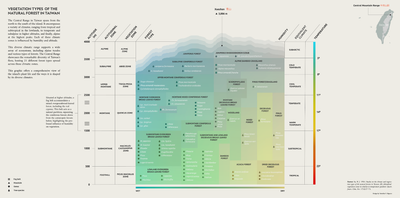
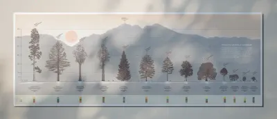
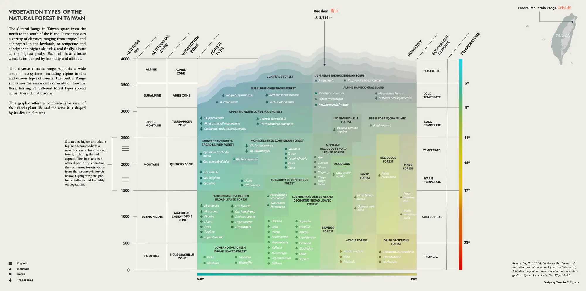
This graphic was requested by Lu Hsin, a landscape architect, during her final master’s thesis on an ethnobotanical garden in Taiwan at AHO – The Oslo School of Architecture and Design.
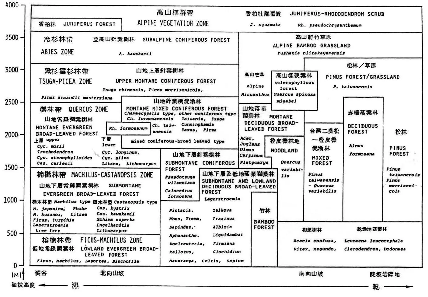
It shows the vegetation zones of Taiwan’s natural forests along gradients of altitude, temperature, and humidity. It explains how Taiwan’s forests change from lowland tropical and subtropical forests near sea level, through montane evergreen and conifer forests, and up to the subalpine and alpine vegetation found near the island’s highest peaks, such as Xueshan, 3,886 m.
Some captions from the location on-site:
The original reference I was given was an older scientific vegetation chart of Taiwan. It showed that, as one moves higher into Taiwan’s mountains, the plant communities shift from warm, wet forests to cold, high-mountain vegetation. It also showed that wet and dry slopes can support different types of forest even at the same altitude.
I also used a bioclimatic classification chart as a second reference. It connects temperature and moisture to the kinds of ecosystems that can occur in a place, from desert and scrub to forest, rainforest, and tundra. The chart helped me understand vegetation through climate gradients: dry to wet, warm to cold, and the balance between rainfall and evaporation.
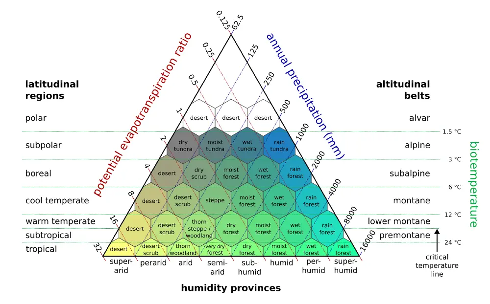
This kind of diagram is a useful global reference for understanding how climate shapes the living world, though it is not an absolute model. Real ecosystems are always more complex.
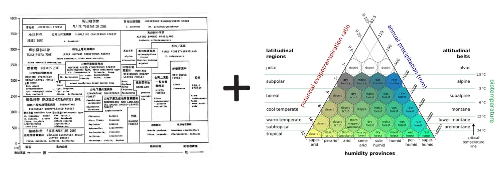
Combined: the old Taiwan vegetation chart gave me the local scientific information: the real forest zones of Taiwan, their altitude ranges, humidity differences, and characteristic species. The bioclimatic triangle gave me the visual and conceptual structure: a way to show vegetation as the result of climate gradients — warmer to colder, wetter to drier, and lowland to alpine.
I used this idea to make the final graph feel more like an ecological landscape.
Final result:
[More information on the design aspect and what needs improvement is coming soon.]
Thank you to Lu Hsin for trusting me and giving me this opportunity ♥︎
This graph was reviewed by Taiwanese naturalist and plant biologist Chih-Chieh Yu (游旨价) back in 2023.
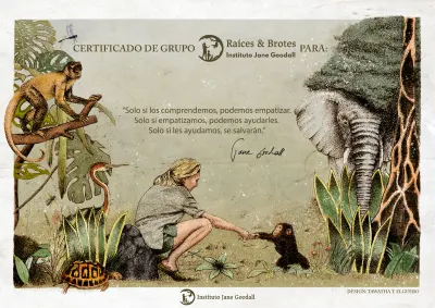
13 May 2019 · Commission
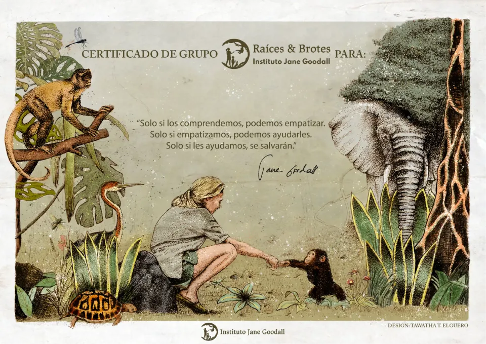
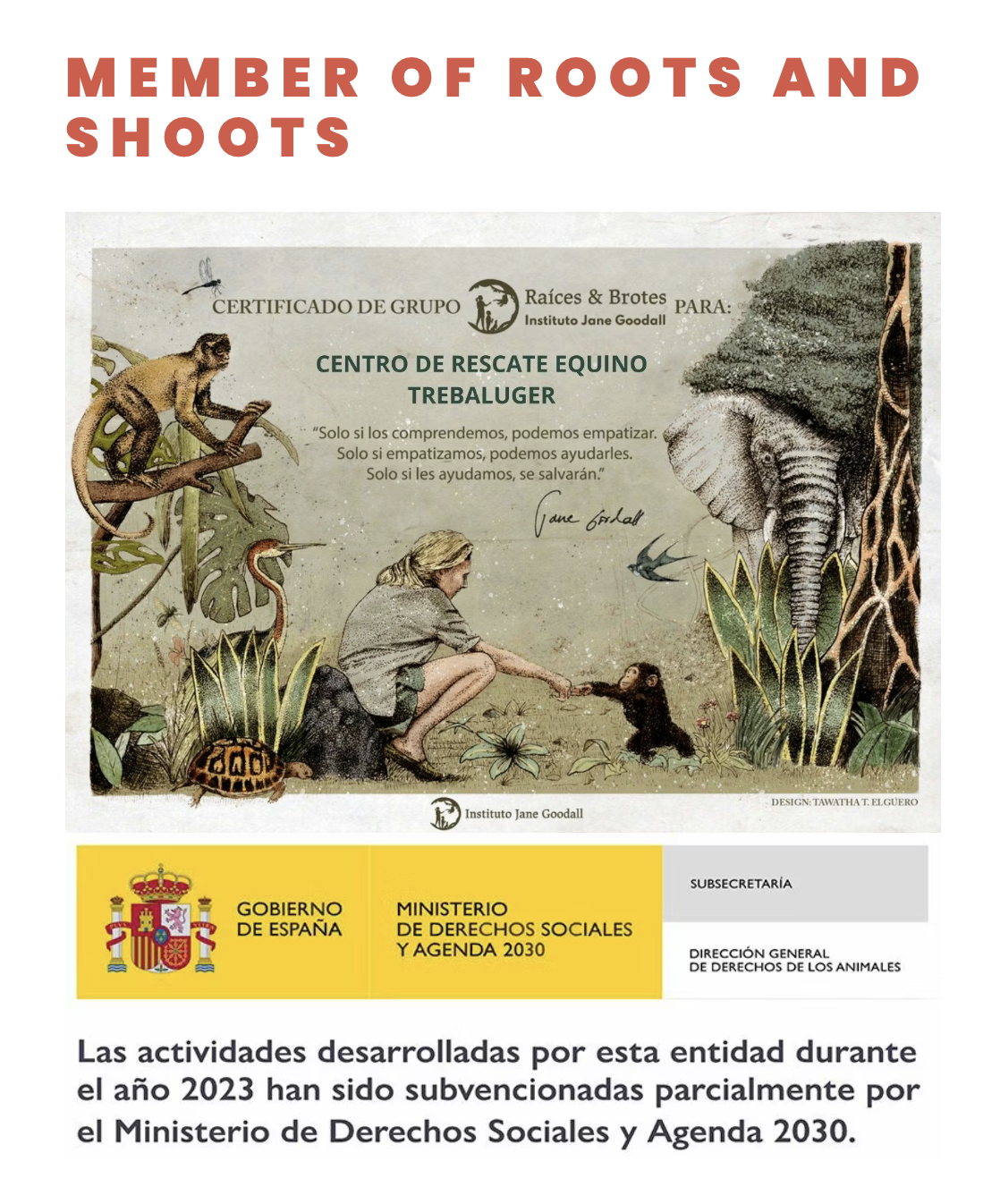
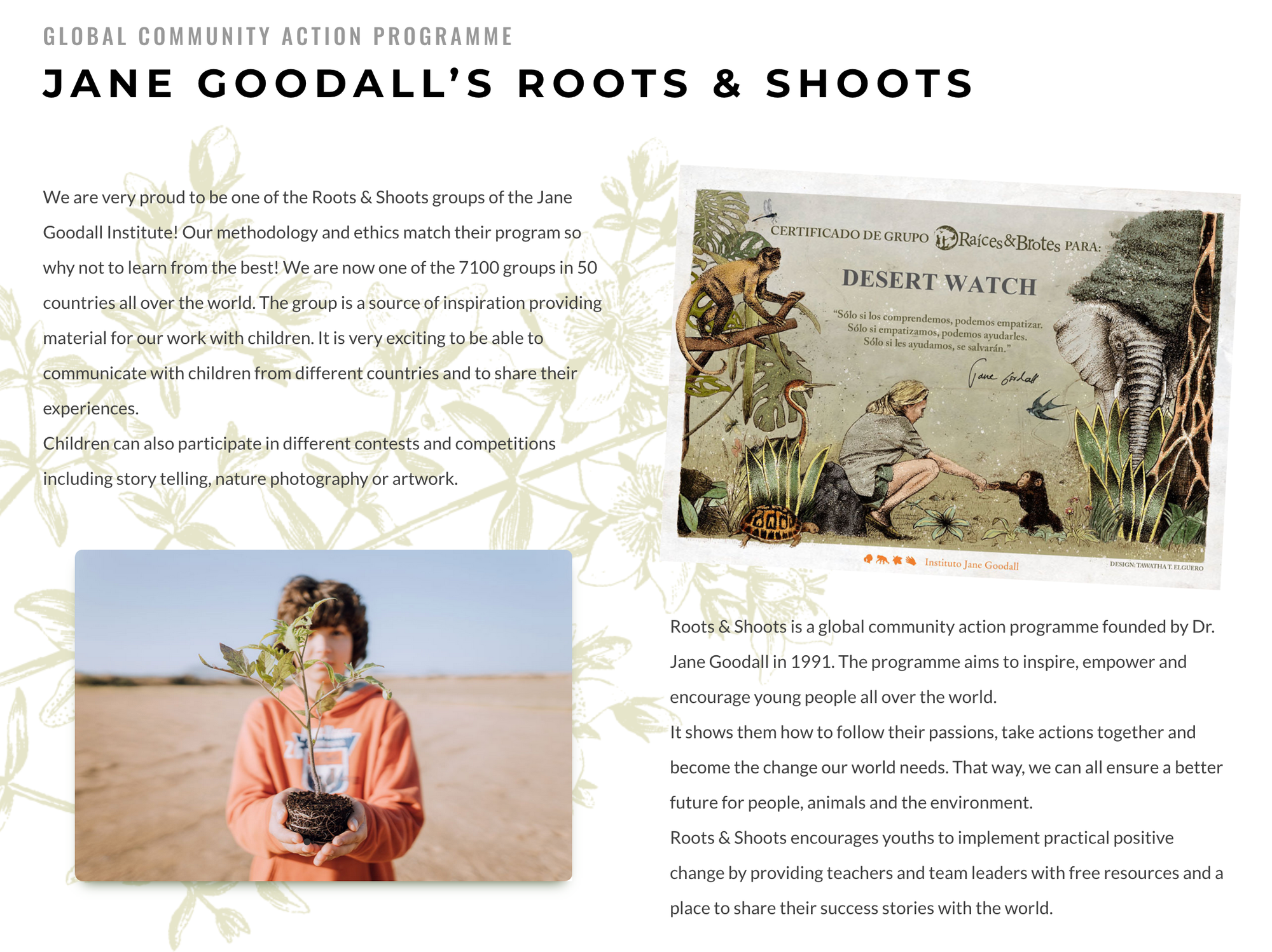
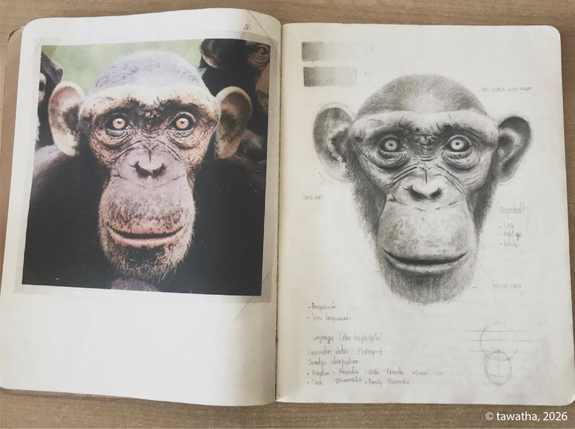
In 2019, I began to collaborate with the Roots & Shoots youth program by the Jane Goodall Institute in Spain. This is an institute founded by the late Jane Goodall, a primatologist and activist, known for her long study of chimpanzees at Gombe National Park in Africa. Her work led to pioneering findings in primatology, such as the observation of chimpanzee tool use, a discovery that forced the scientific community to rethink the definition of what “human” meant at the time.
The program takes positive action through local and international projects aimed at wildlife conservation, the environment, and local communities.
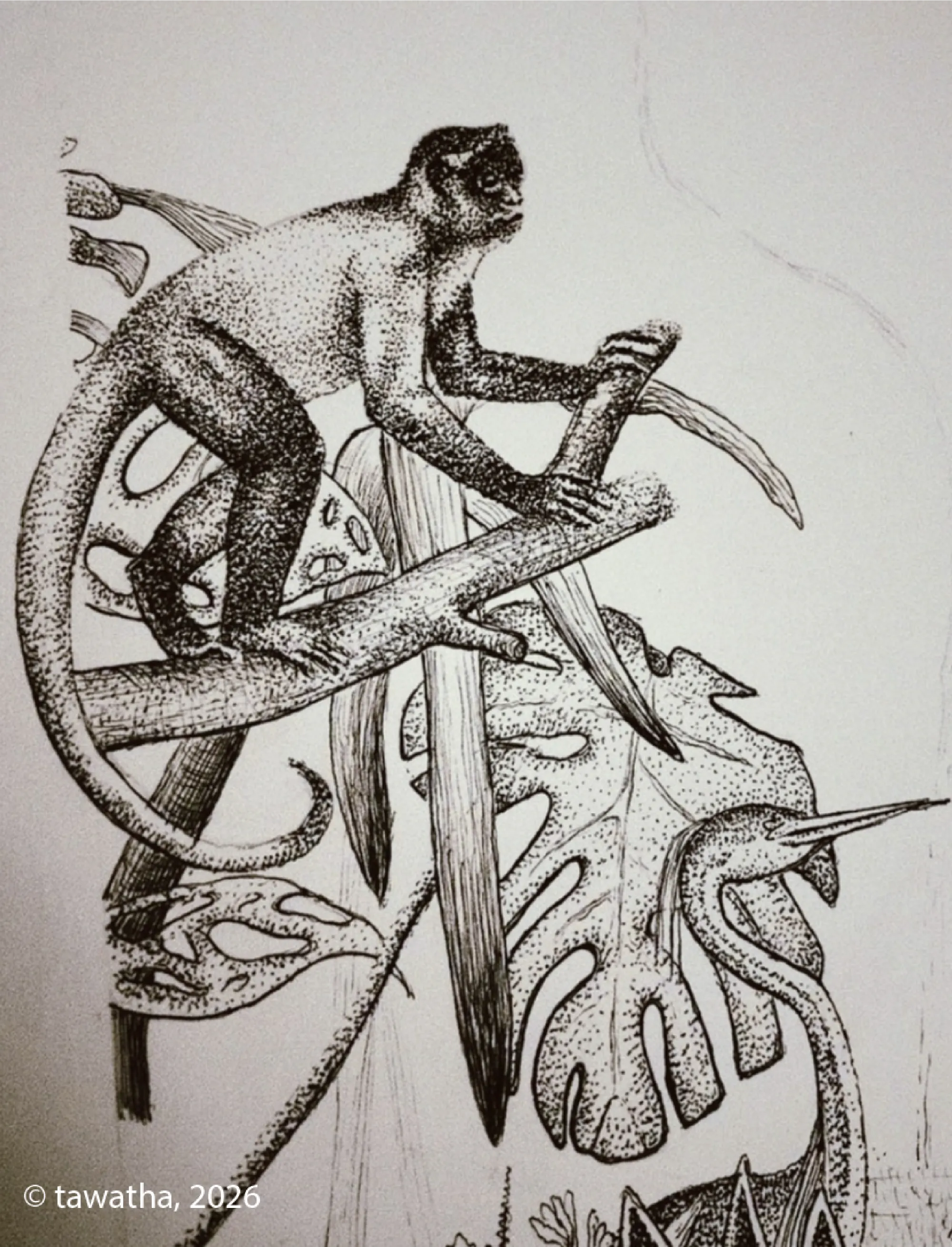
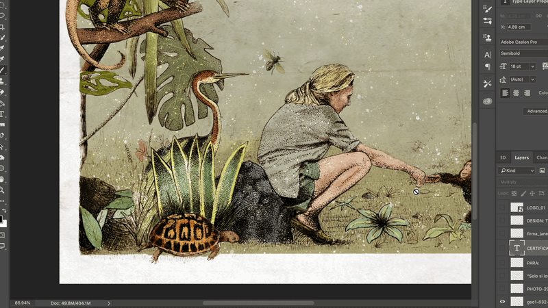
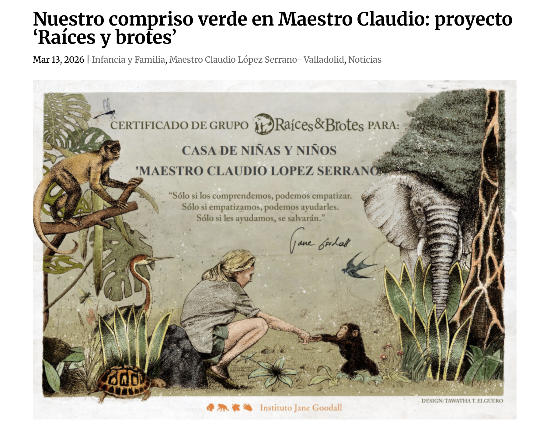
I volunteered on multiple designs, including a diploma handed to new Roots & Shoots group participants.
I combined hand-drawn dot-work with later digital colour refinement, combining a traditional illustration style with a finished digital touch.
This is the digital post-production stage, where the original hand-drawn dot-work was refined through colour-correction, texture work, typography, and final layout adjustments in Photoshop.
Here is the final result:

Some Roots & Shoots members that have received the diploma:
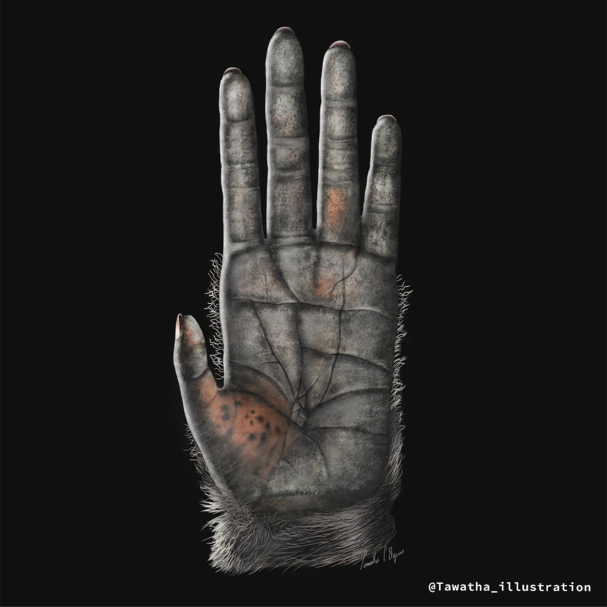
A chimpanzee hand drawn so that children can compare their own hands to those of one of our closest relatives and understand the functionality of the opposable thumb.
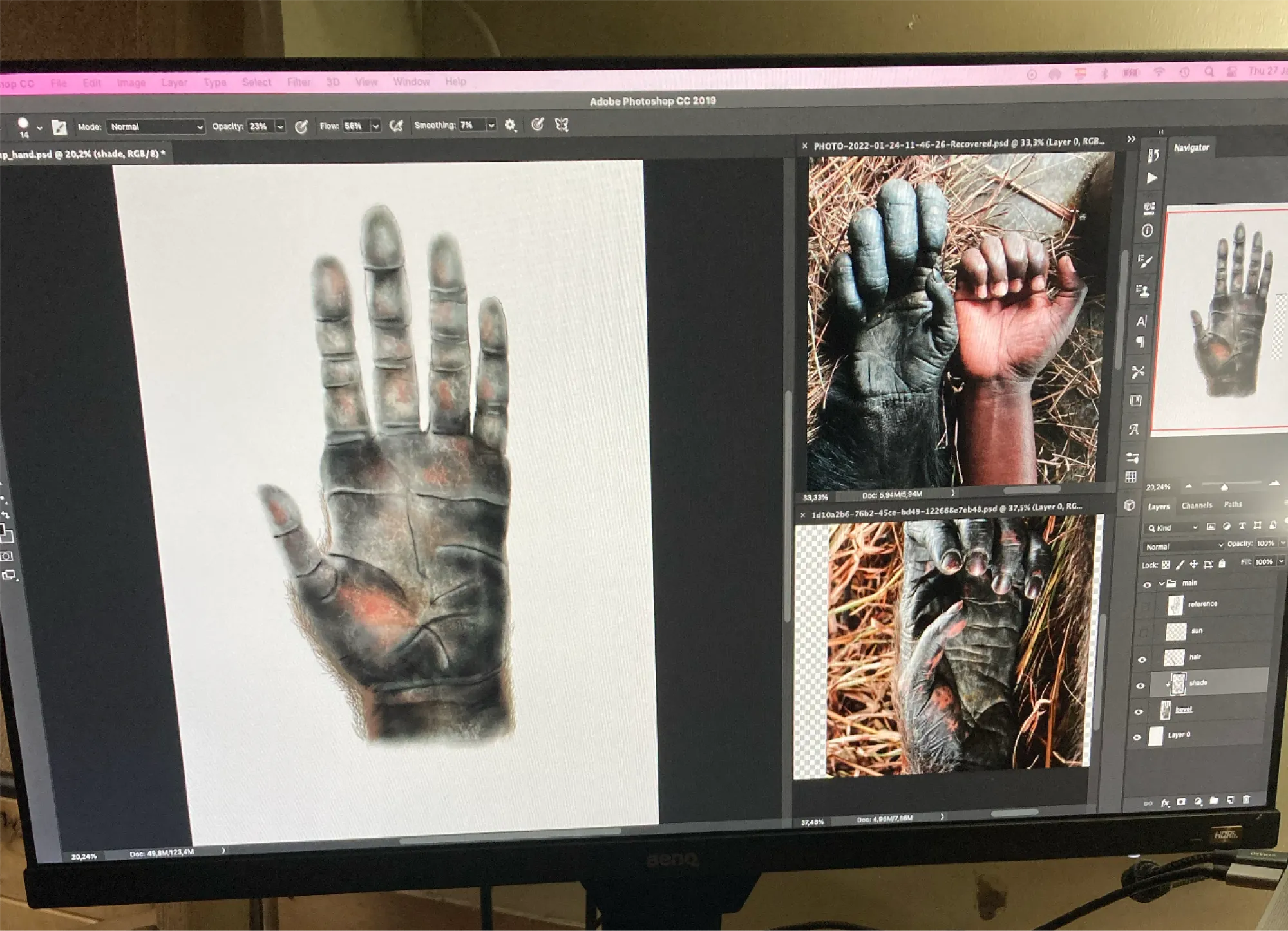
The digital illustration was drawn in Photoshop, paying close attention to anatomy, texture, hair, and the position of the thumb. By comparing their hand with the illustration, children can explore how the opposable thumb supports gripping, climbing, touching, grooming, and manipulating objects, while learning how form relates to function in evolution.
Final version:
(more illustrations coming soon)
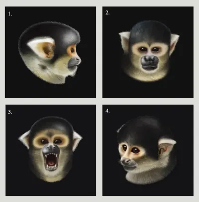
16 Jan, 2023 · Freelance
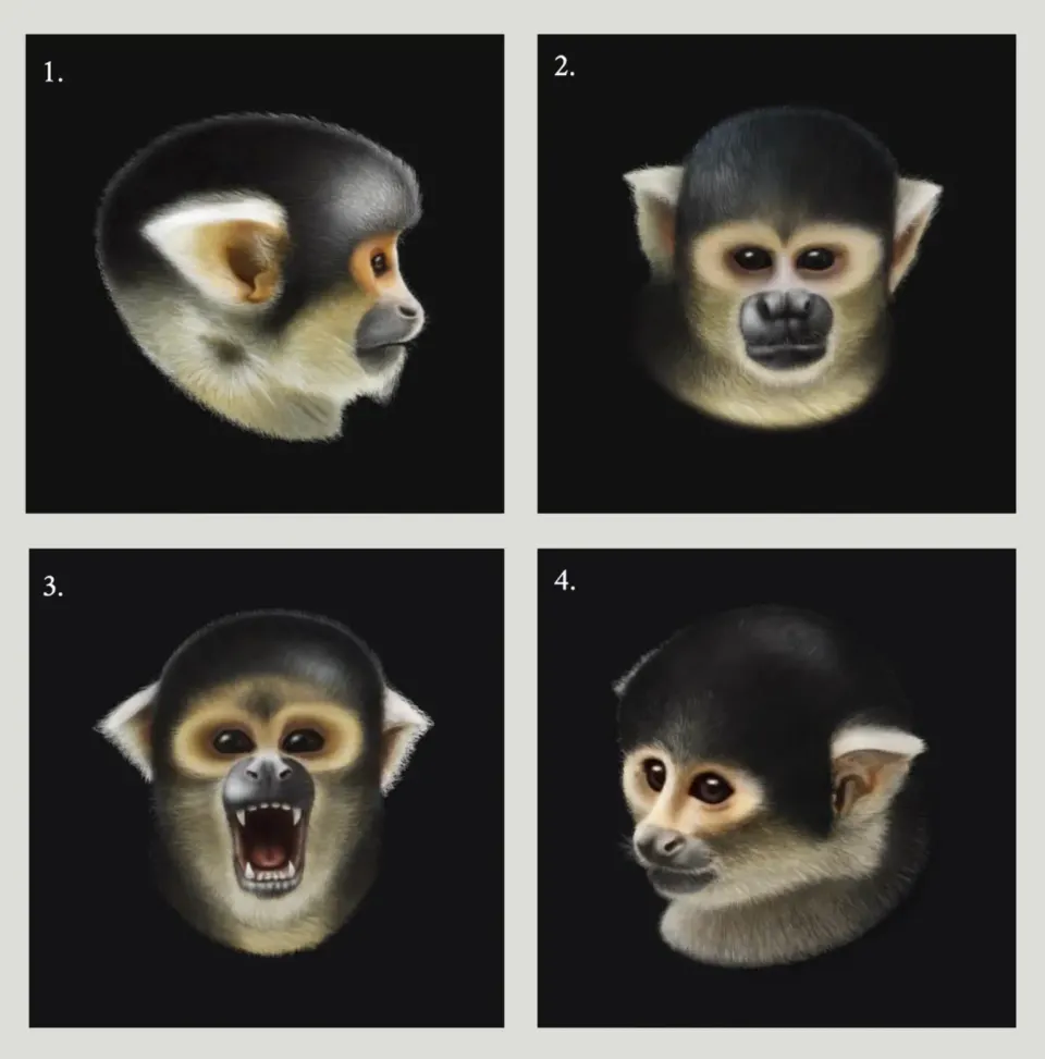
I illustrated a series of four Black-capped squirrel monkey portraits for Carla Pascual, a primatologist and master’s degree student at the University of Girona. The purpose of these illustrations was to support a study exploring the relationship between the distinct personalities of squirrel monkeys, specifically Saimiri, and their unique vocalizations within a specific group.
The primary challenge of this task was the low quality of the reference images provided, as these monkeys are wild. Only one female, who was used to humans, was captured in a relatively clear photo.
I had to meticulously reconstruct each monkey’s image in Photoshop, paying close attention to individual traits to accurately depict each one. Despite the limited references, I tried to create the most realistic representations possible.
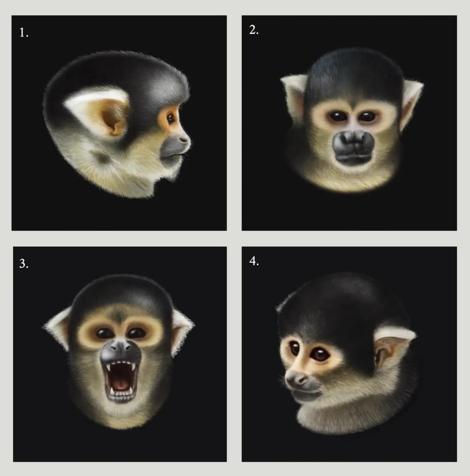
Low-quality reference images compared with final digital renderings. Tawatha T. Elguero
Thank you, Carla, for trusting me and for the opportunity! ♥︎
Carla Pascual, Primatologist, UdG (Universidad de Girona)
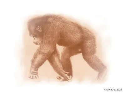
Aug 12, 2019 · Formal training

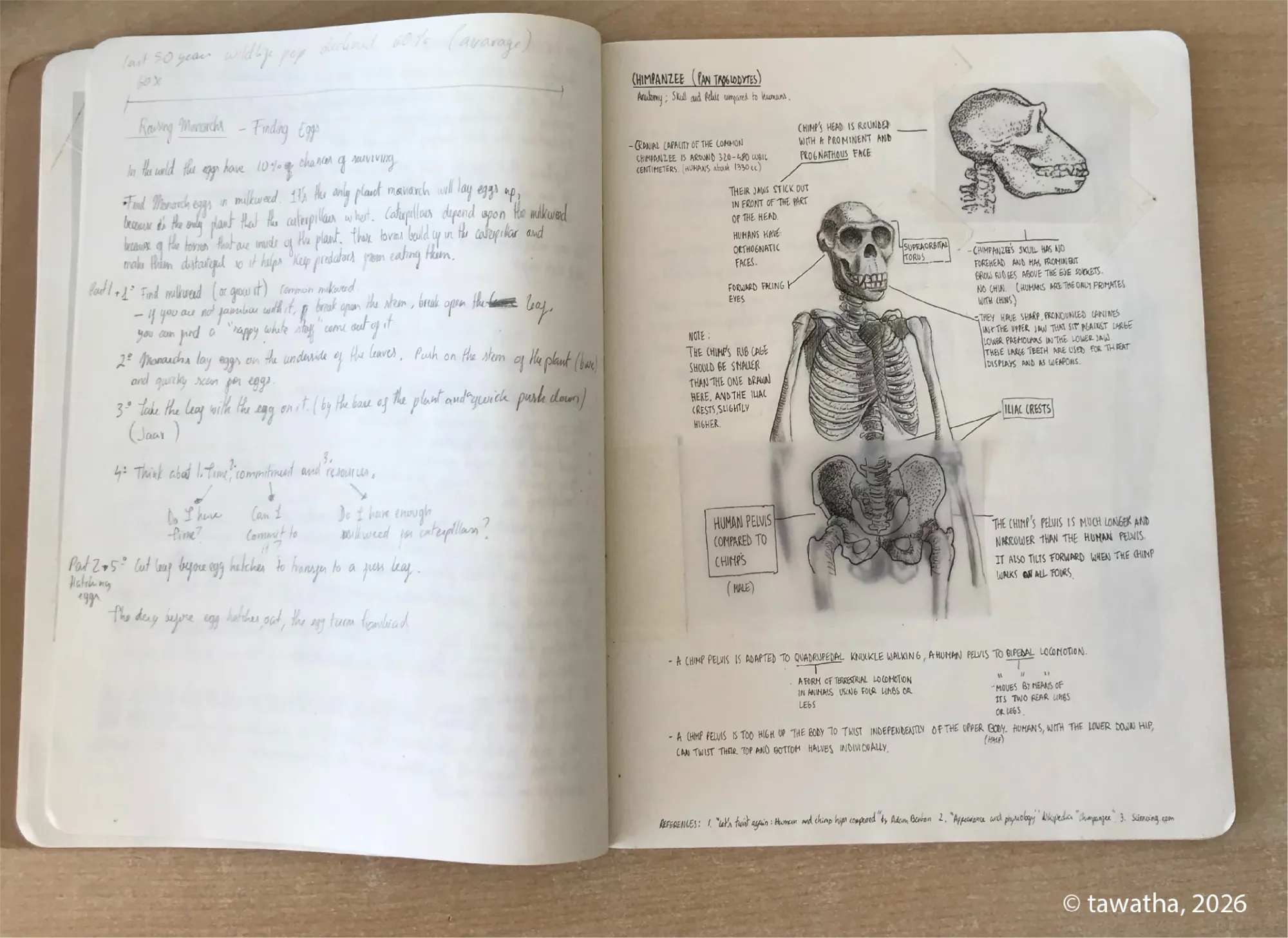
This was a weekend intensive course in scientific illustration, taught by Blanca Martí and organised by Fundación MONA, the Centre for Primate Rehabilitation in Girona, Catalonia, Spain.
The course introduced me to basic primate anatomy, locomotion, and field sketching.
Here are some of the course materials I worked on:

Thank you, Blanca, for your teachings. ♥︎
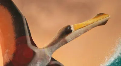
09 Sep, 2021 · Formal training
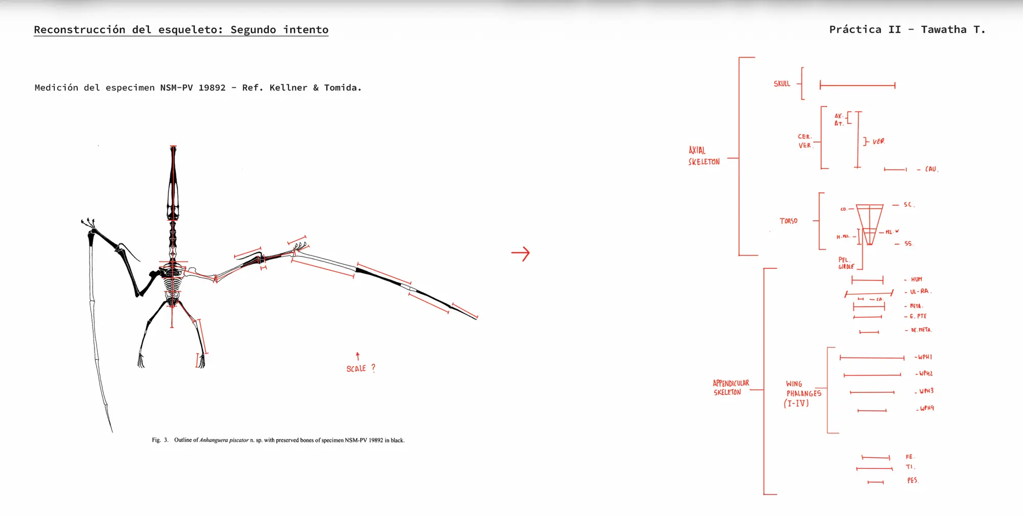
This is a course I took in paleo-artistic illustration with Hugo Salais, a biologist and paleo-artist, through Illustraciencia. The course focused on creating paleoart by collecting relevant and reliable data, interpreting fossil remains, progressively reconstructing anatomy, and representing an extinct organism’s behaviour and way of life during the span of 2 months.
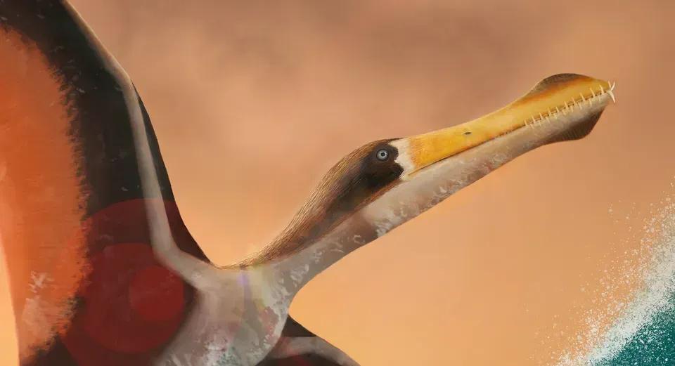
I focused on the pterosaur Anhanguera piscator, a pterosaur that existed during the Late Cretaceous in what is known as Brazil today.
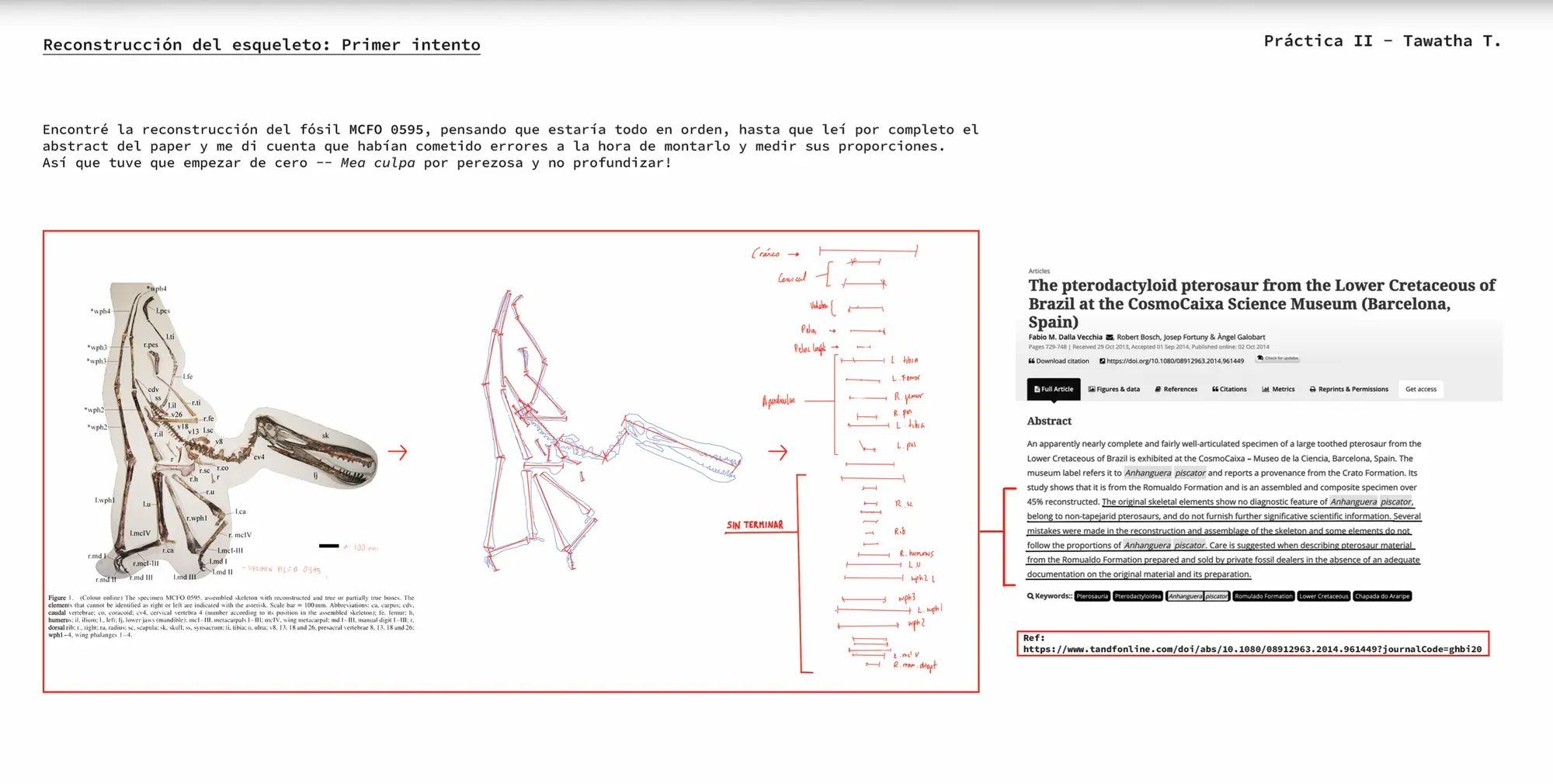
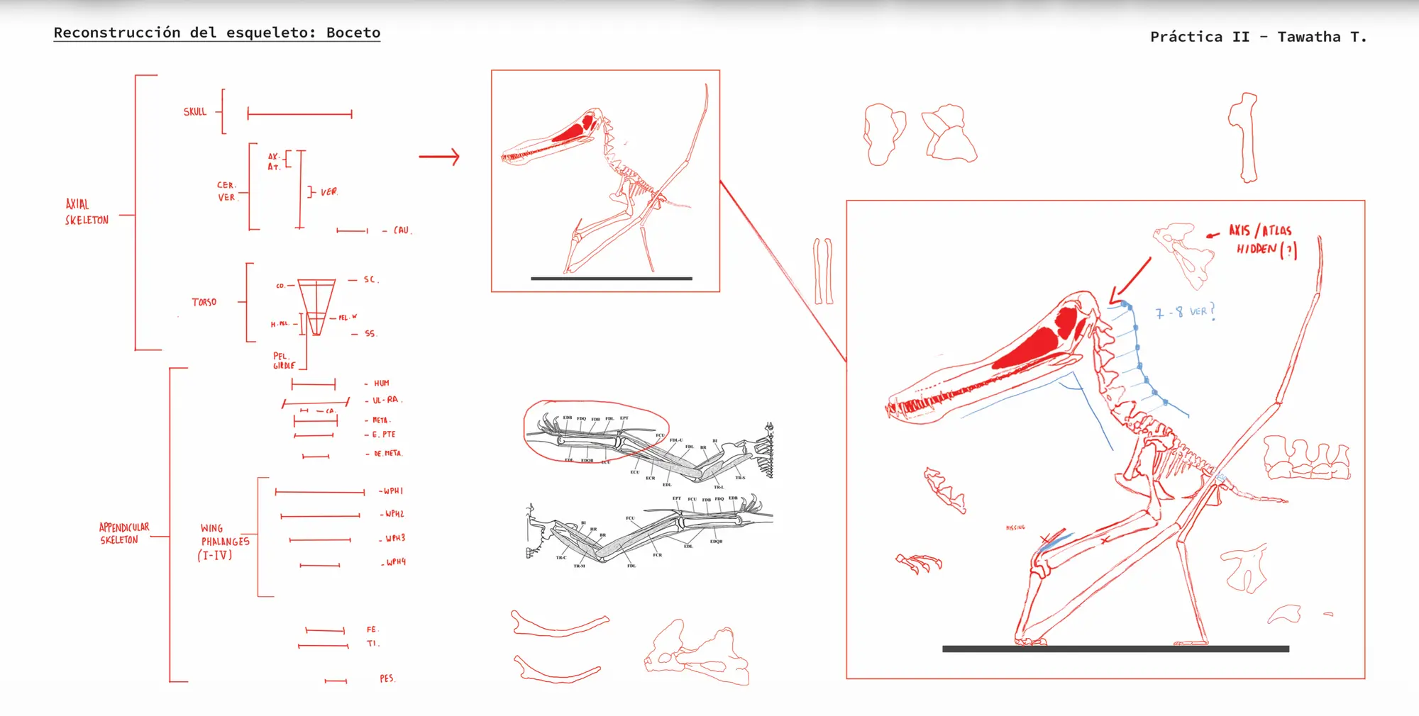
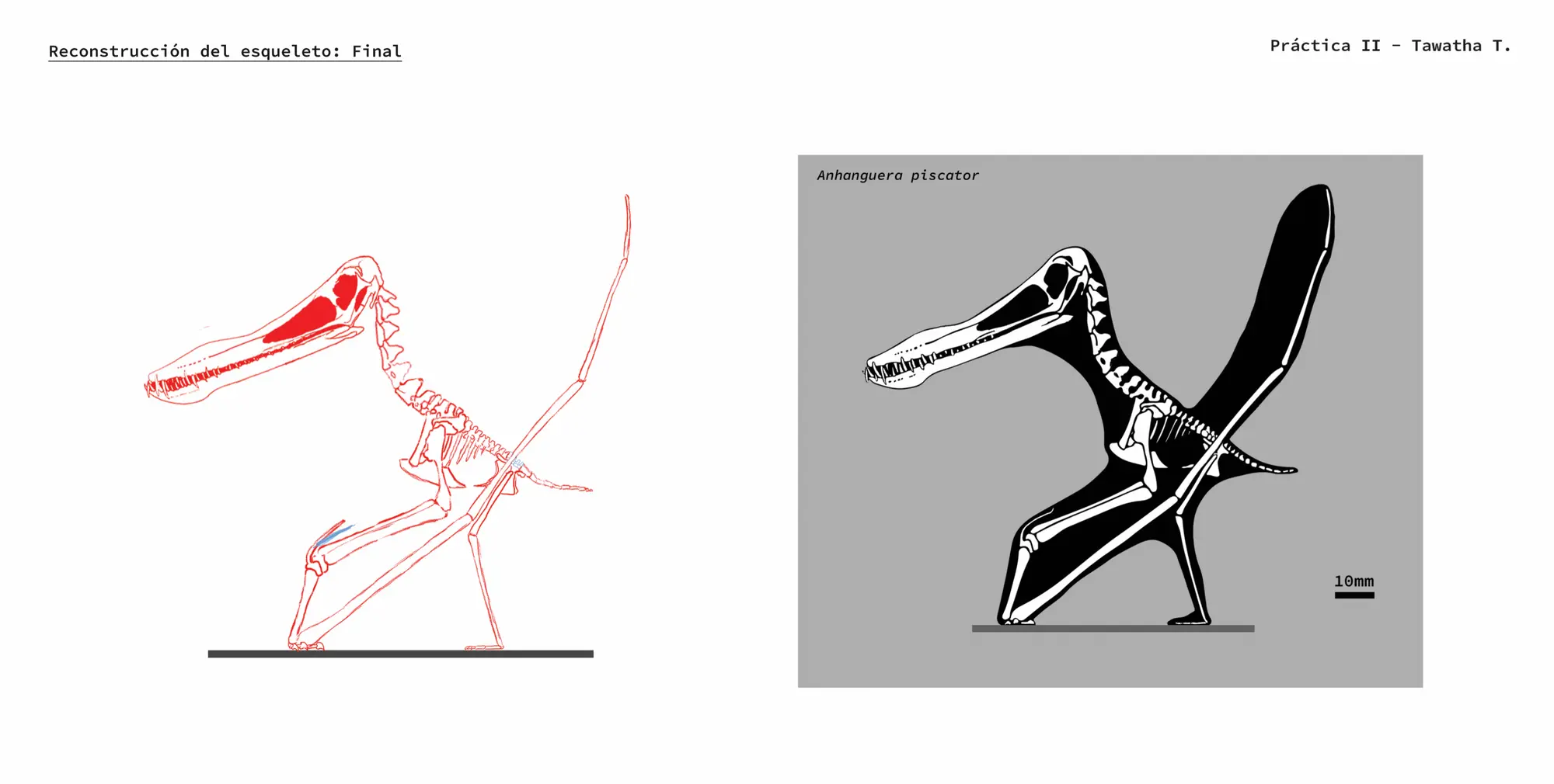
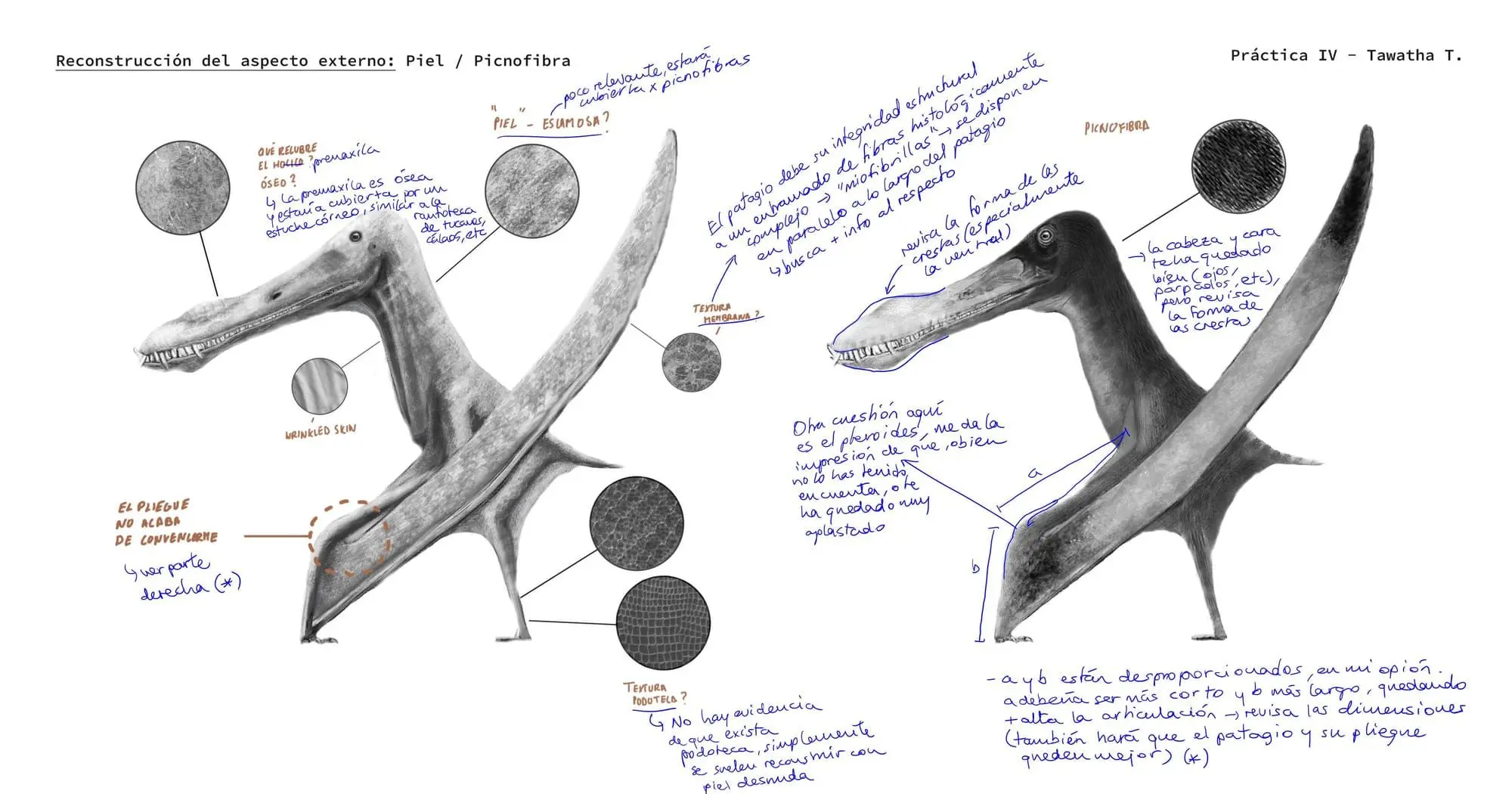
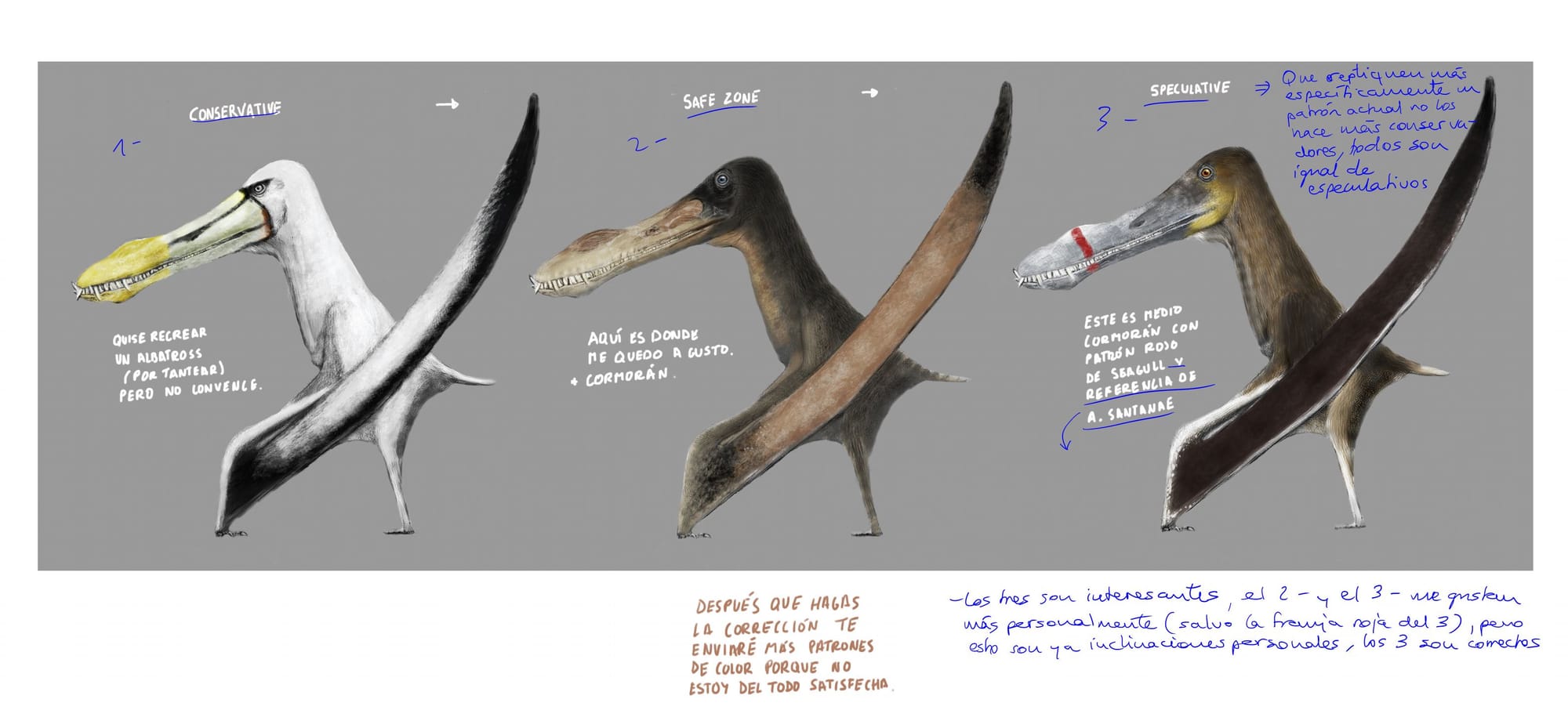
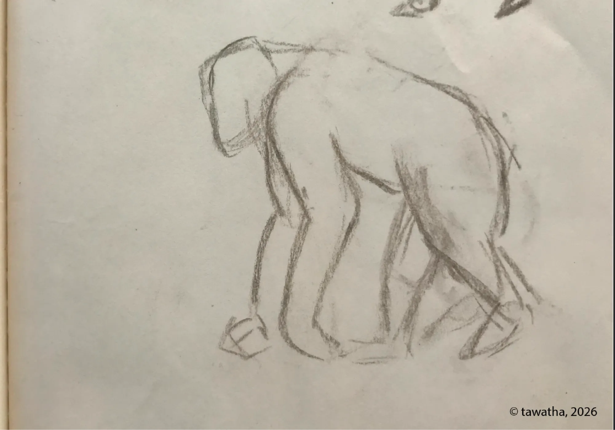
This image was created in Photoshop, and it is the first draft of my final project proposal for the course. At this stage, the anatomy had not yet been corrected by the professor, and several background details still needed further development.
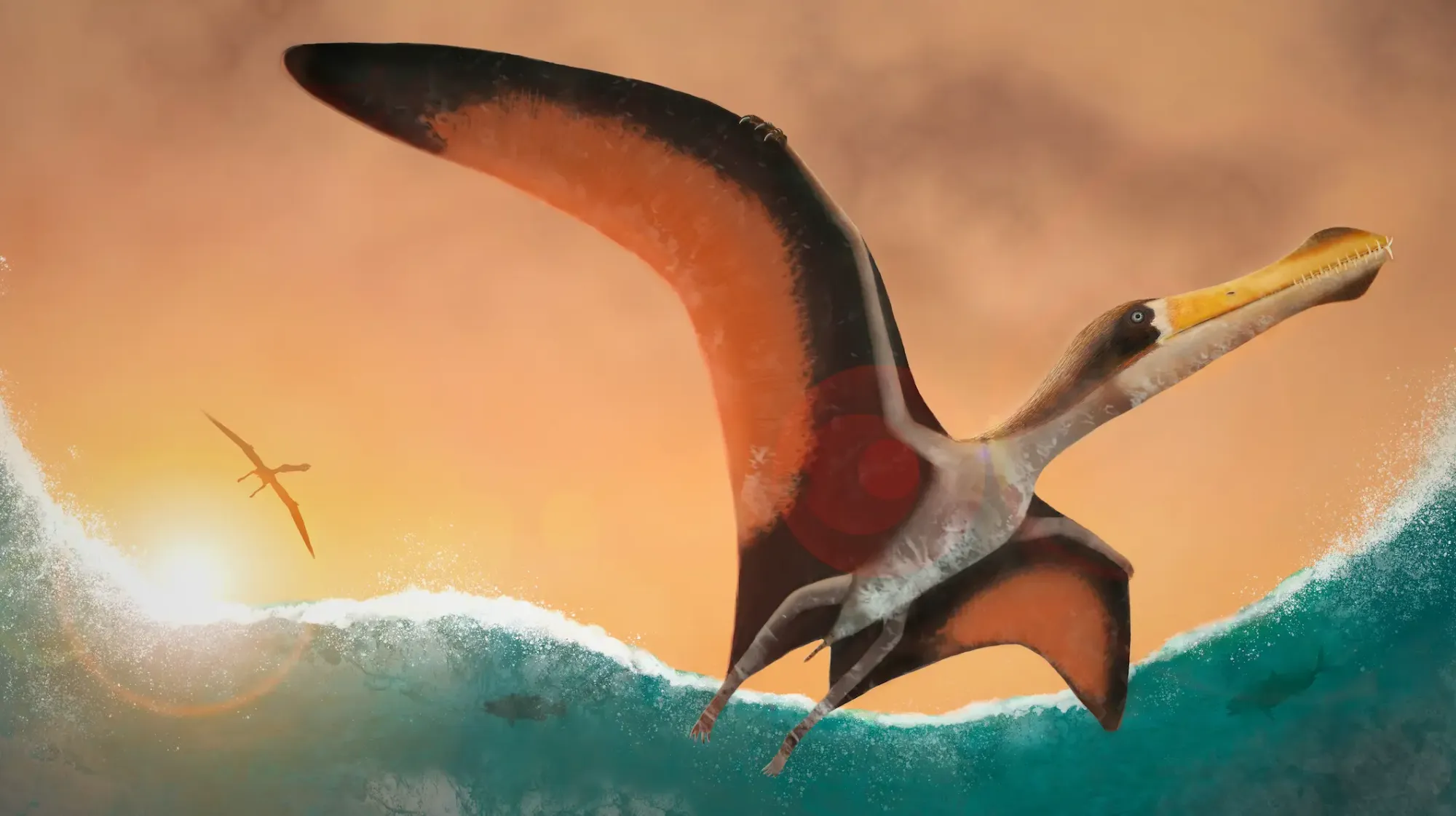
Although I did not have the opportunity to complete the course, the process taught me a great deal about creating dynamic illustrations, especially how movement, composition, atmosphere, and scale can work together to bring an extinct animal to life.
Despite the unfinished elements, I am quite satisfied with this draft. It represents an important stage in my learning process and helped me better understand how to build more expressive and engaging paleo artistic scenes.
Thank you, Hugo, for your teachings.
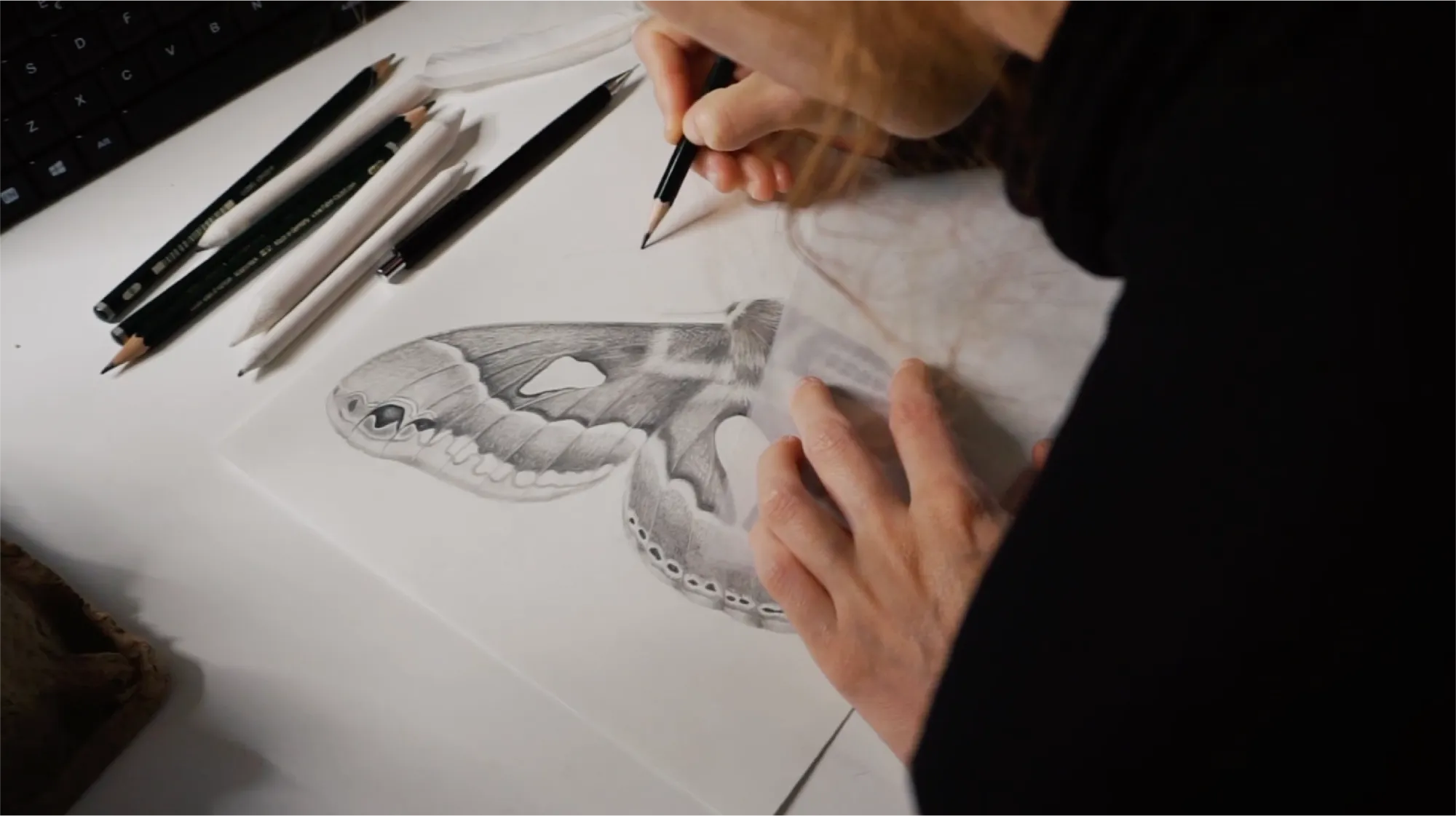
Apr 12, 2020 · Formal training
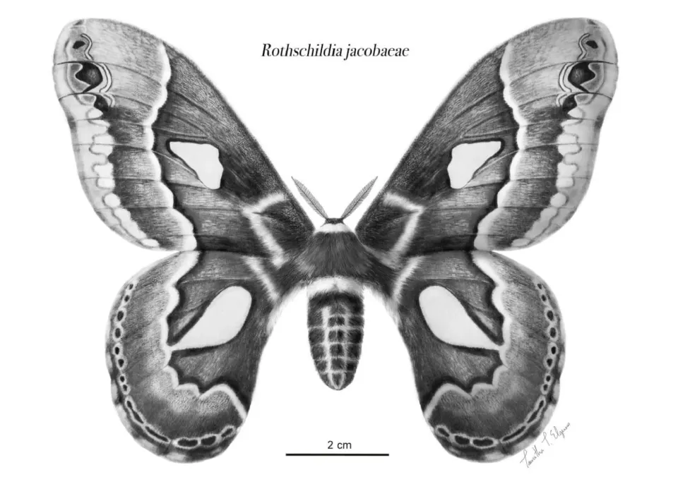
This scientific illustration was created as the final project for Julia Rouaux’s Illustra entomología course at Illustraciencia Academy.
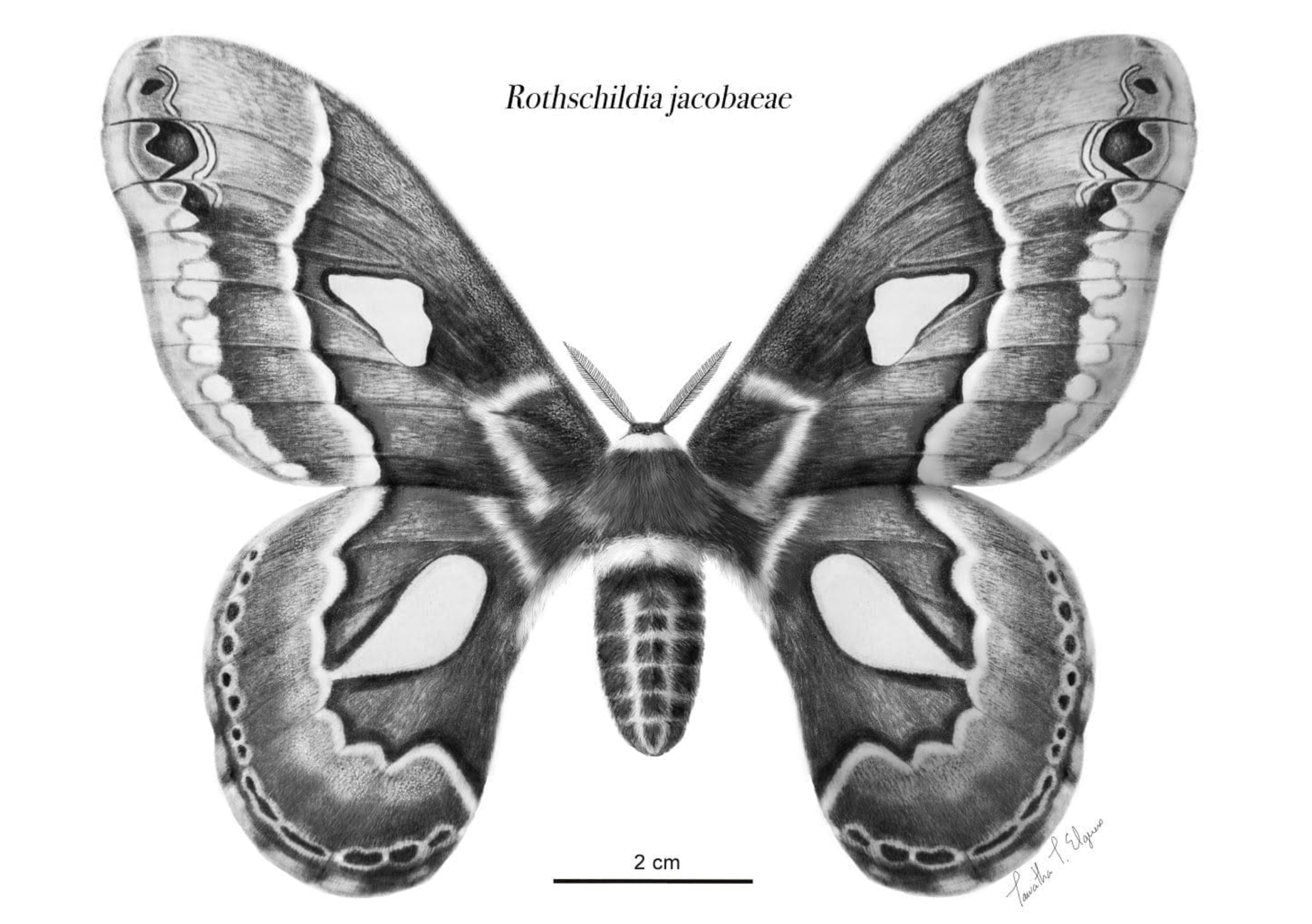
I chose the beautiful Rothschildia jacobaeae as my focus model, a large Neotropical silk moth from the family Saturniidae.
Through the course, I learned how to study insect anatomy, and communicate scientific information clearly through composition, labelling, and detailed observation.
One of the exercises involved analysing an existing scientific illustration to understand how complex anatomical information can be simplified, organized, and communicated clearly. I chose an illustration by Sandra Boyle.
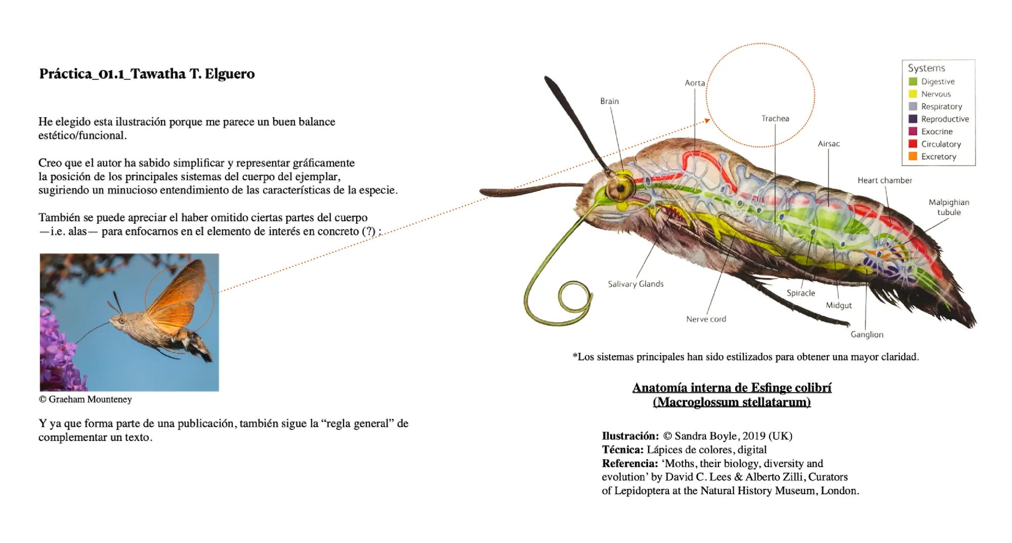
I focused on how the artist used colour coding, labels, selective detail, and composition to represent the internal anatomy of the specimen. I studied how aesthetic choices can support scientific accuracy and make the illustration easier to read.
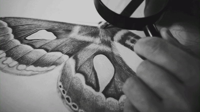
Rothchildia's final project pencil rendering layer by layer:
Final result:
Thank you, Julia, for the great teachings. ♥︎
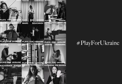
24 Feb, 2022 · An independent music-solidarity initiative for war victims.

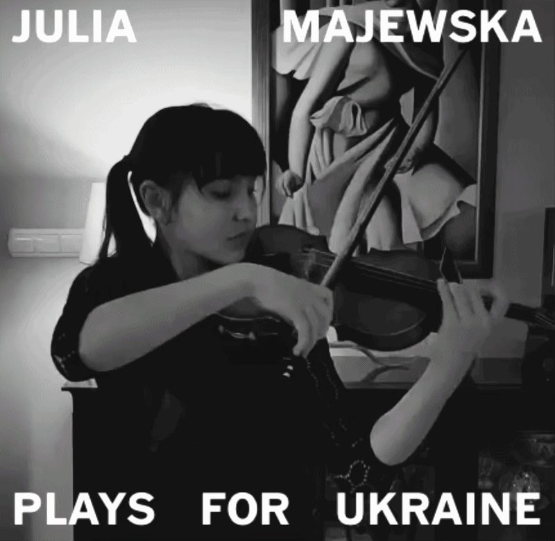
In 2022, after the escalation of the Russo–Ukrainian War, I created #PlayforUkraine, an online initiative that brought together musicians from around the world to share short performances in solidarity with Ukrainians and war victims.
The project began from a simple question:
Could I replace the sound of war with music, and bring meaning back to people?
Back in 2021, I was trying to escape the long COVID-19 quarantine restrictions in Barcelona, Catalonia, when I discovered a valley in the Siurana region. I ended up staying there on my own for over a year, and it became an exploratory hub for my identity.
I spent a lot of time listening to classical music, particularly Vivaldi’s The Four Seasons, recomposed by Max Richter, while surrounded by nature.
On 24 February 2022, when the Russo–Ukrainian War began to escalate, I remember watching the news on my computer screen. It was loud. I could hear sirens and the sound of bombing. So I turned off the volume and replaced the sound of war with Vivaldi.
The contrast was immediate. Suddenly, the bombing became manageable. The suffering was still there, but it had transformed into something I could bear.
It had become… beautiful?
That question stayed with me.
I had once heard the primatologist and neurobiologist Robert Sapolsky speak about a disturbing story from Indonesia in the 1960s, in which death squads would sometimes bring traditional gamelan orchestras with them during massacres. They considered it a "beautiful act".
Music being used alongside violence.
I began to wonder whether the structure could be reversed.
Could I recreate an online orchestra like the one those war veterans had brought with them — but reverse its purpose? Could I replace the sound of war with music, and bring meaning back to people?
I wrote a quick statement and shared it:
We used music as an instrument for peace.
I had been following the social media hashtag #100daysofpractice, started by violinist Hilary Hahn. I became fascinated by musicians practicing and sharing their process in real time.
By breaking their practice down into one-minute videos, they made the learning process feel much more accessible and digestible.
So when the war started, my instinct was to contact musicians who were already engaging in this kind of practice. I thought it would not take much of their time to share a short performance in solidarity.
I created a quick profile photo and wrote a statement in my stories, asking violinists to play supporting war victims.
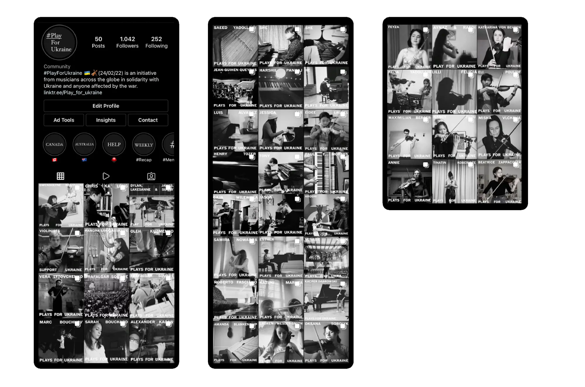
The next step was to contact violinists I was already familiar with. To my surprise, many replied instantly, excited and willing to contribute.
After one month, we had around 60 participants.
Nancy Zhou playing Tchaikovsky’s “Meditation.”
We managed to reach the official M6 channel in France, as well as Polish national radio. I only realised this after a sudden spike in French followers.
Although I was happy about the coverage, my goal was not to reach a French audience specifically — it was to reach Ukrainians.
That was when I realised that the most direct way to reach them was through Instagram ads, targeting specific locations where refugees had fled.
And it worked instantly:
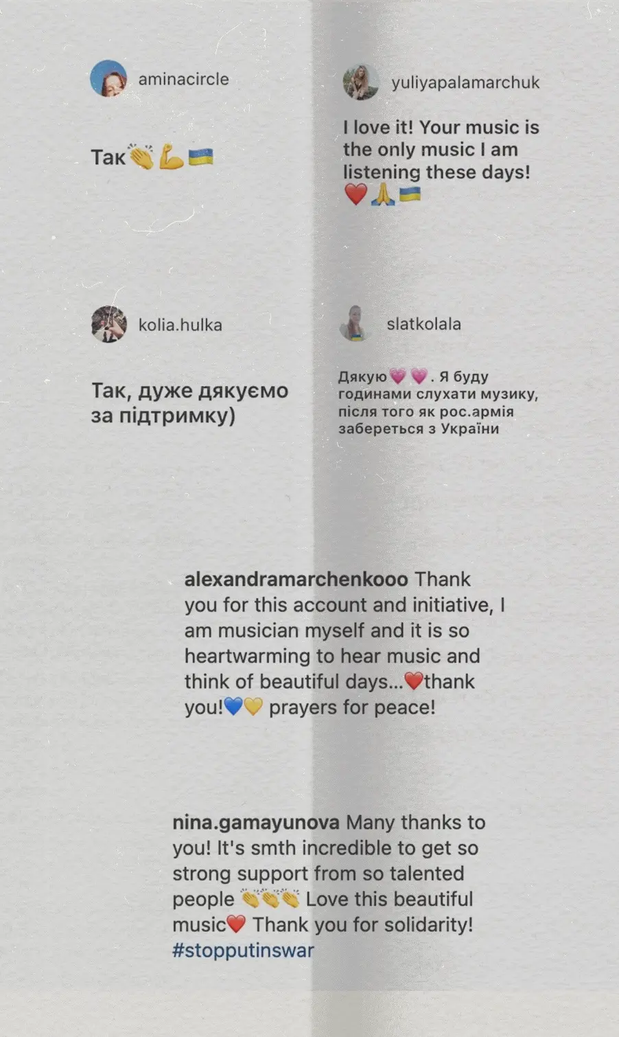
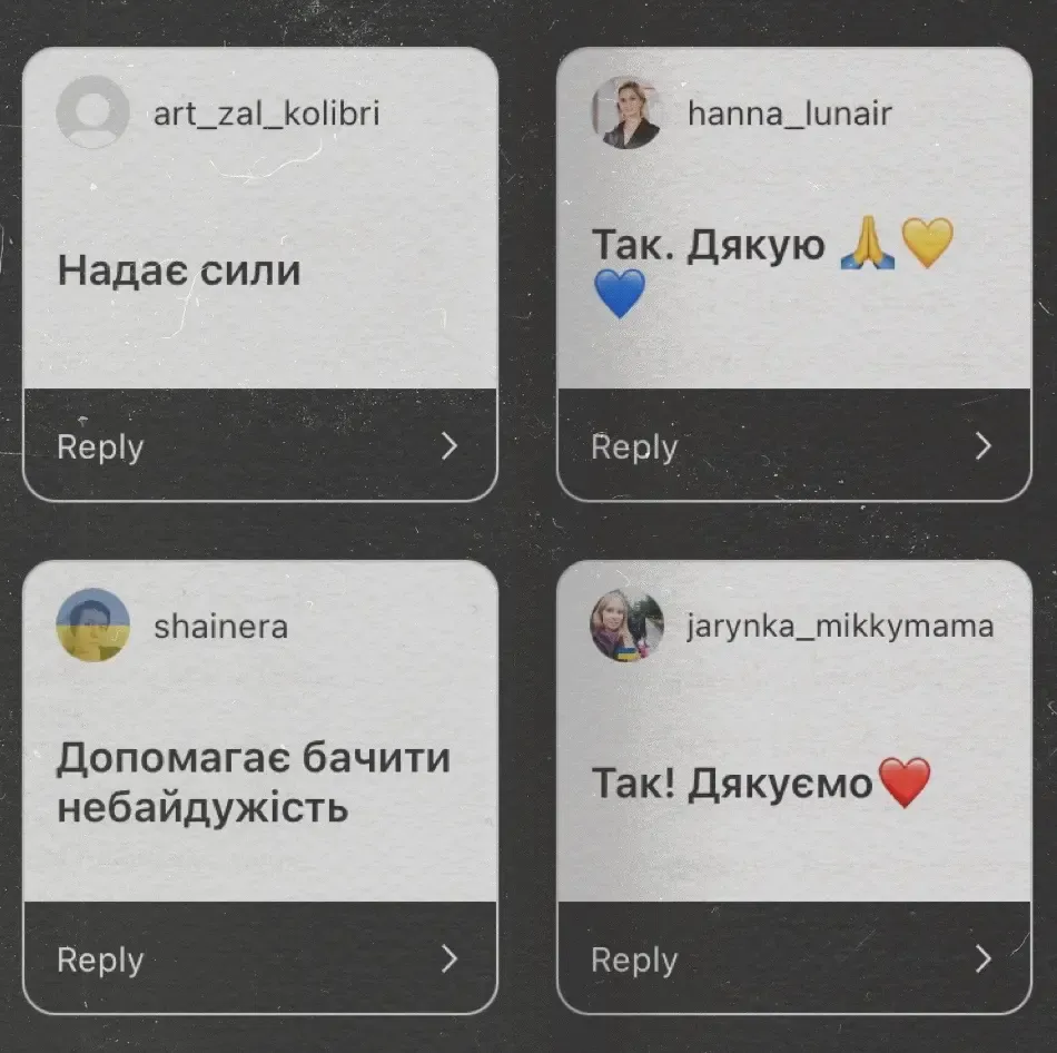
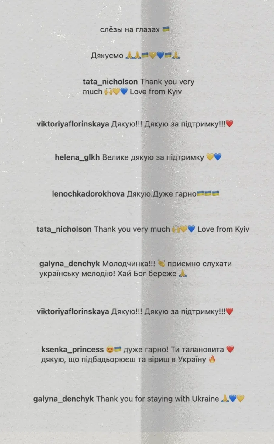
Some reviews from Ukrainian refugees. Tawatha T. Elguero
I stayed in close contact with Ukrainian refugees. Some were sheltering in bunkers, while others allowed me to follow their journeys from Kyiv to Poland and other neighbouring countries.
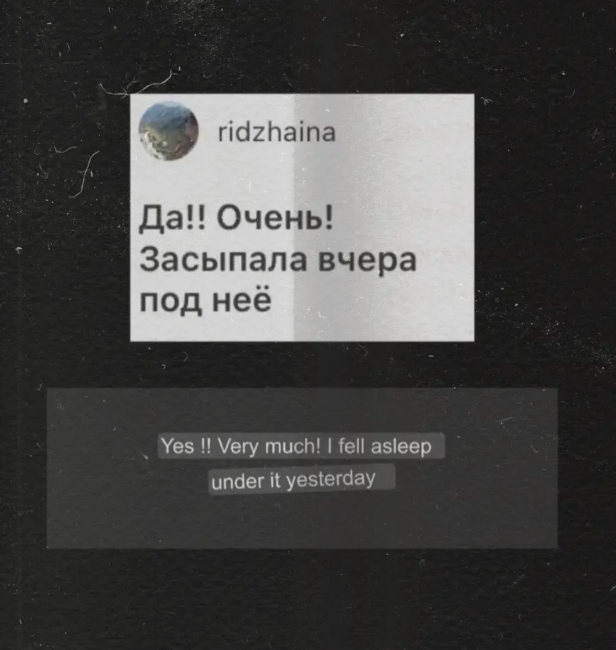
One of the most meaningful responses came from someone distressed who managed to fall asleep while listening to our music.
I created a symbolic map showing participants around the world directing their music towards Ukraine. I used the blue and yellow colours of the Ukrainian flag to represent the country.
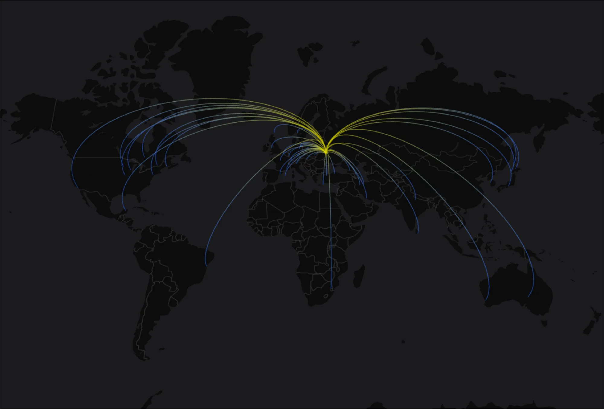
The Dnieper River became a guiding analogy for the initiative: rising in Russia, passing through Belarus, and flowing through Ukraine before reaching the Black Sea.
It crosses territories divided by history, war, and power, yet the river itself remains continuous.
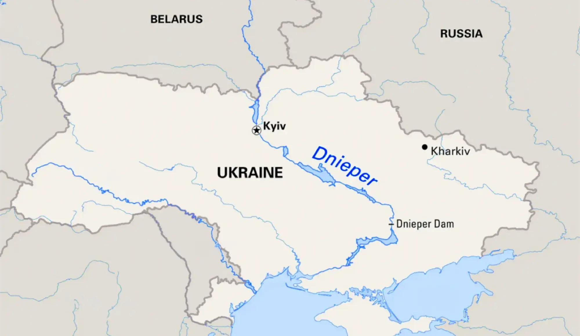
Music can be like that — not a denial of borders, but a reminder that beneath them, life continues to move: through memory, grief, beauty, and shared humanity.
This was my first initiative, completely led and funded by me.
I created the concept, contacted musicians, wrote the statement, collected performances, managed the Instagram profile, posted the videos, created visual material, ran targeted ads, and followed the response from war victims.
It required a lot of trial and error. I felt a whole spectrum of emotions. It was a lot of work, but the satisfaction of knowing that someone distressed managed to fall asleep to our music was priceless.
This project taught me that social media can be a powerful tool if used altruistically and methodically. It does not have to be intrusive. Tools become what we make of them.
For me, #PlayForUkraine became a way to transform helplessness into action, memory into empathy, and music into a shared gesture of care.
The initiative was removed from Instagram in 2025 after having completed its purpose.
Thank you to all the wonderful participants.
I do not own the rights to the video performances presented here. These videos were kindly sent to me by the artists, or shared with their permission, as part of this initiative. They are presented here for archival purposes.
If you are one of the musicians featured and would like your video removed, please contact me.
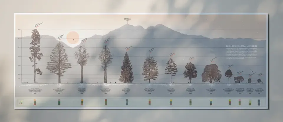
07 Jul, 2023 · Infographic
This was a collaboration between Lu Hsin, a landscape architect, and me during her final master’s thesis on an ethnobotanical garden in Taiwan at AHO, the Oslo School of Architecture and Design.
Known as Formosa, or “beautiful island,” Taiwan is home to diverse and historic plant life, including Taiwania cryptomerioides, one of Asia’s tallest trees. The illustration presents 13 endemic and native species found in Snow Mountain, a serene area in eastern Taichung, Taiwan, symbolizing the island’s rich natural heritage.
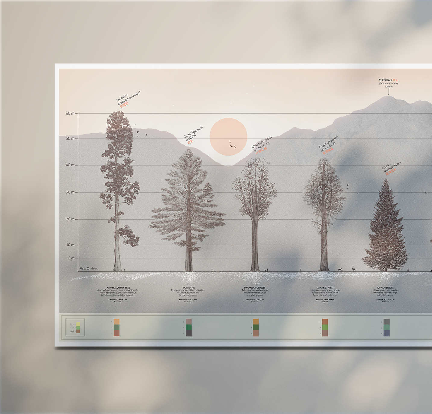
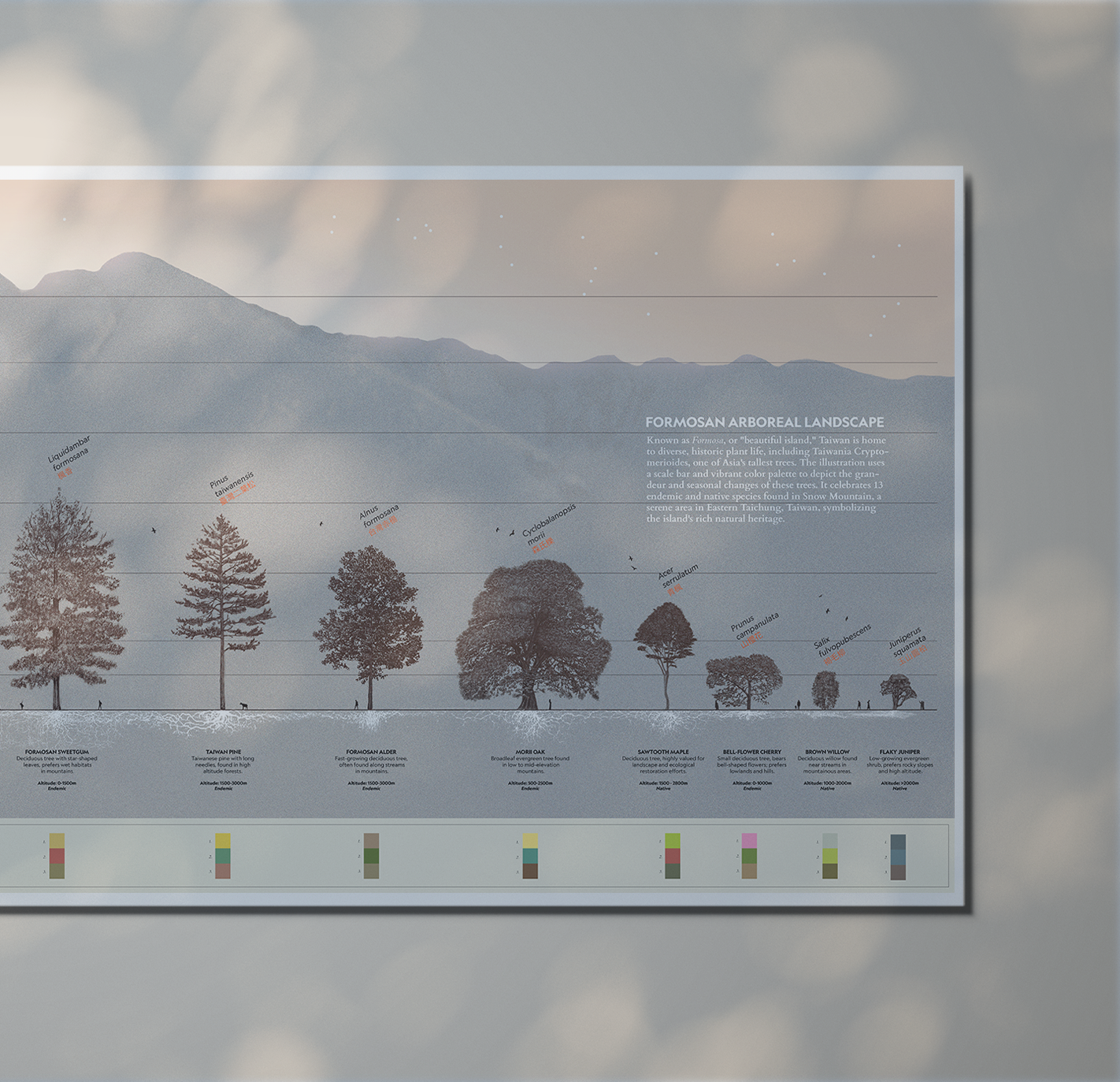
Thirteen trees were hand-drawn in pencil by the two of us, while I designed the rest of the composition in Adobe Illustrator. The illustration uses a scale bar and a colour palette to depict the height and seasonal changes of these trees.
The roots were taken from botanical databases, with a few exceptions where I could not find references for the original species. In those cases, I used the closest related species from the same family line.
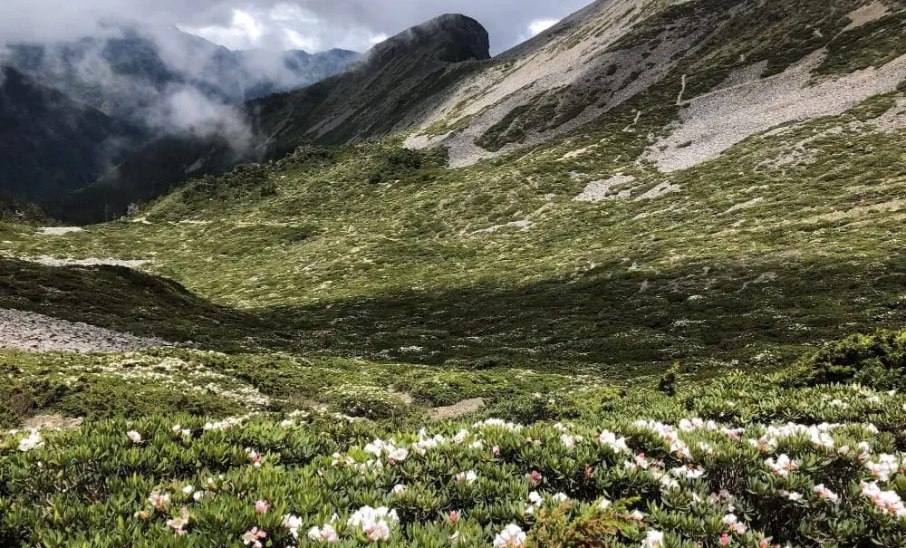
The background image shows the silhouette of Xueshan Mountain, also known as Snow Mountain, which is 3,886 metres high.
Thank you, Lu Hsin, for trusting me with this collaboration. ♥︎
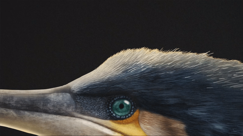
03 May, 2022 · Personal project
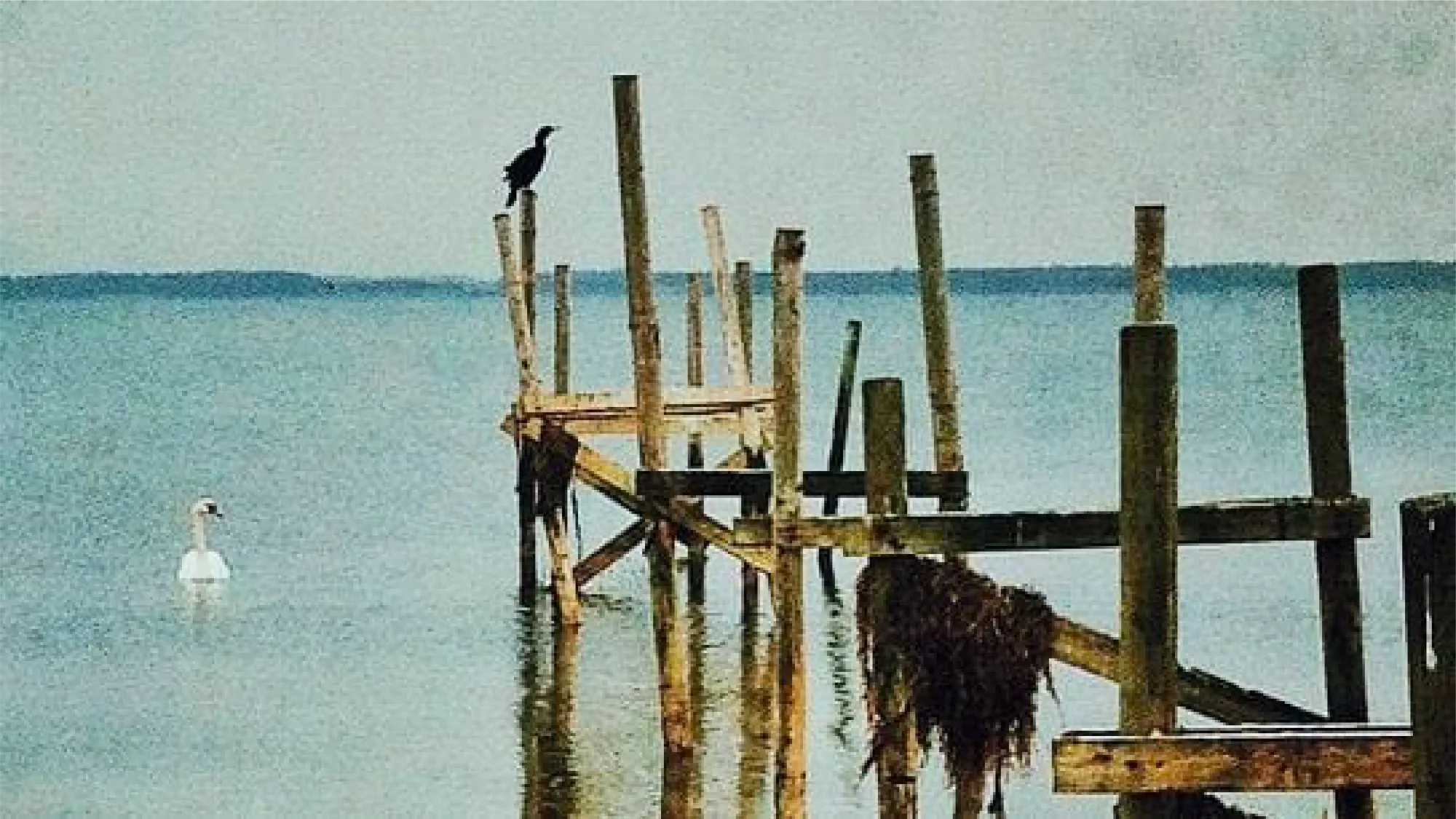
This is a personal illustration of a Great Cormorant (Phalacrocorax carbo). I had been fascinated by the Great Cormorant and was experimenting with ideas as I went along.
The first time I saw a Great Cormorant (Phalacrocorax carbo) was in Copenhagen, Denmark, in 2013. A swan was swimming across the Amager Nature Reserve in eastern Copenhagen when a cormorant flew by and landed on a wooden post right next to it.
I remember staring at the cormorant’s plumage and hooked beak. Its feathers had an iridescent bluish gradient. At the time, I thought it was the closest modern bird I had seen to something prehistoric. I found them beautiful.
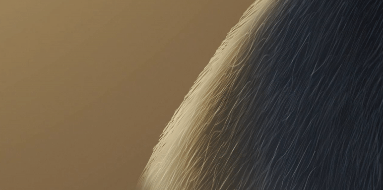
Here are some GIFs showing the process:
Feather direction marked with arrows before drawing:
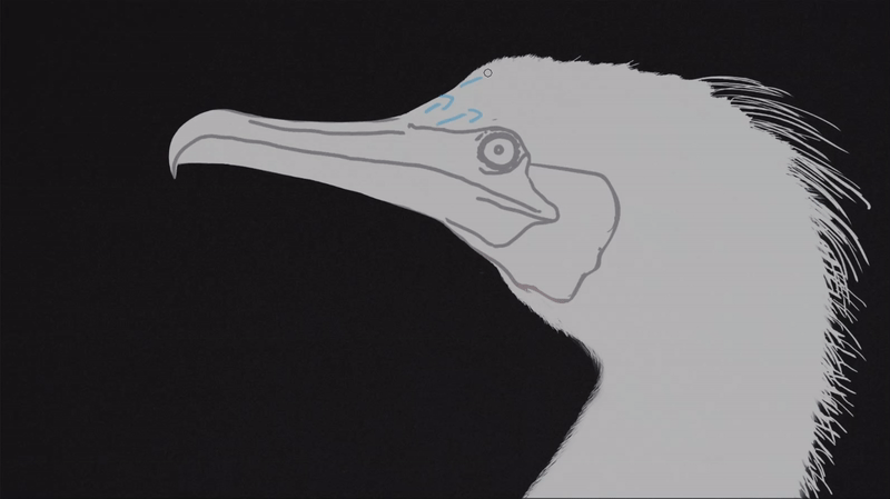
Beak texture:
Fine feather details:
Highlights on and off:
The female iconography was particularly relevant to me. I had been researching and comparing how many scientific graphics use the male silhouette as the default reference model, and I was not surprised to find that most of them relied on male figures.
Although average height differences between men and women exist, they do not justify using the male body as the default human reference in every scientific or educational context.
Around the same time, I had been reading Invisible Women: Data Bias in a World Designed for Men by Caroline Criado Perez, which inspired me to keep pushing for greater female visibility in scientific graphics.
I hope these figures will help counteract the overuse of male bodies as default reference models in scientific graphics.
And here is the final result:
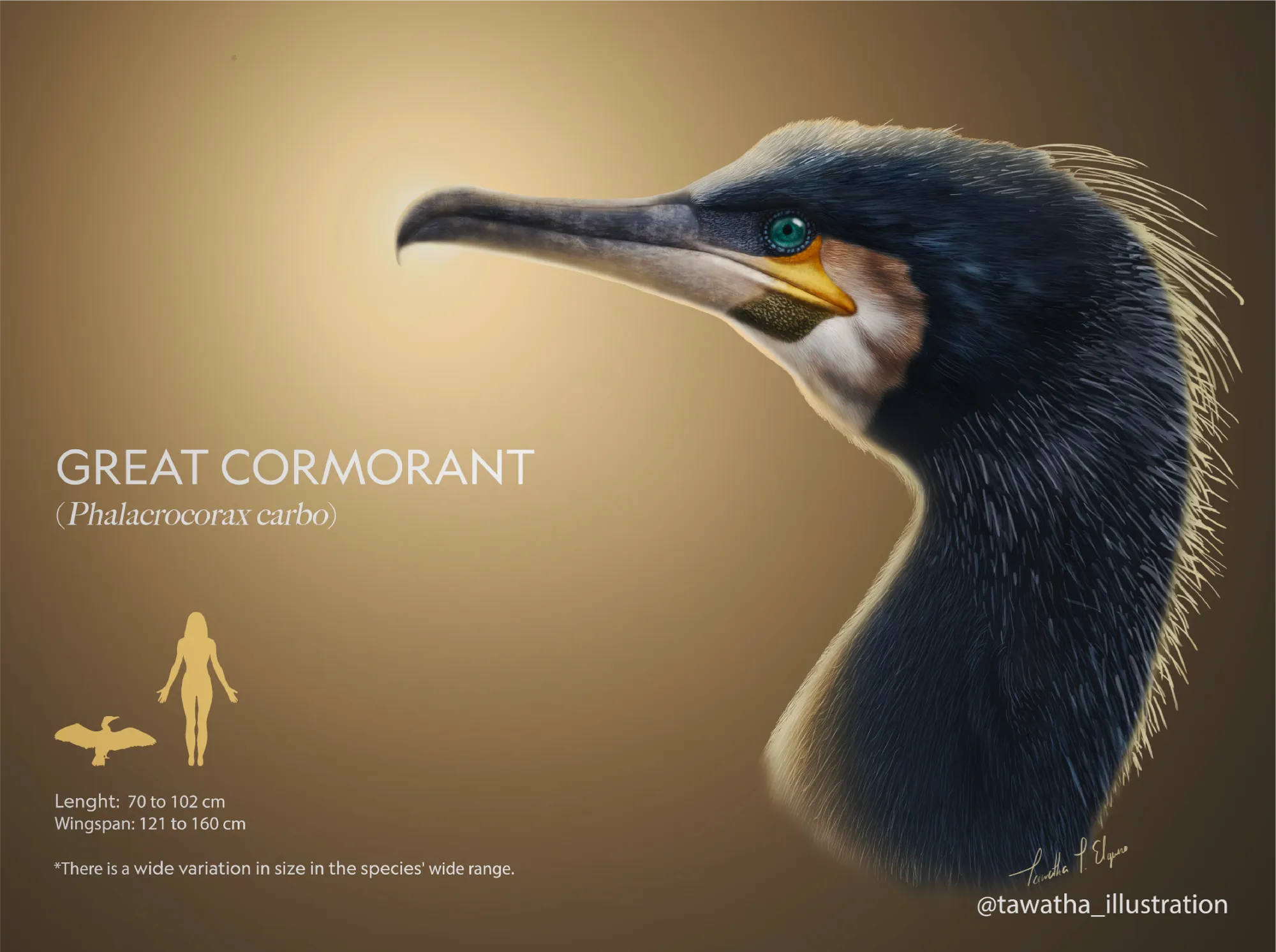
Note: I used the light source effect in Photoshop 2022, before it was updated. I think it is no longer possible to recreate the sun effect in the same way.
💡 FUN FACT:
In China, along the Li River, cormorants have been domesticated for generations through an ancient fishing technique known as cormorant fishing, in which fishermen use trained birds to catch fish.
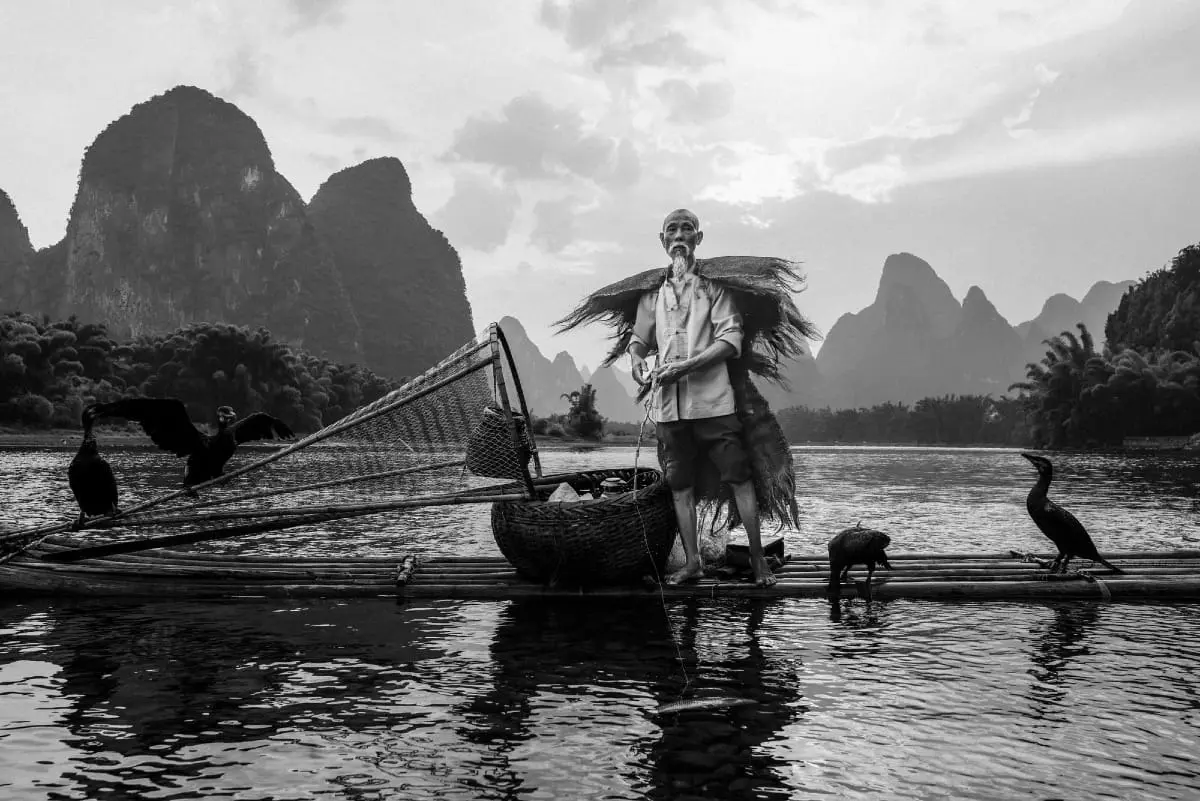
Photograph by Rod Waddington - CC BY-SA 2.0 Wikipedia
A grass knot is tied around the cormorant’s neck before the bird is released into the water to hunt. The process can take about a minute. After catching fish, the birds are rewarded with smaller fish, creating a symbiotic relationship between birds and humans.
This tradition is now at risk of disappearing if it is not passed on to future generations.
16 Feb, 2022 · Conservation
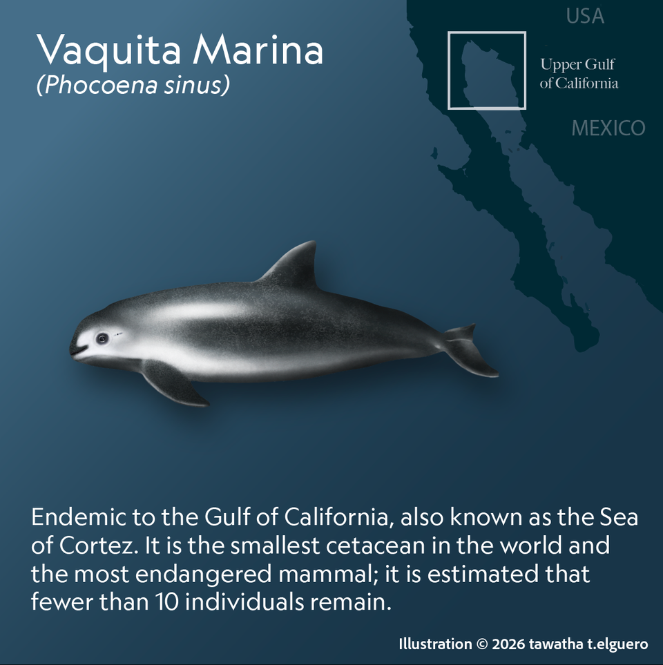
IUCN Red List status: Critically Endangered (CR).
I began this project in 2022 as an ongoing collaboration with Julia Rouaux, PhD in Natural Sciences and scientific illustrator, who has supervised me throughout the process to help ensure the accuracy of the data and information used in this project.
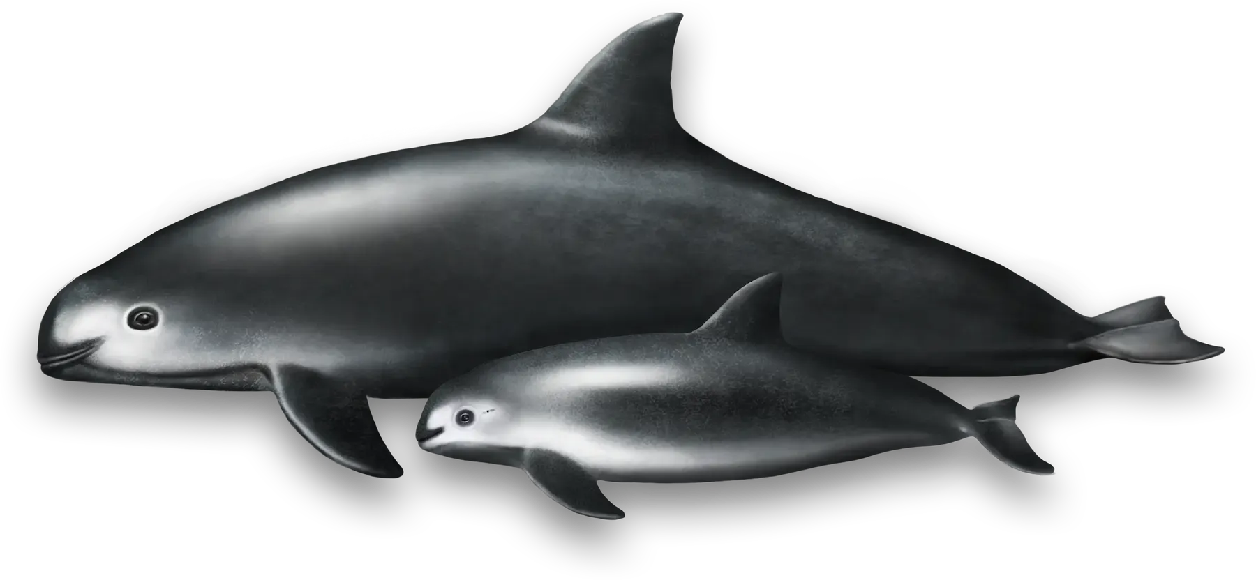
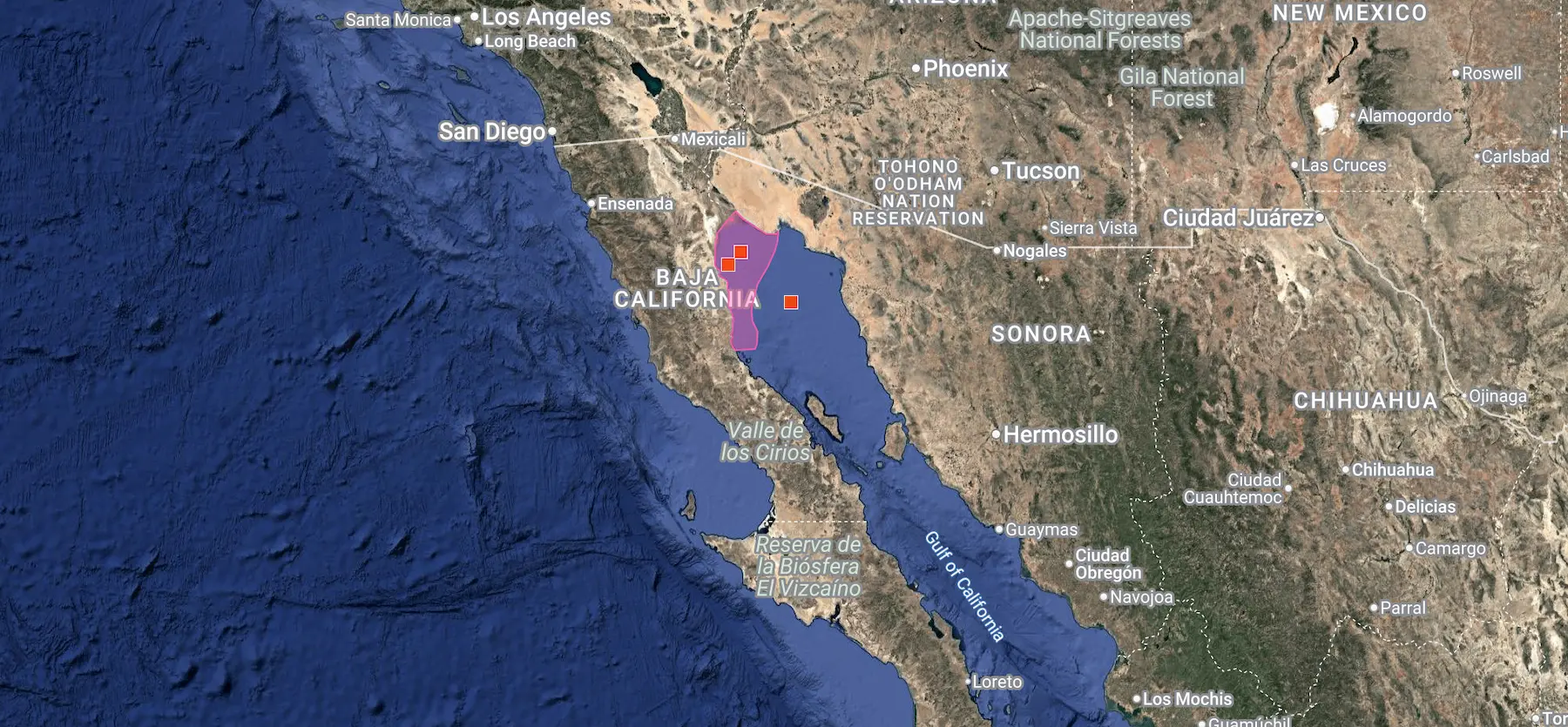
The vaquita marina (Phocoena sinus) is the world’s smallest porpoise and one of the most endangered marine mammals on Earth. Its range is limited to the Upper Gulf of California, Mexico. Only a handful of individuals remain, with 2025 monitoring efforts estimating approximately 7–10 vaquitas observed.
The main threat to the species is bycatch in illegal gillnets set for totoaba, an endangered fish whose swim bladder is highly prized on international black markets. Despite the severity of the decline, conservation efforts continue to protect the remaining animals and support the possibility of population recovery.
The project is currently in progress. So far, I have focused on reconstructing the skull and developing preliminary infographics to communicate the species’ anatomy and conservation status. There is still a lot of work ahead and the development of additional educational material.
The research process has been challenging because the remaining population is minimal, and skeletal material is scarce. Only a limited number of specimens are available through museums, archives, or private collections.
Because some cranial elements were missing from the available references, including the teeth and zygomatic arch, we sent a formal request to the vertebrate collection in Mexico for additional specimen photographs.
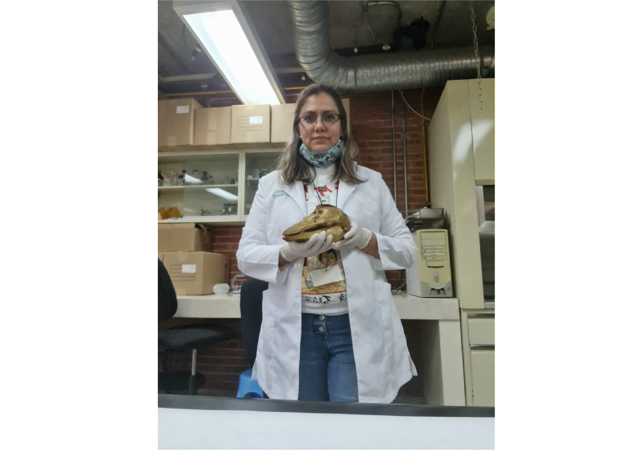
Dr. Sandra Martínez gathered the necessary photographic material, which allowed me to complete the skull reconstruction.
Close-up of a Vaquita skull study in pencil, showing tonal development - 2022. Tawatha T. Elguero
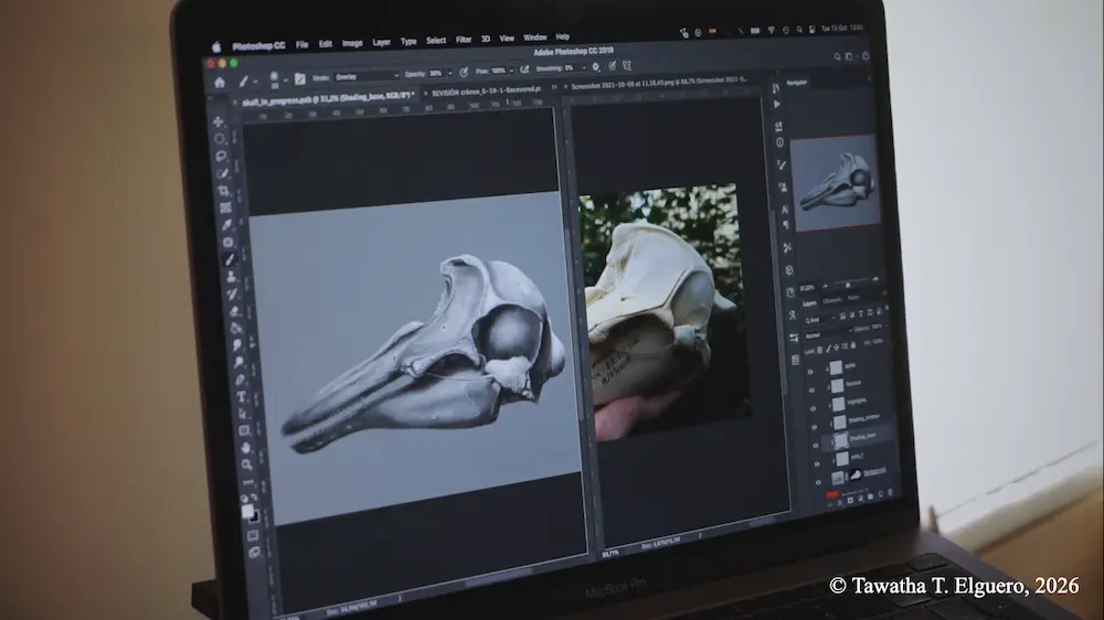
A mixed-media skull study combining trad-pencil drawing with digital refinement in PS. Tawatha T. Elguero
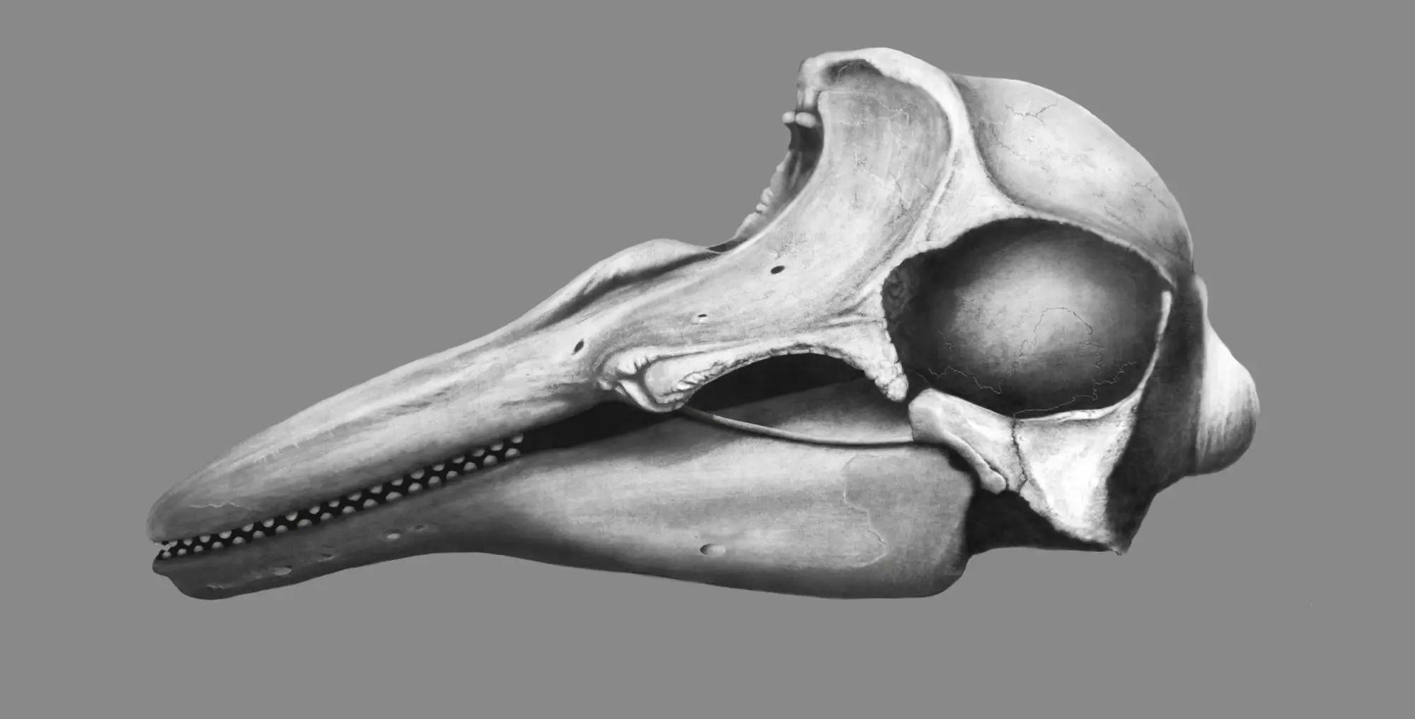
And here is the final-rendered skull:
Special thanks to The Vertebrate Collection of the Natural History Museum of Mexico and to Dr. Sandra Martínez for their generous support and for providing the photographic reference material that made this part of the reconstruction possible.
[In progress.]
26 Sep, 2022 · Formal training
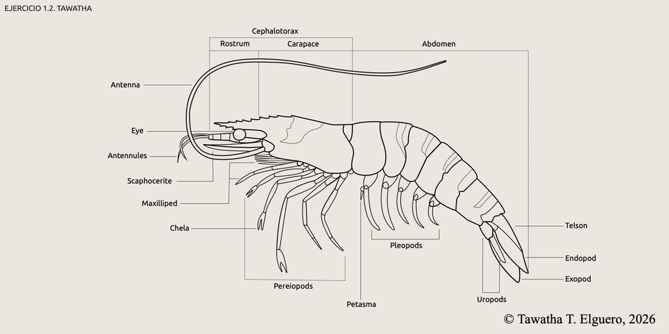
These exercises were created as part of a vector illustration course taught by Mikel Rodríguez through Illustraciencia Academy.
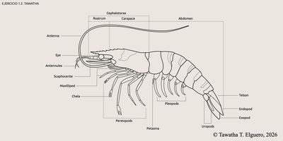
The first exercise is a labelled anatomical study of a shrimp, exploring its external structure through vector illustration.
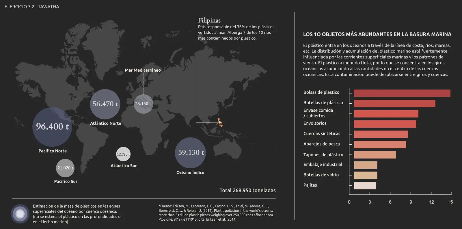
This second exercise is an infographic on marine plastic pollution, using vector illustration to visualize ocean waste distribution and the most common objects found in marine debris.
Credits: Design by me. Data by Mikel Rodríguez.
Thank you, Mikel, for your teachings ♥︎.
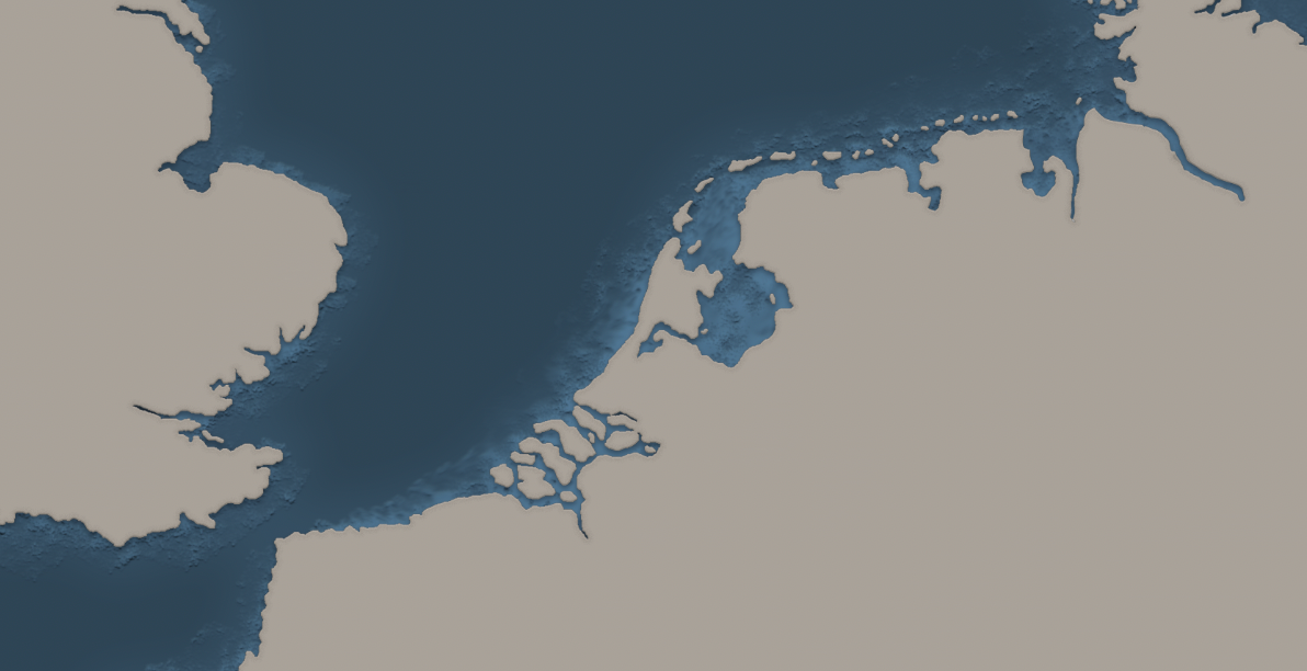
Sep 15, 2021 · Commission · Freelance

(Photoshop CC 2022)
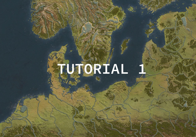
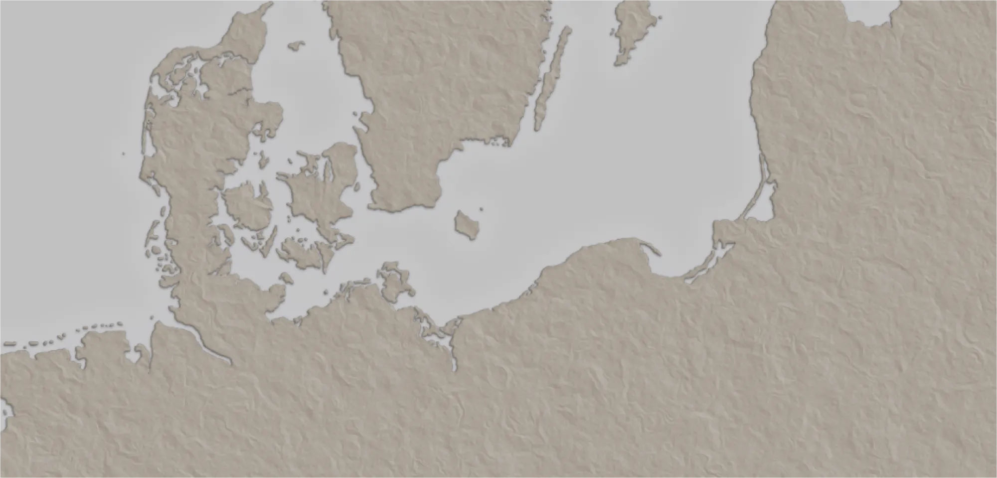
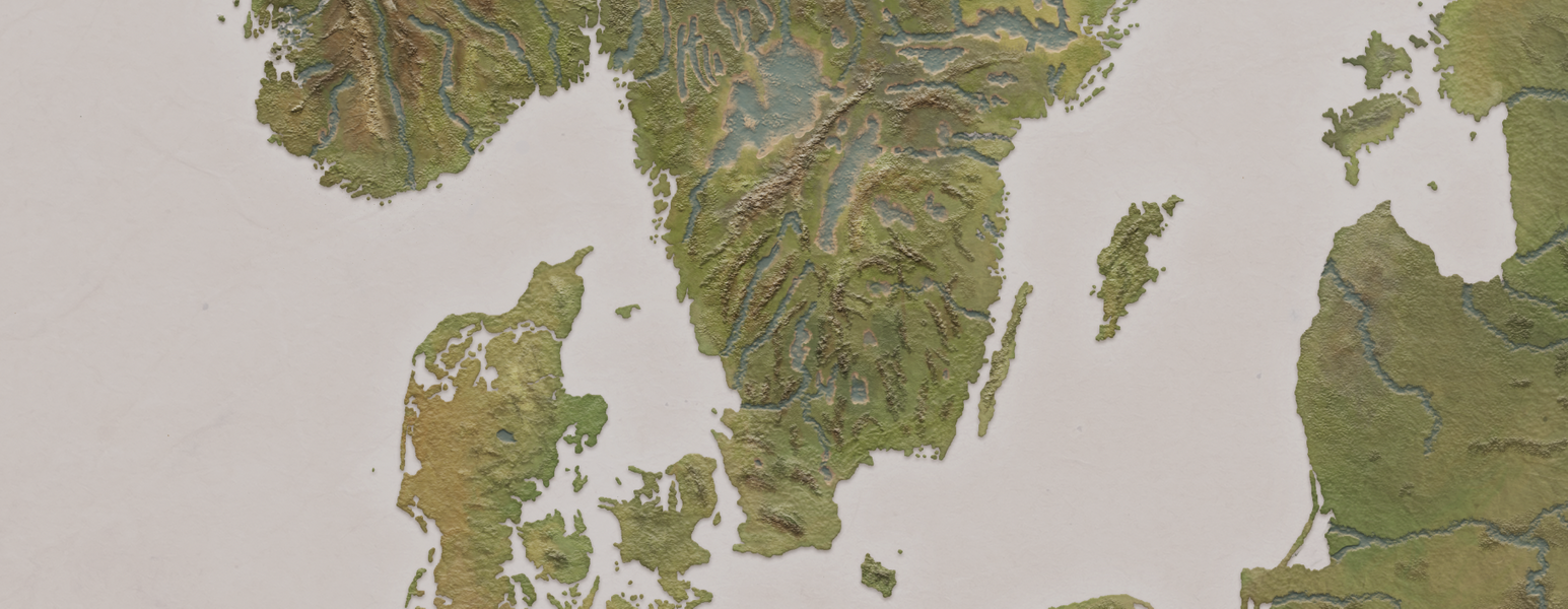
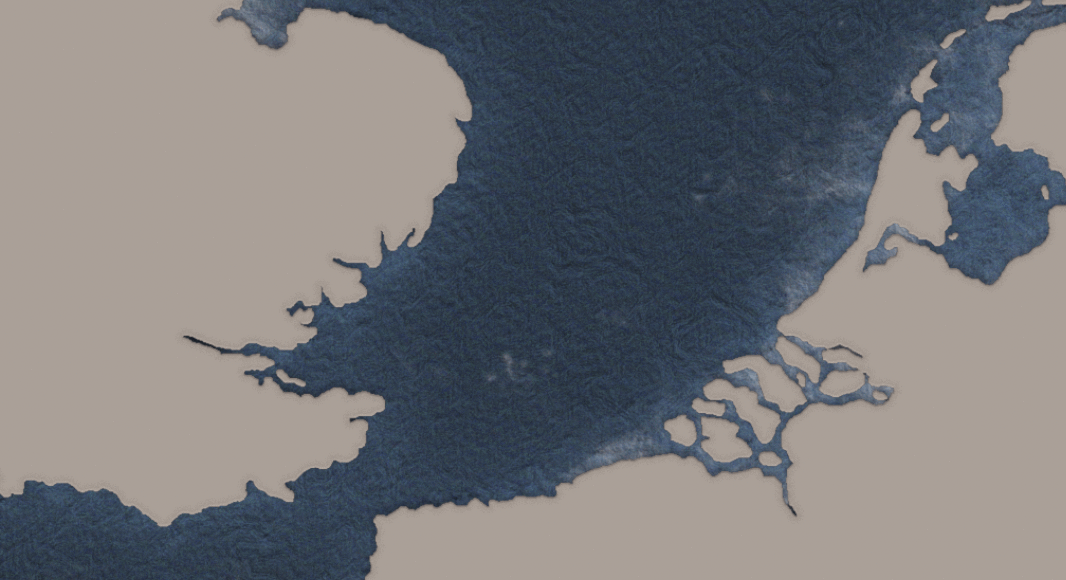
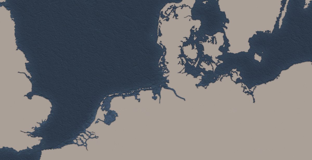
In 2020, I was tasked to recreate a map for a medieval trading game based on the Hanseatic League in Central and Northern Europe.
I decided to give it a try and use the digital technique - what a quest!
I thought it'd be worth sharing the process and hope it will be of some use to someone struggling out there - as well as a self-reminder of my learning process.
I began by creating a new file in PS of 50 x 35 cm dimensions and 600 resolution.
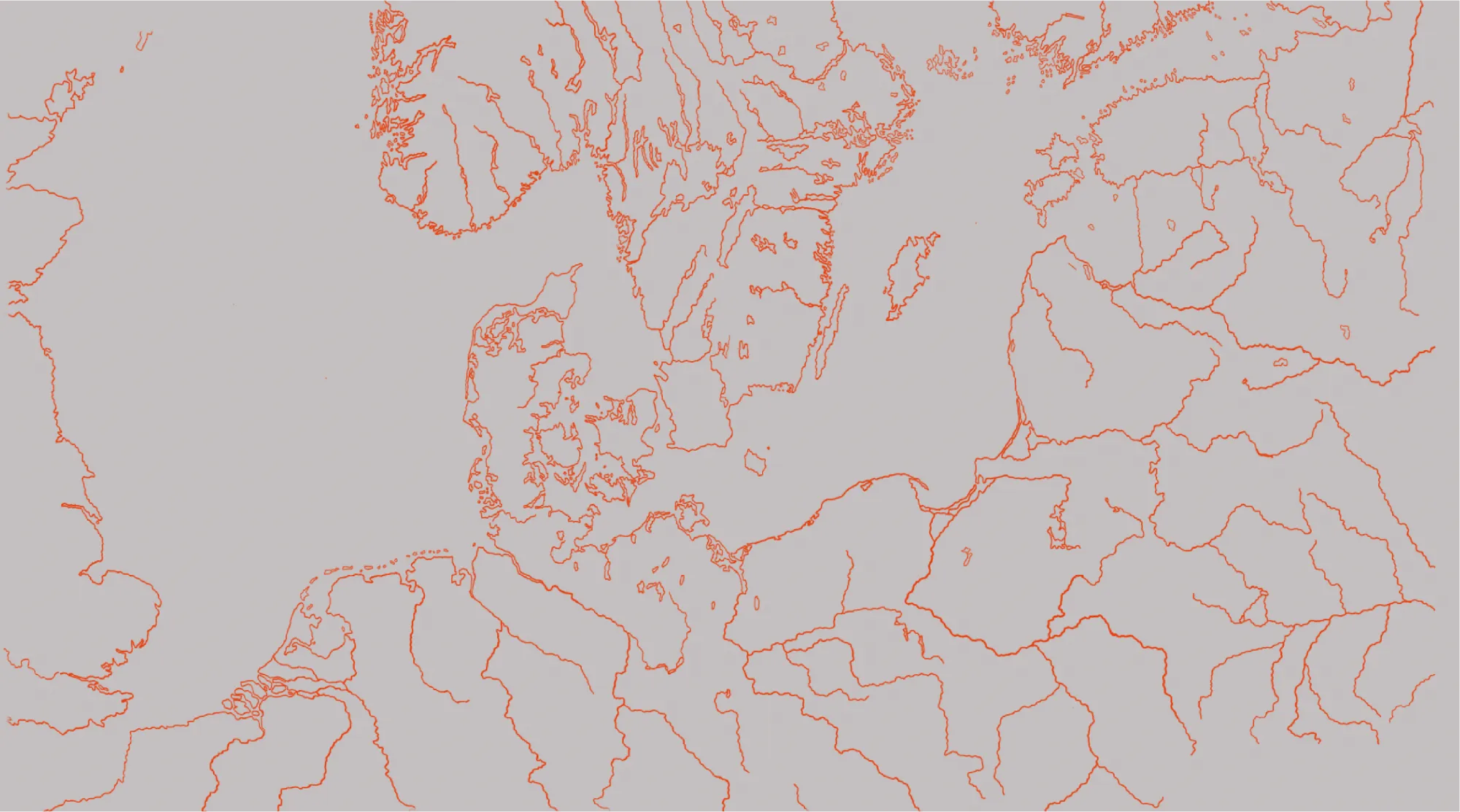
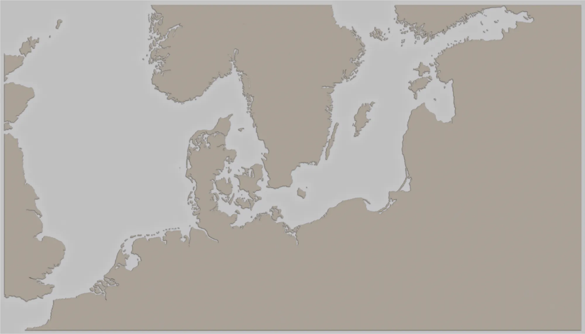
Next, I looked online for a Northern European map and found a reference that served my purpose. I then uploaded the image to Photoshop and created a new layer named Outline to outline all land, rivers and lakes of interest.
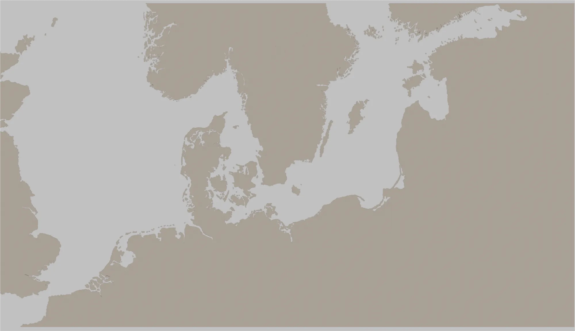
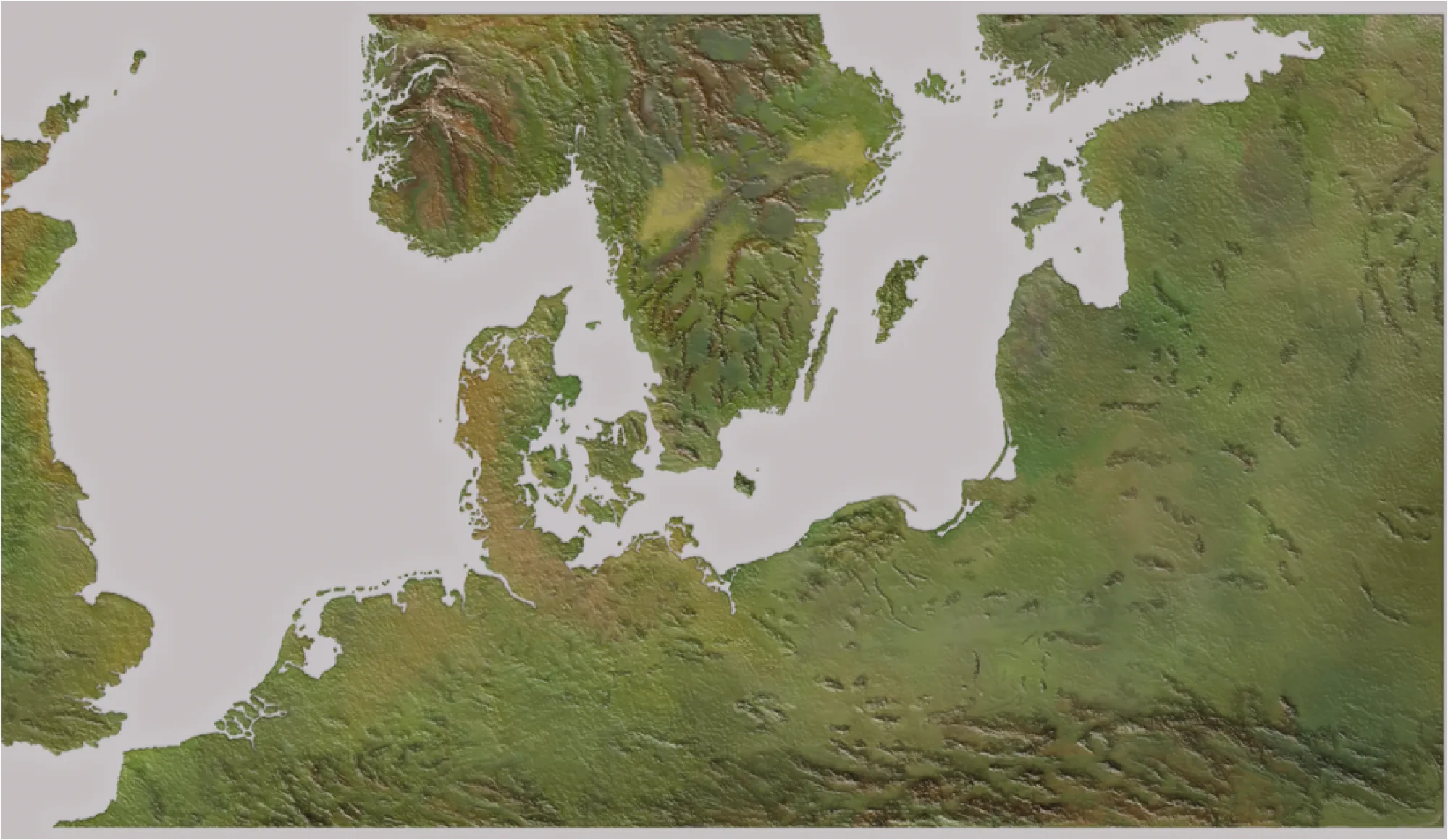
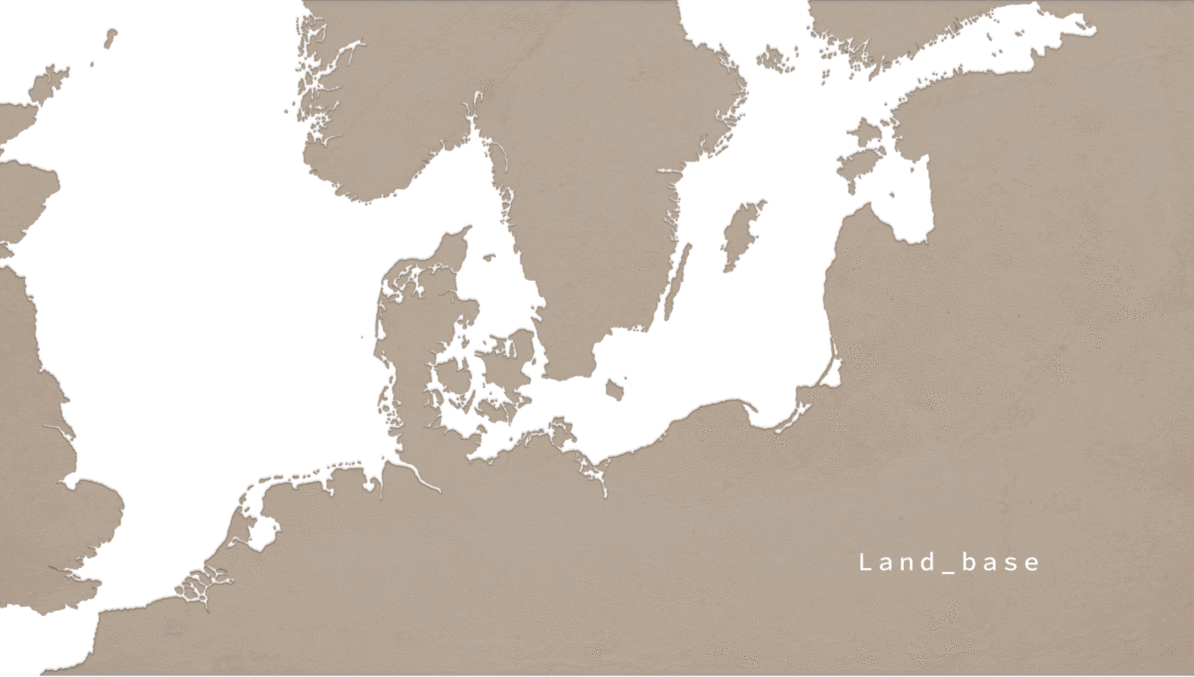
Next, I created a new layer and named it Land_base then placed it below the Outline layer. I then coloured in Land_base with the Paint Bucket Tool after making sure there were no gaps between the lines. Looking like this:
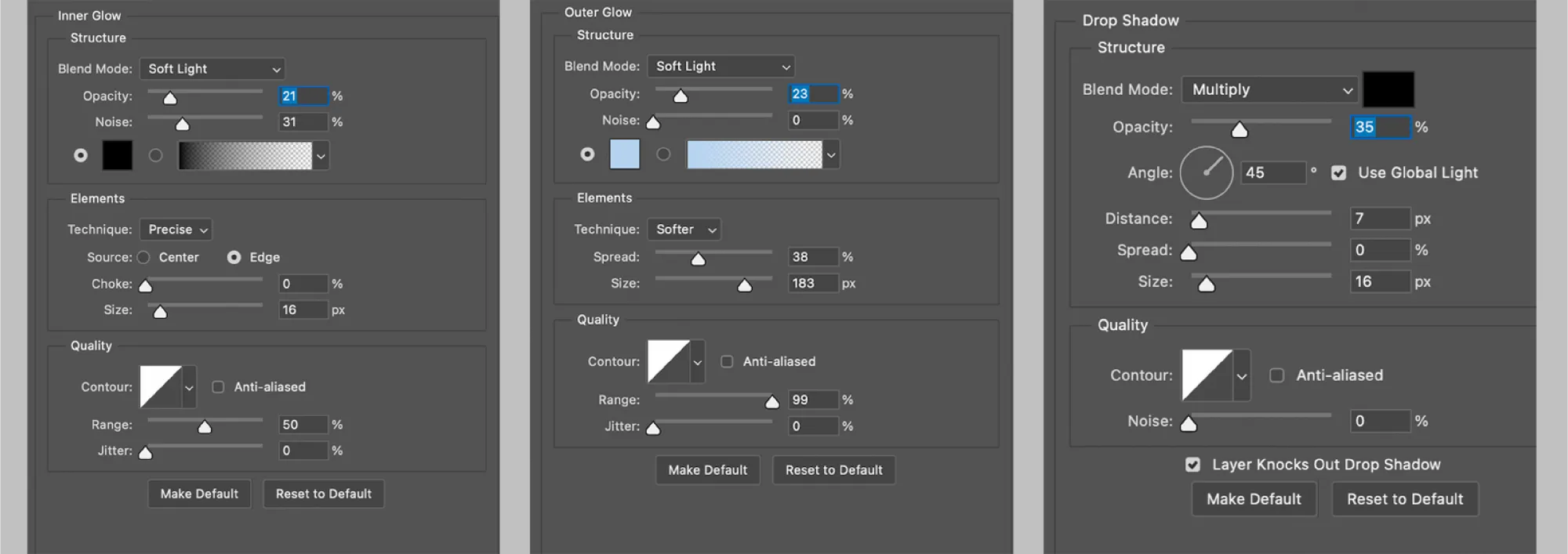
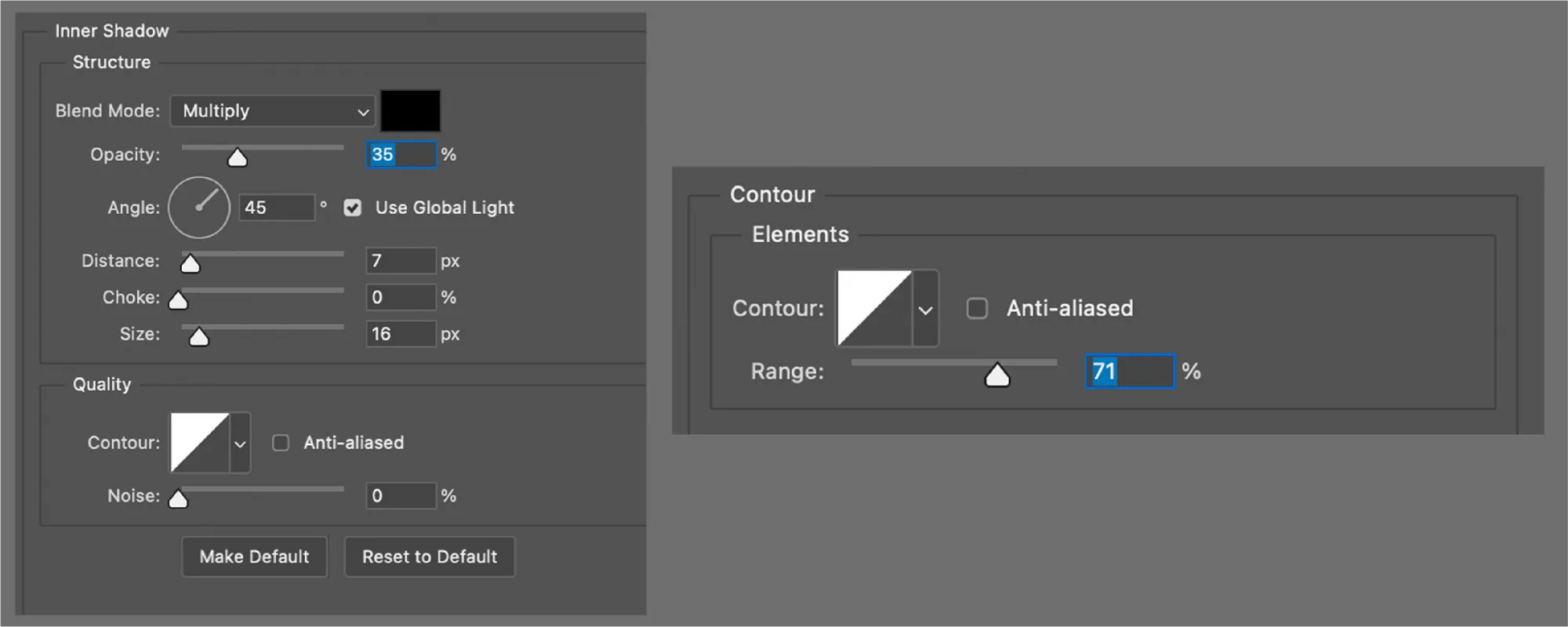
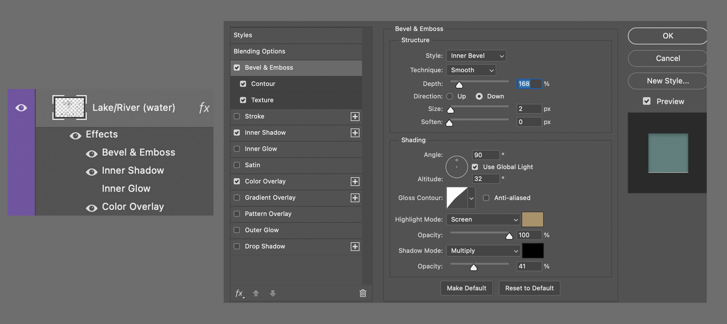
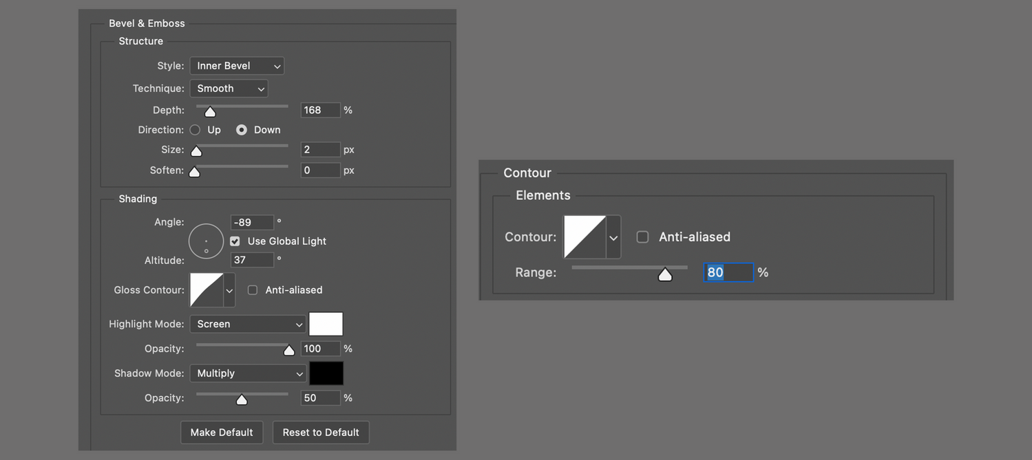
To create the illusion of depth (or relief) I selected Land_base and went to Add a layer style -> Blending options and started tweaking around with Bevel & Emboss first:
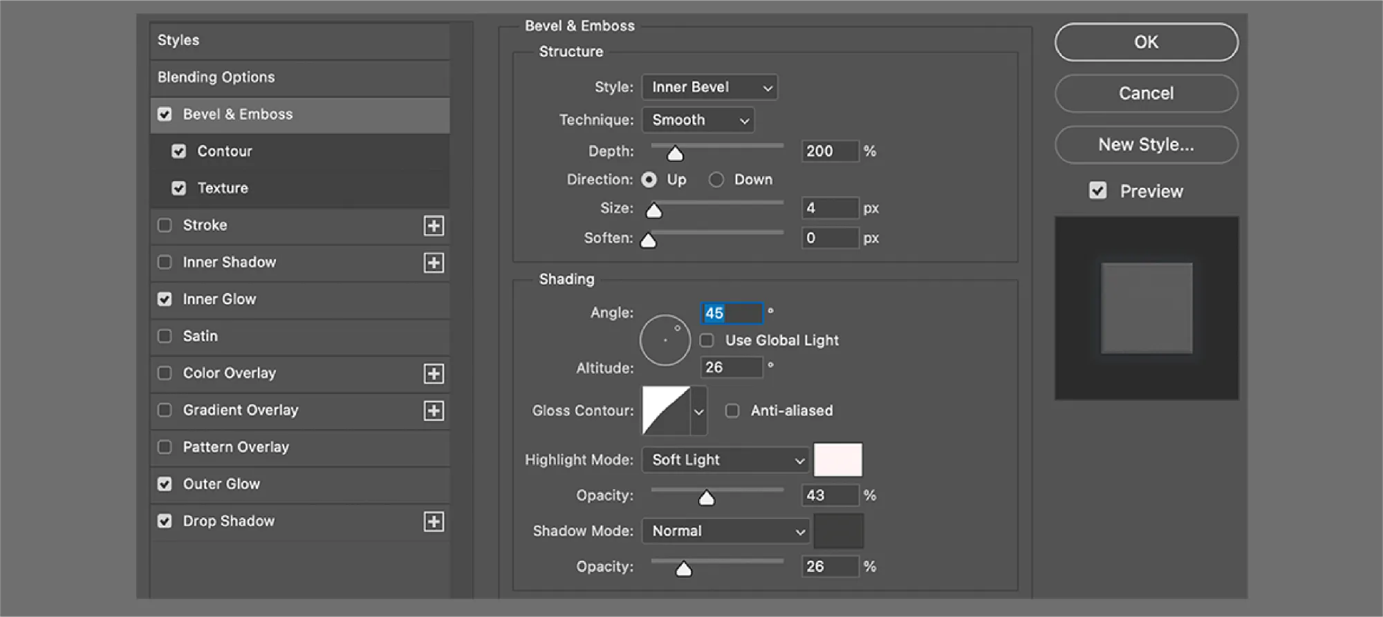
I moved on to adjust Inner Glow , Outer Glow and Drop Shadow :
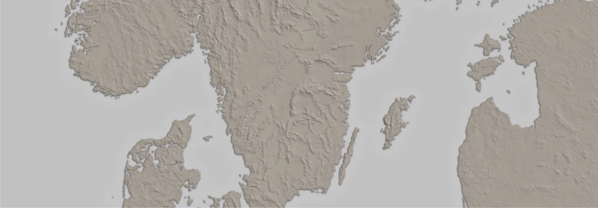
I ended up with this result:
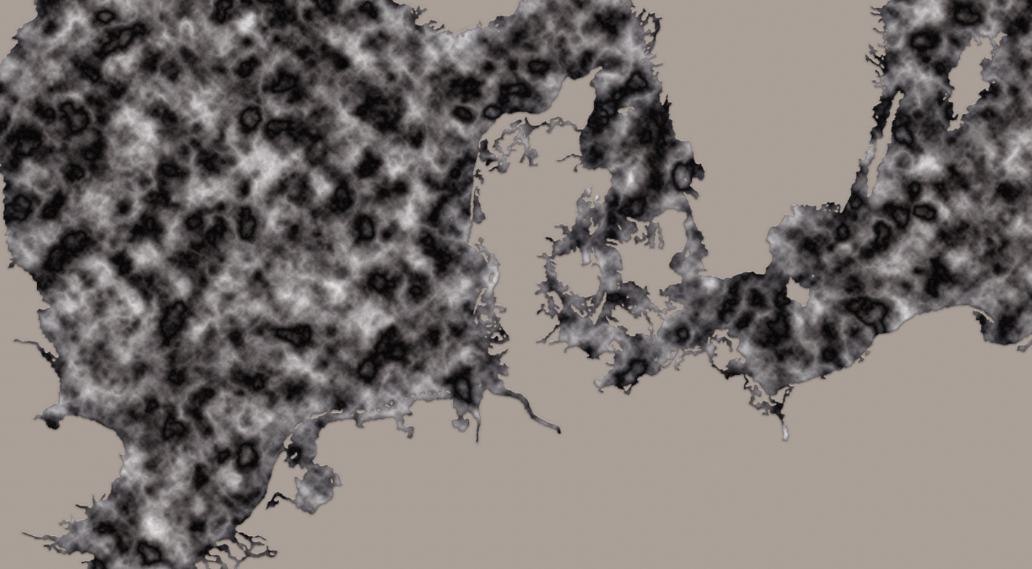
This was the tricky part—to create a terrain texture (or topographic look), I had to dig online until I found someone with the alias Online-Tabletop who had tested some adjustments that matched what I was looking for.
So in this order:
01. Creating a new layer above Land_base named Terrain.
02. Applying Land_base -> Clipping mask -> Terrain.
03. Going to Add a layer style -> Blending options.
04. Setting these adjustments:
05. Next, go to Brush Preset and find 24px Splatter Brush.
If the brush isn't visible, going to Brush preset picker -> tool icon (upper right corner) -> Legacy brushes -> Default brushes will fix it.
06. Then applying new Brush Settings:
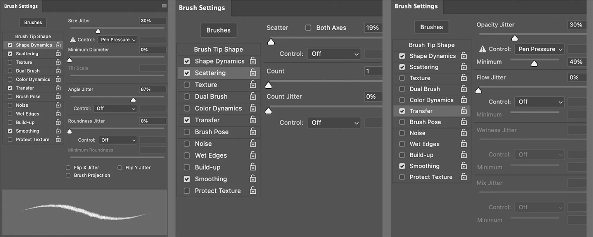
07. Changing 24px Splatter Brush to 30-40% Opacity.
08. Selecting back Terrain and testing the new brush.
09. Lowering the layer Opacity to 50%.
Result:
Optional:
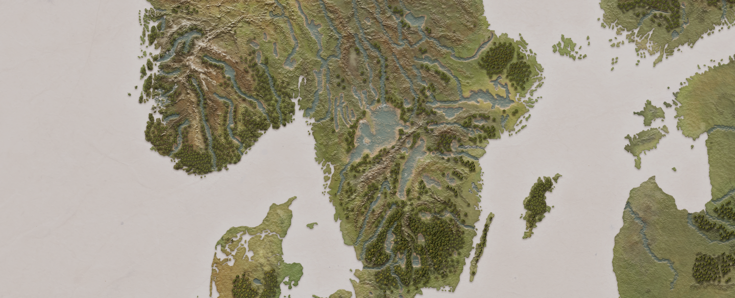
To add extra texture to the land, I then created a new layer named Land_texture and went on to:Filter Render Clouds #to get a patterned surfaceFilter Noise Amount 4px #to sharpen Filter Render Different clouds #to randomize the existing pattern Shift + Ctrl + F keeps randomizing clouds.Filter Stylize Emboss Height 4px, Amount 77%
Then changed Blending mode from Normal to Overlay
and clipping Land_texture to Land_base
Looking like this:
After some testing, and playing around with settings for a while, I ended up with this result:
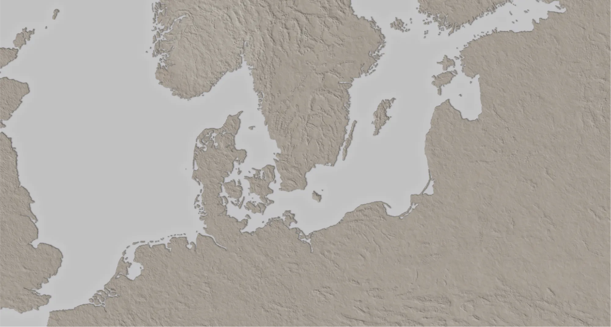
The surface's rough look comes from the position of the light angle. It's the same principle as pointing a torch onto a high-raised relief map—all the objects facing the torch will be highlighted while shadowing all surfaces angled away from it.
To ensure that the light source corresponds across multiple layers, PS has a setting called Global light in Effects Bevel & Emboss or Drop Shadow that by configuring it, it will automatically match the same light angle in all layers, creating the illusion of realism.
Few examples:
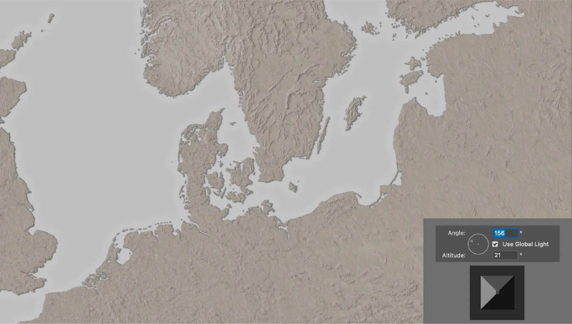
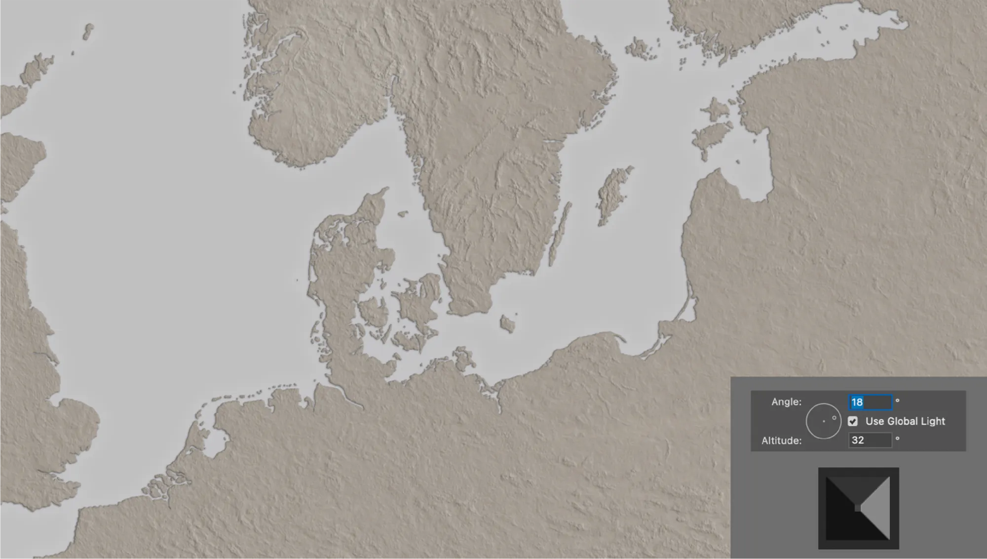
The Global Light setting was never meant to be fixed - I kept changing it throughout the project until the very end.
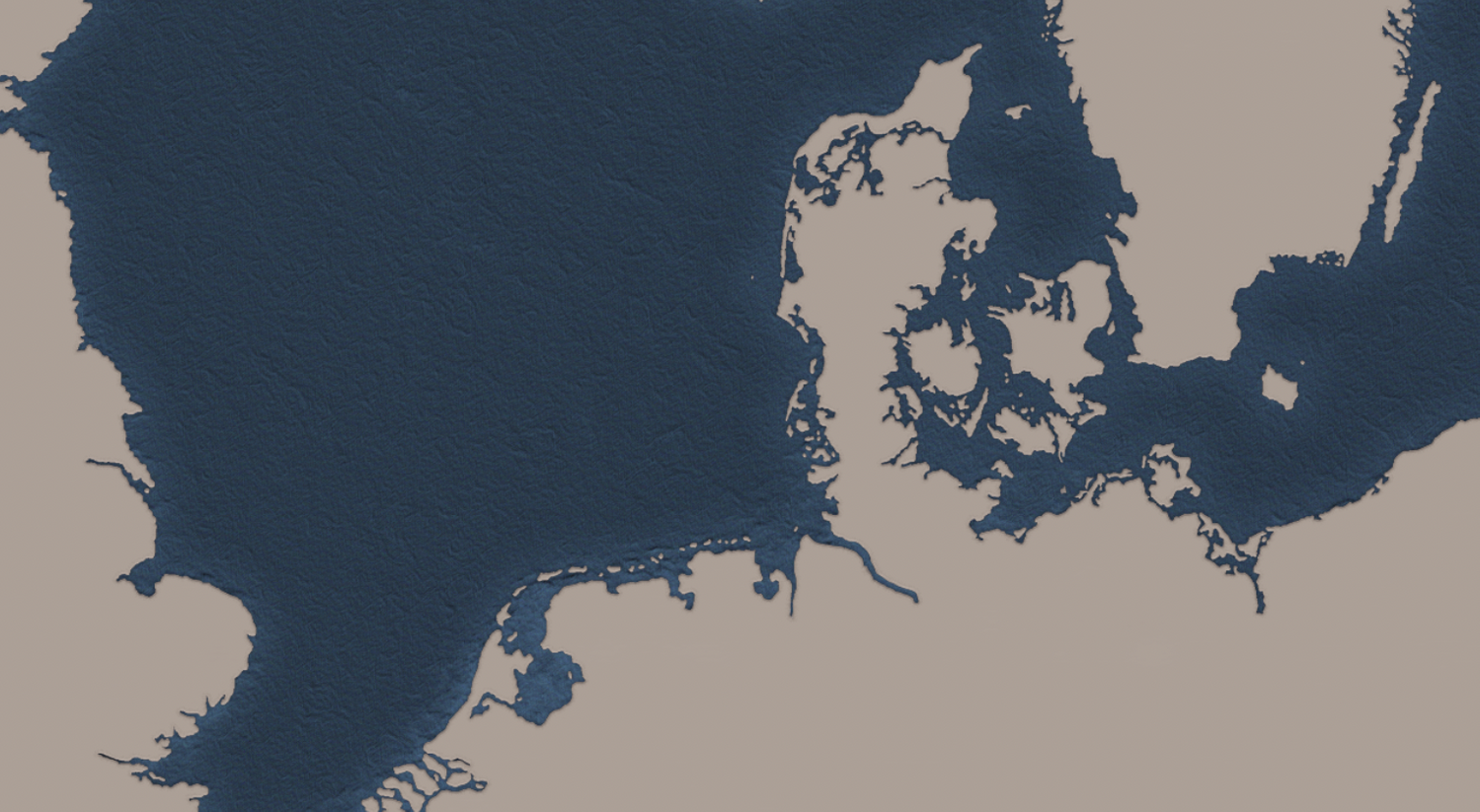
The next step was to add some colour, so I searched online for a colour palette generator such as color.adobe, and looked for different maps I had collected for reference that matched what the client had asked for:
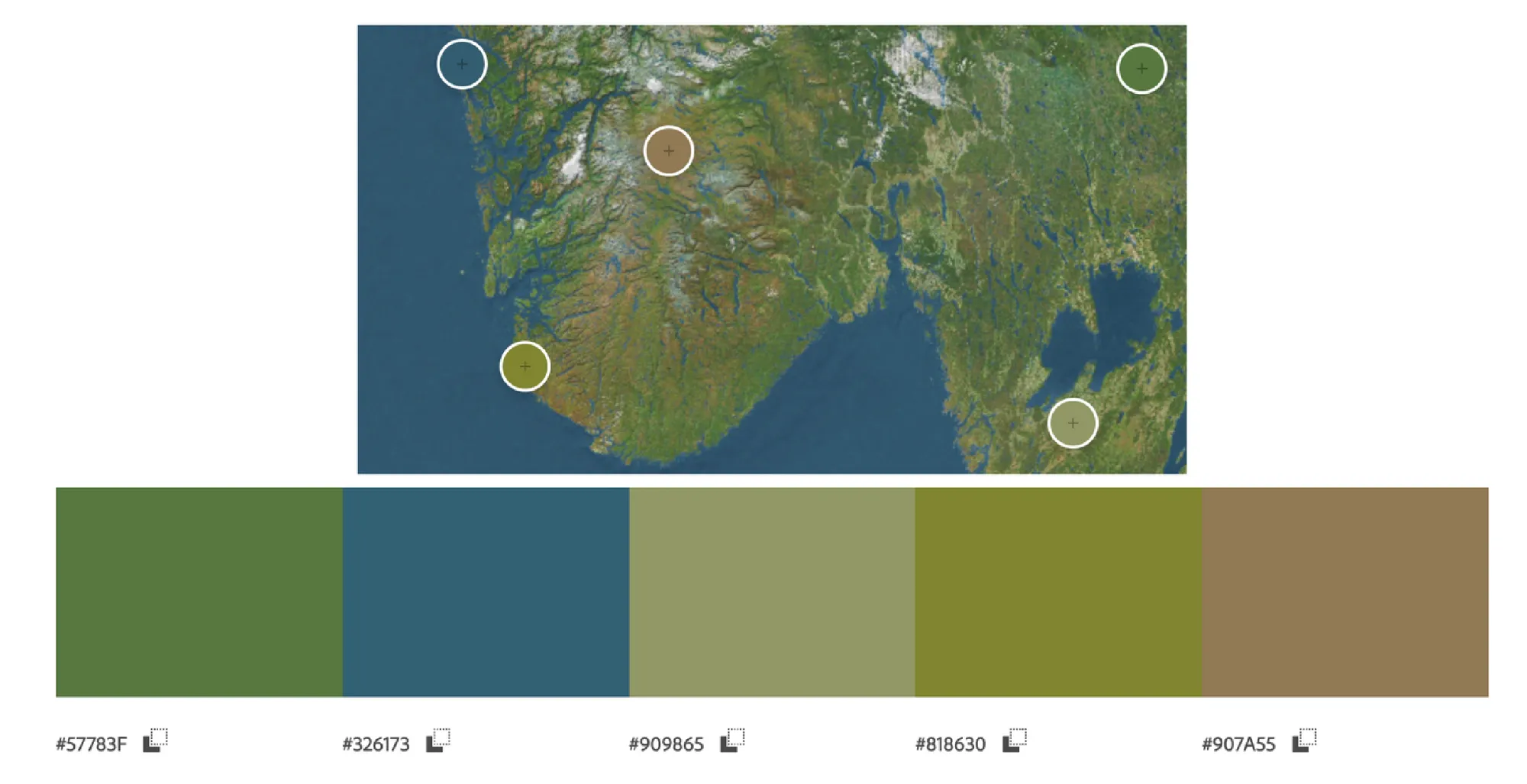
I played around some more, and created a colour palette that would serve as a reference for the entire project:

Then I created a new layer named Land_color.
I simply used a General Brush and started mixing colours around with a Blender Brush. The point was to have a base color to begin with, so I didn't spend much time with it as I knew it would eventually be covered by multiple layers:
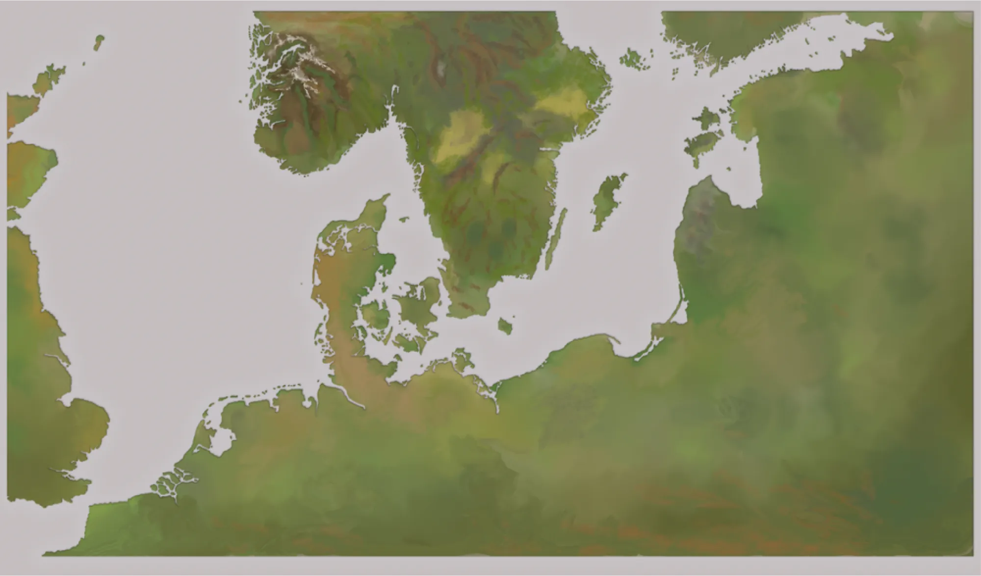
For Land_color to 'fit' Land_base I had to place it above Land_base and clip it by using the Clipping Mask:
Looking like this:
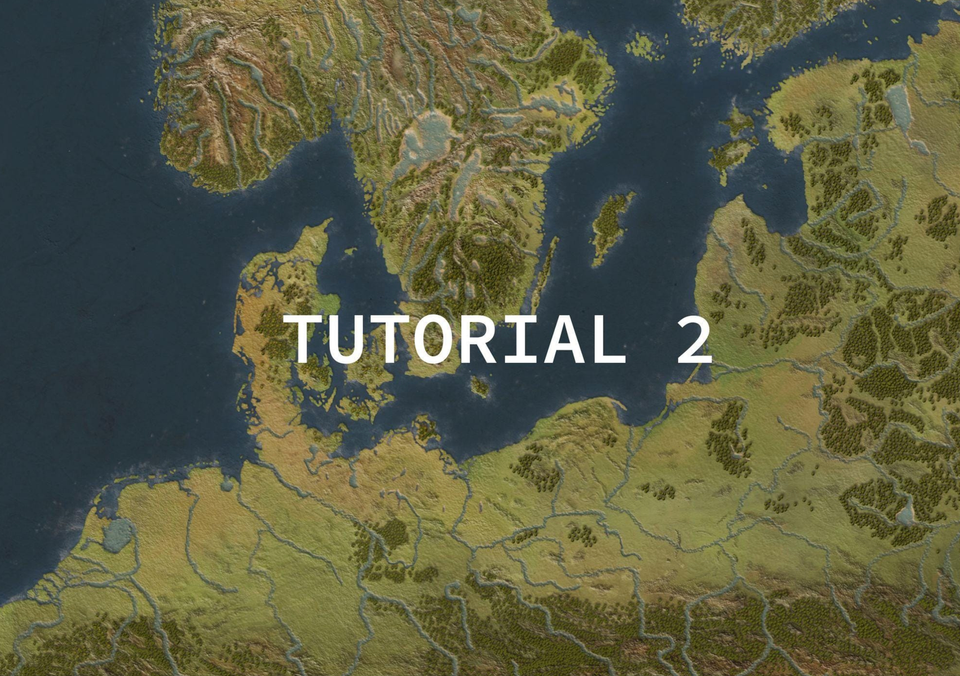
In Part 2 I'll show you how I continued making forests, lakes and rivers.
#tutorial #freelance #commission
I started by using the Mixer Brush Tool. Continuing with:
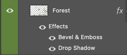
01. New layer named Forest
02. Applied these effects:
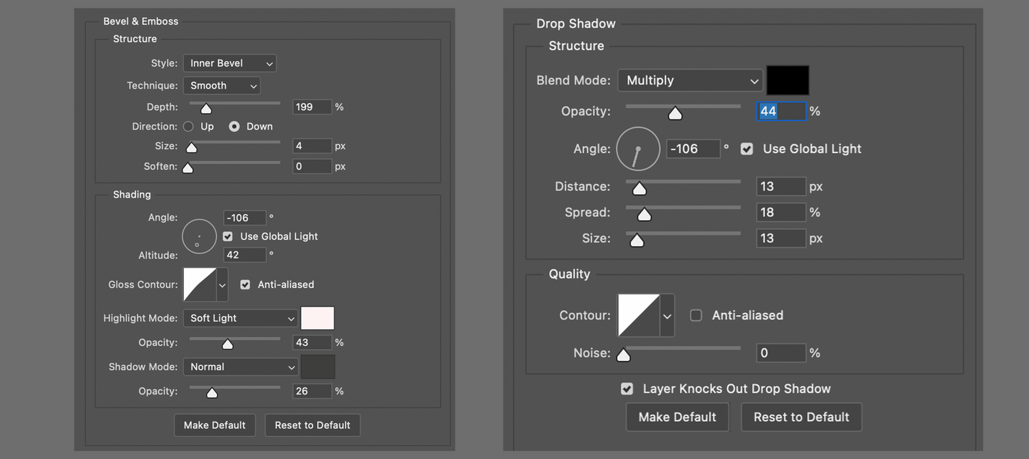
Looking like:
I then looked online for the easiest way to recreate a forest, which was to create a brush with a tree-top view .png file and therefore accelerating the process.
So in this order:
01. I created a separate New file named Tree_brush with specs Width: 29'7cm, Height: 21cm (A4)
02. Downloaded a free/paid tree-top view png file.
03. I then Place embedded.. the treetopview.png file of choice.
04. Then scaling the image transform -> scale or Command + T in a hit or miss style until I achieved the desired effect.
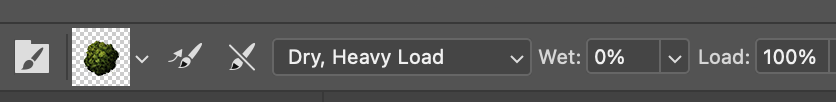
05. Selecting Mixer Brush Tool
06. Making sure the tip of the brush is round shaped. I used a General brush.
07. Changing the brush size to cover the entire tree.
08. Then hovering the mouse over a single tree to load the 'paint' (making sure there's no background visibility to avoid loading it as well.)
Specs looking like this:
If the tree has white boarders and hasn't been cleaned properly, then:
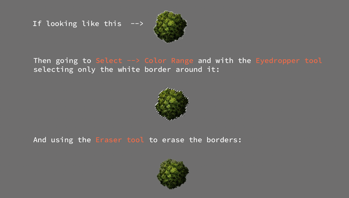
Next, I changed the Brush settings:
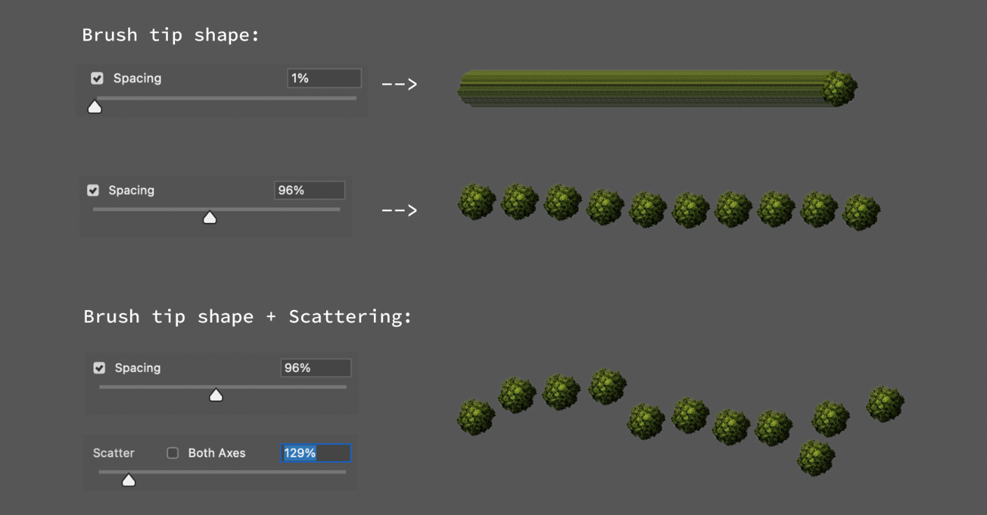
I went back to the main file and selected the forest layer and just played around with the new brush, changing sizes until it looked más o menos as intended.
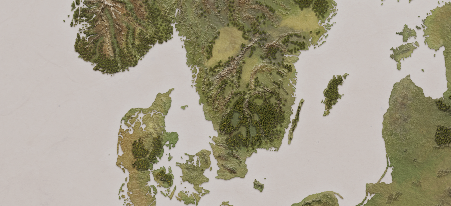
An important factor to remember is that the map is based in medieval times (1400s), meaning there were denser forests back then compared to the ones today.
In my case, I didn't use various trees because I didn't have the time to play around with details (I had already wasted a lot). Instead, I just changed the shape and color of the same tree to at least try to create a more interesting pattern.
So if you want to avoid monoculture plantations like I did, mix different trees.
I went back to my initial Outline layer, and traced all rivers and lakes of interest in a new layer named River_outline. This layer was used just for reference.
Next I moved on to draw the lake beds, creating a new layer lake(bed) and using these settings:
Looking like this:
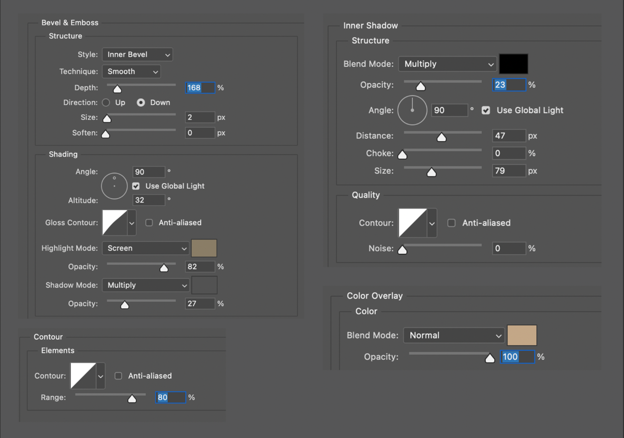
Next I created a new layer above lake(bed) named river/lake(water)with
specs looking:
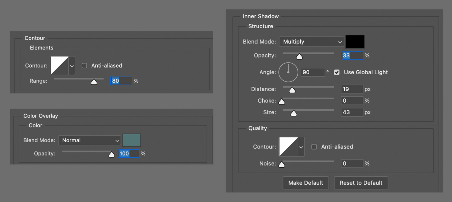
These settings will give the river the illusion of depth.
I then chose a brush of interest and started tracing the rivers following the river_outline layer placed under lake(bed):

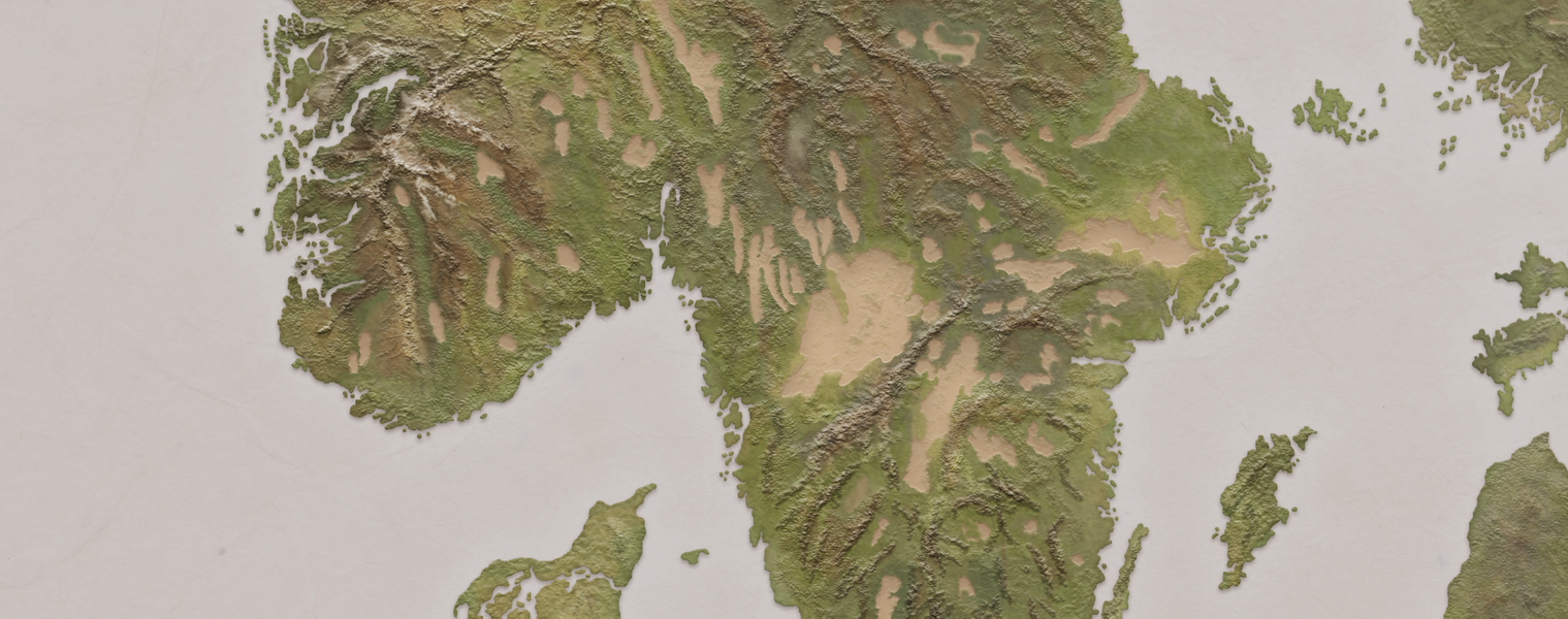
Result:
The rivers were made quite thick because later on in the game, assets like ships would have to sail through them.
And here you can see all layers so far with visibility on:
In Part III I'll finish off by making the sea and final touches.
#tutorial #freelance #commission

I started by creating a new folder named Sea and nested the new layer named Sea_color within it. I then placed the Sea folder under Land folder:

I went on to Edit -> Fill -> Color and chose a blue color from the color palette reference layer I had previously created. I then set Sea_color to Multiply to see through the water in future layers.
At this point I only had Land_base and Sea_color visibility on to see where I was. Looking like this:
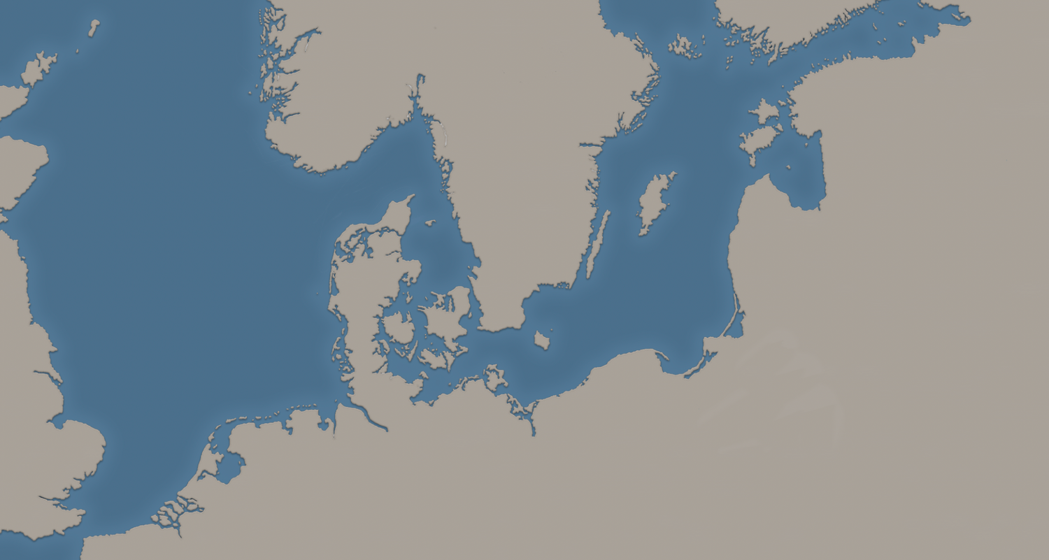
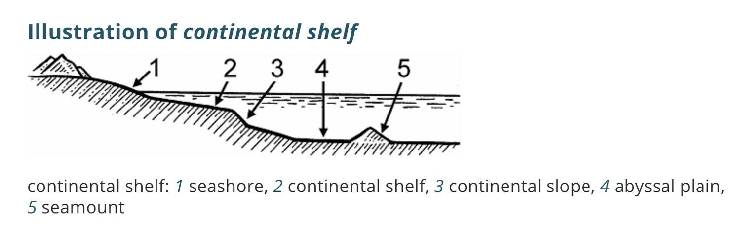
The outer glow you see around the land's margin comes from the effect applied to Land_base layer early on. Its purpose is to create a Continental shelf effect:
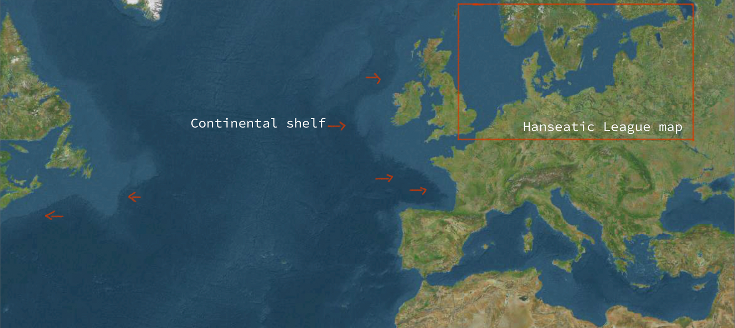
Cross-section view:
So working in this order:
01- New layer Continental_background
02- Edit -> Fill.. -> Grey background
03- A new layer named Continental_shelf above Continental_background
04- Specs:
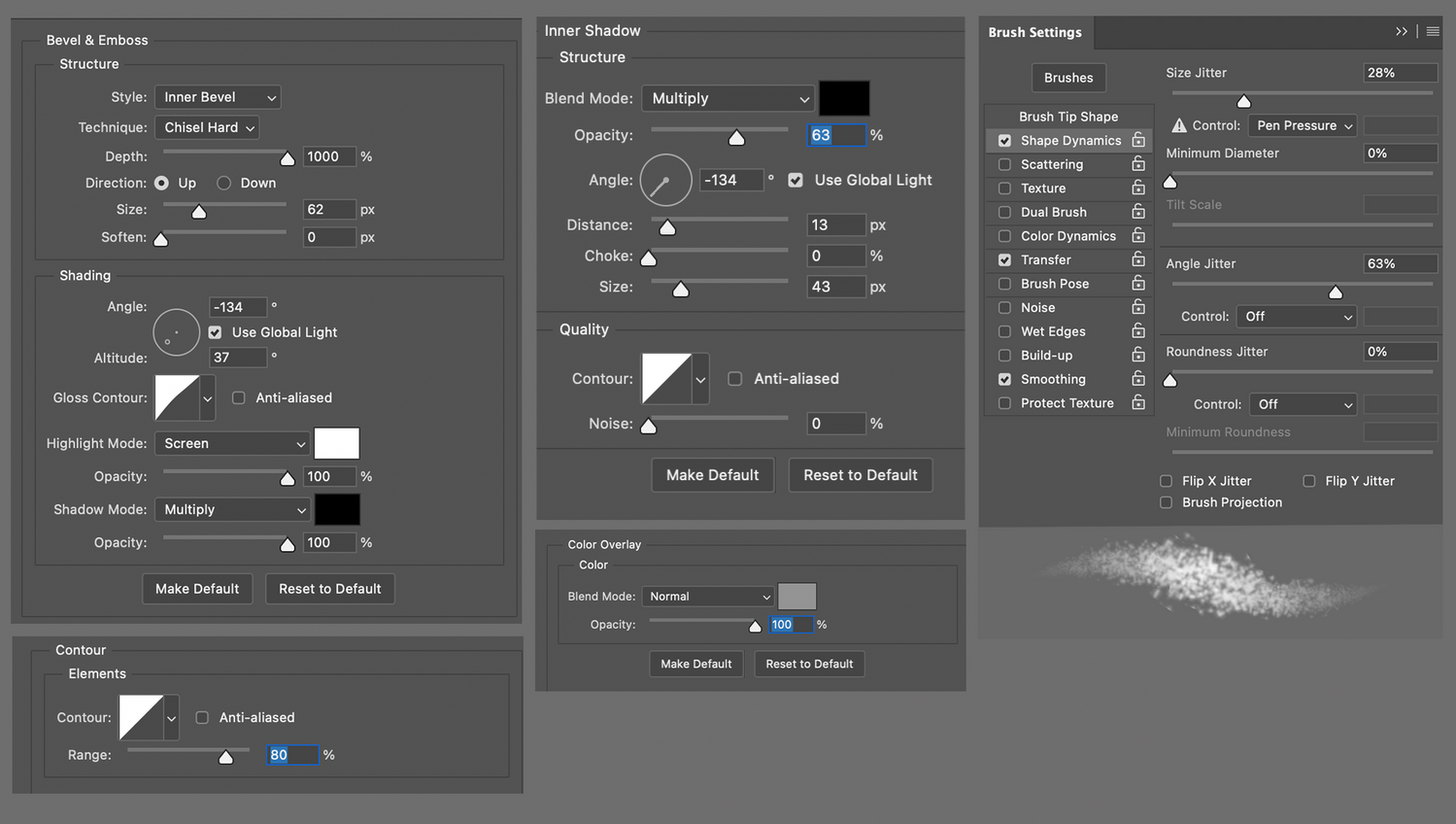
The brush settings are the same as the ones used for the Terrain layer in Part I:
01- Splatter brush
02- Brush tip shape -> Spacing: 30%
03- Brush color to white or same color as background.
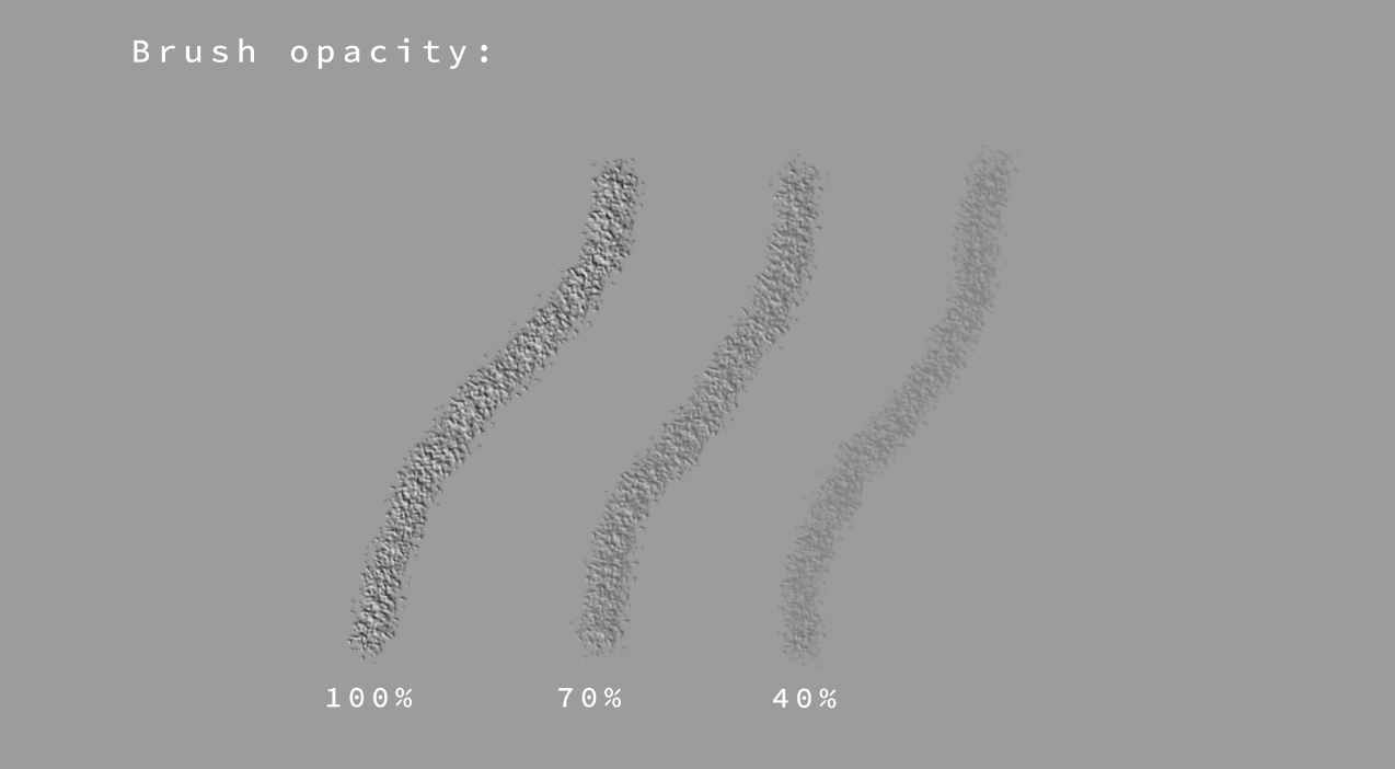
I played around with the brush opacity until satisfied:
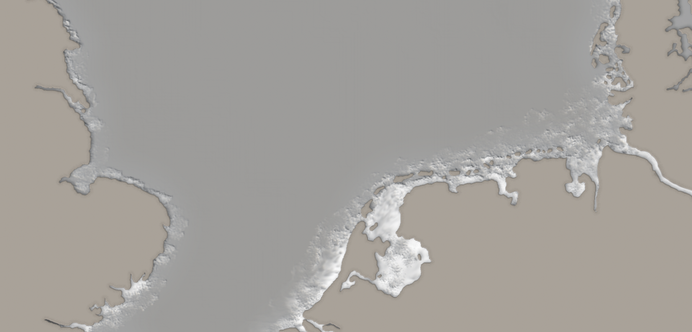
Results:
I then turned visibility on for sea_color and lowered sea_color opacity to 90% to see through the water, with these results:
Next, I added some wave texture by following these steps:
01- New layer Sea_texture
02- Filter -> Render -> Clouds
03- Filter -> Render -> Different clouds
04- Filter -> Noise -> Add Noise
05- Filter -> Filter Gallery -> Glowing Edges
06- Lowering the layer’s opacity to 70%
07- Placing Sea_texture layer under Sea_color
Then getting a texture similar to this:
And for final touches I added a foam effect to the sea to achieve a more realistic look.
So in this order:
01- New layer named Sea_foam above Sea_color
02- Specs:
03- And with Splatter Brush to 80% Opacity -> Color: White painting the coastal areas:
04- I then used an Eraser brush to sharpen the splatter strokes, to eventually make it 'pop' around the edges:
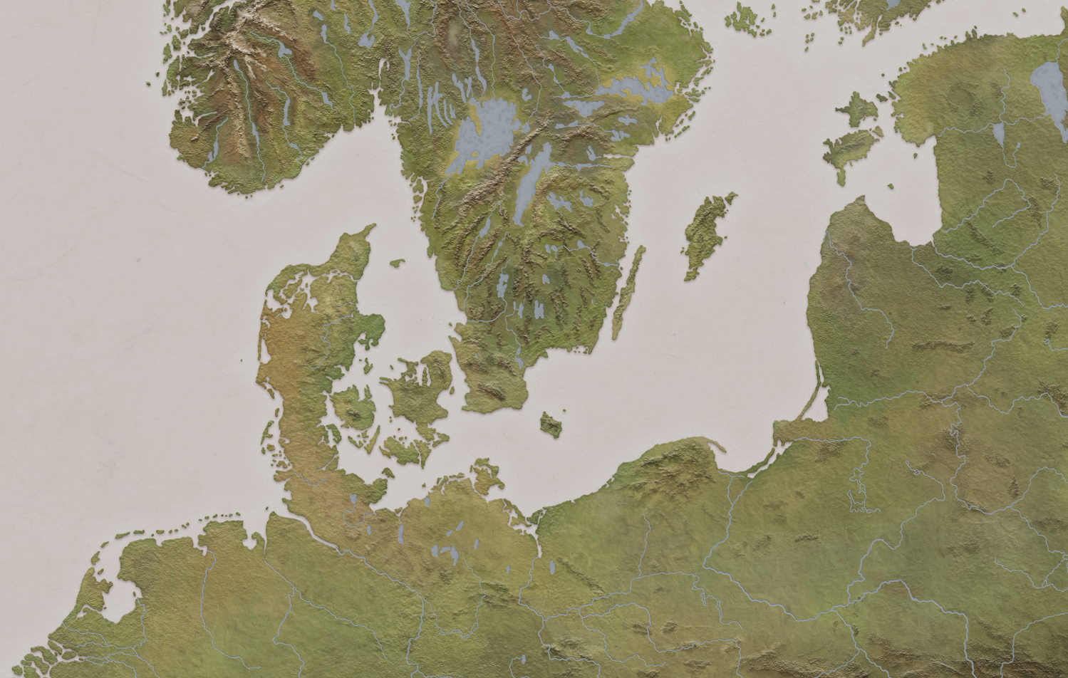
And when turning visibility on in all layers I got the final result:
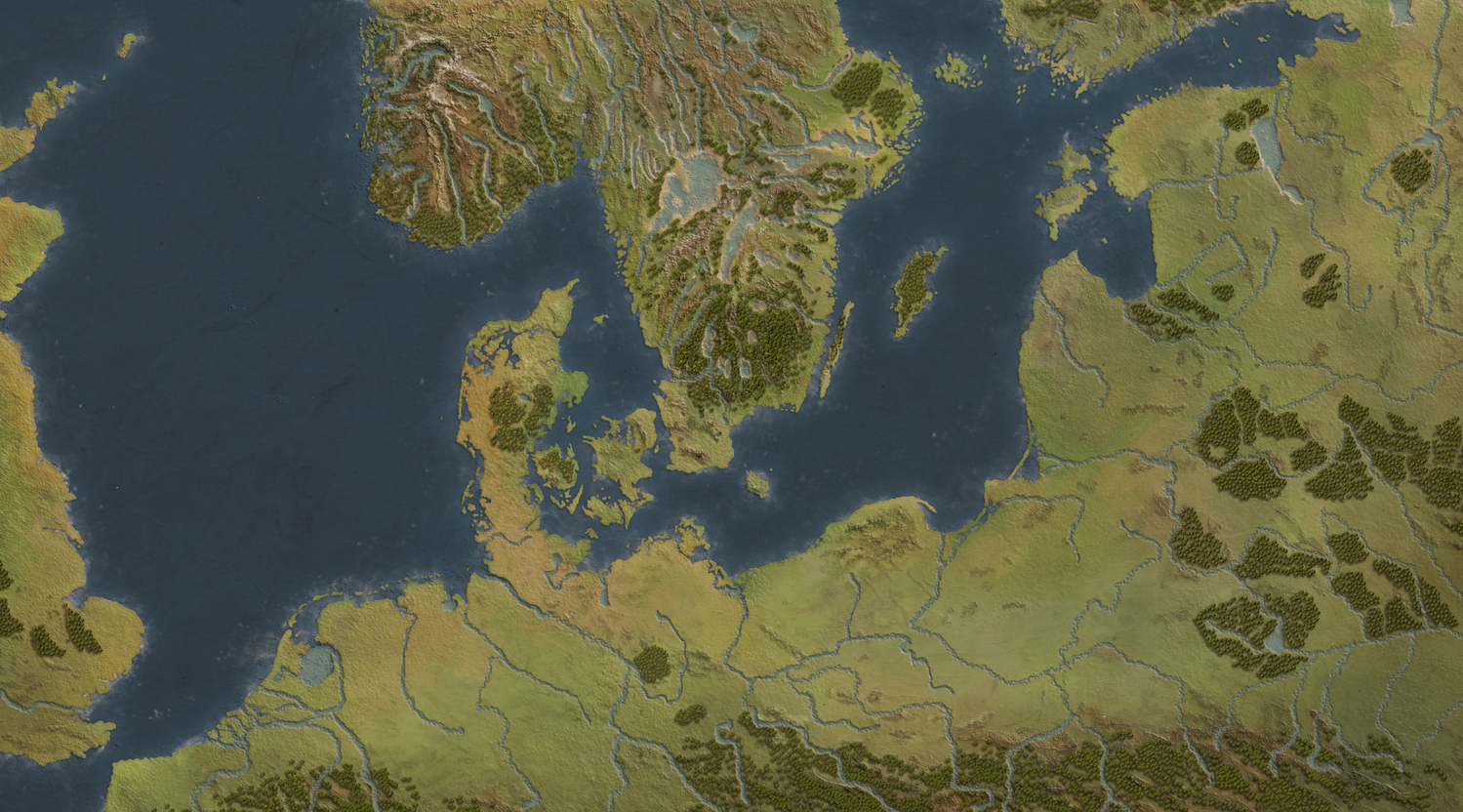
And that was it! After tweaking here and there, and applying different filters to it I ended up with something looking like this:
Am I content with the final result?
As a non-experienced cartographer, yes. As a perfectionist, no.
Things I would change today?
More forests! Happier shapes, happier trees.
Are there more practical ways of applying effects and using tools?
Definitely, I just don't know about them. Most of the results here are just a combination of mistakes, and making Photoshop crash. But as the great late Bob Ross used to say:
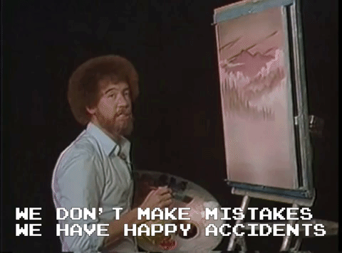
I wish you many happy accidents!
- Tawatha
